10 Questions With… FreelandBuck
 FreelandBuck, the Los Angeles architecture firm founded by Brennan Buck and David Freeland, AIA, creates environments that seem to defy reality. Lately, the firm has kept busy with a bevy of notable commissions that landed them on our list of must-watch emerging firms—and as a finalist for the 2018 Museum of Modern Art and MoMA PS1 Young Architects Program. Take Parallax Gap at the Smithsonian’s Renwick Gallery, where they translated nine drawings of historical ceilings into a canopy of aluminum frames and polypropylene panels. Or film production company Hungry Man’s Los Angeles headquarters, where scattered cubes and cartoonish furniture both distort spatial perception and add whimsy to the work day. Below, the duo reveals their most admired historic interior, recounts how they started working together, and details their most technologically challenging project.
Interior Design: Where did you grow up, and how did it influence your work?
Brennan Buck: I grew up in Vermont which was fantastic, but I tend to think about our work in relation to contemporary culture and recent experience rather than our origins or personal histories.
David Freeland: A small town in upstate New York. A few summers working there for a contractor helped me to understand the rudiments of construction.
ID: What are a few recent projects?
FreelandBuck: Our Parallax Gap installation is up at the Smithsonian American Art Museum’s Renwick Gallery in Washington, DC (open until February 2018). This project was the culmination of a series of projects that attempt to build drawings. Of course drawings are always a part of the process of building, but at the Renwick the installation is a three-dimensional, physical drawing; drawn elements like linework and hatching are constructed as objects in space. The general public typically looks at drawings in one way (as representations that allude to other things and have legible meaning) and rooms or buildings in another way (as the utilitarian background of everyday life). Conflating the two is a way to insert illusion, depth and meaning into that background.
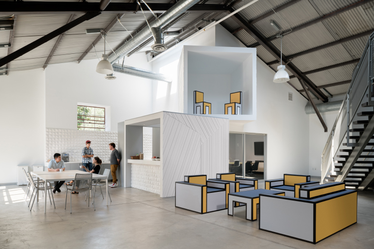
Another recent project is an office renovation for Hungry Man Productions, a film production company in Los Angeles. We aimed to match the light-heartedness of Hungry Man’s identity with a series of “tumbled” cubicles that playfully challenge the regularity of the typical office space. The faces of each cube are finished with CNC-milled MDF panels that create spatial illusions depicting a second set of cubes drawn in distorted perspective. The full-scale drawings create two simultaneous sets of cubes seen from two different vantage points, one physical and one representational.
ID: From a technological standpoint, what was your most challenging project?
FB: The Parallax Gap installation is a multi-layered 80’x40’ canopy hung from a historic ceiling in the Renwick Gallery. We worked with a rigging company to install an operable metal truss that moved up and down on 12 remote-controlled motors which allowed us to assemble the canopy panel-by-panel on the floor and then raise it into place.
ID: You met while enrolled in UCLA’s M.Arch program. How exactly did you meet, and what led you to start a firm together?
FB: We met in a design studio taught by Jason Payne called ‘Difficult Sites’ studying how the form and interior volume of a house adjusts to an extremely steep hillside site. We were friends with a lot of shared interests but a different range of professional experience and we started the firm by doing a competition and a commissioned project about five years after graduating.
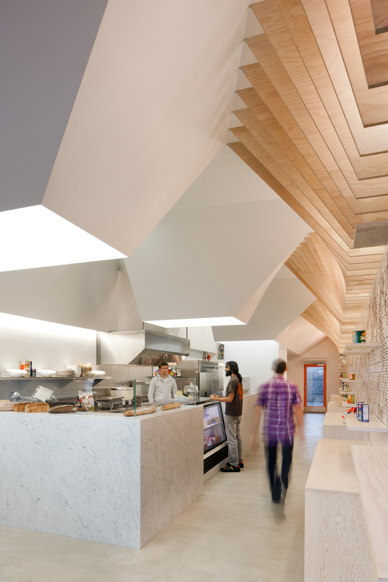
ID: Which project/projects are you most proud of and why?
FB: The first commissioned project we worked on together was a small deli in Los Angeles called Earl’s Gourmet Grub. It’s now closed, but the clients were open-minded and we were able to manipulate space through large torqued skylight volumes as well as work with graphics at an architectural scale—things we still are interested in today.
ID: Favorite paint color?
FB: We did a lot of research on Victorian-era colors for Parallax Gap. A lot of vibrant colors were invented at the time—the possibility of inventing a new color is so strange to us now when we think about color as a set of infinitely divisible gradients. But we always tend to come back to Josef Albers’s color combinations, particularly one combination of purple and orange.
ID: Most admired historic interior or building?
BB: The interior of the Yale School of Architecture, designed by Paul Rudolph in the 1950’s, is full of surprise and vitality. The primary finishes are incredibly jagged, downright dangerous hammered concrete and bright orange carpet. Rudolph thought the hand-wrought quality of the surfaces would make people feel comfortable, but they often do the opposite, making people wary. Still, it’s a constantly challenging and beautiful place to be.
ID: Dream commission?
FB: We spent the last year working on an indoor miniature golf course which just fell through.

ID: Most recently downloaded app?
BB: Qclone, a 3d scanner for your phone.
DF: Hopper, a predictive algorithm for travel costs.
ID: Are there any young designers or firms you have your eye on?
BB: Only-If and Norman Kelley have done some small but striking interiors in New York recently.
DF: To that list, I would add Bureau Spectacular and LADG—both have unique approaches to the architectural interior.
