10 Questions With… Harry Nuriev
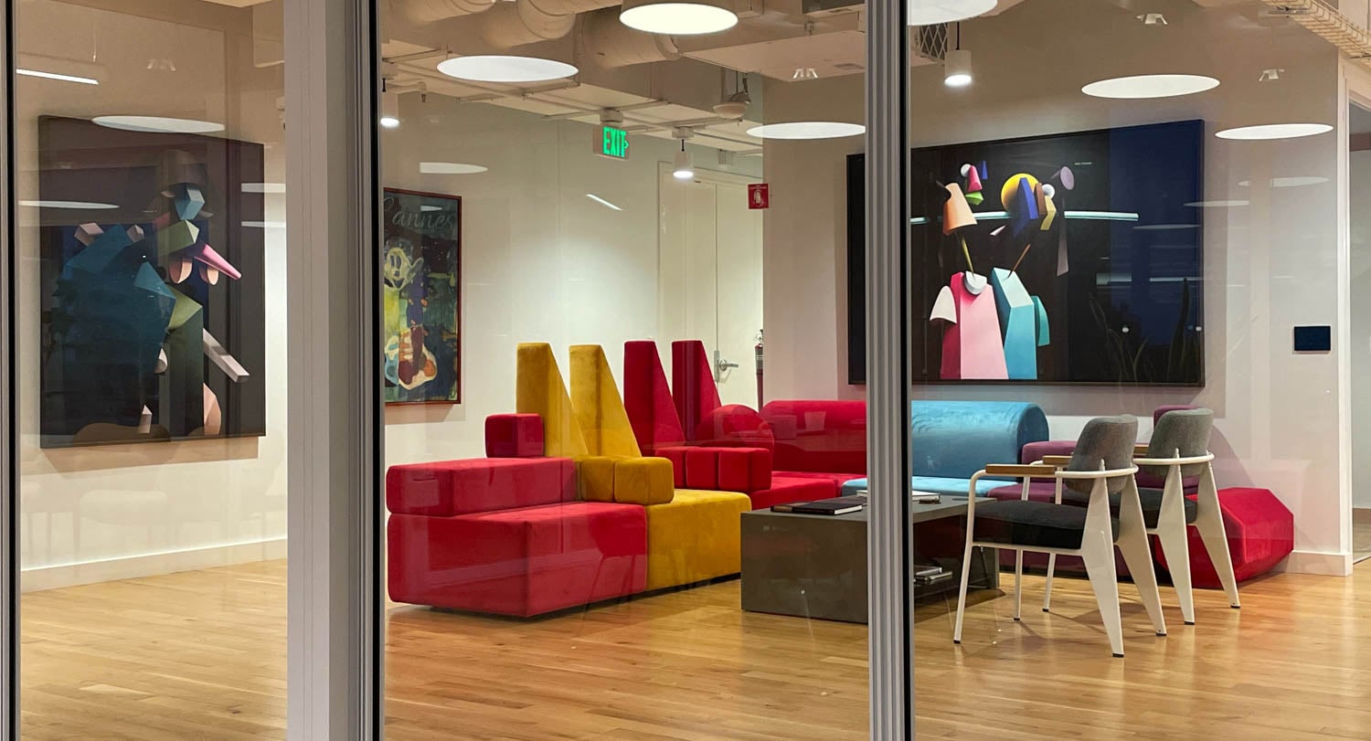
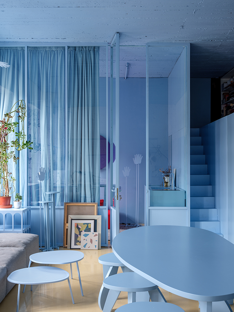
 One glance at the portfolio of Crosby Studios, the up-and-coming firm founded by Russian artist and architect Harry Nuriev, and one dominant theme is clear: bold use of monochrome. Each project abounds with one unconventional color in such attention-grabbing shades as deep purple, electric blue, and shimmering gold. Nuriev’s palette is so on-trend with millennial sensibilities that the New York Times recently profiled him as Instagram’s favorite designer. While some may bristle at being bestowed with such a label, Nuriev takes it in stride. The network is a beloved platform where he shares his studio’s recent happenings and his own wide-ranging inspirations, many from fashion runways. Plus, any Instagram compatibility is pure coincidence—Nuriev championed “millennial pink” long before it became a buzzword.
The Brooklyn-based designer just wrapped up his busiest season yet. Aside from dreaming up dozens of residential, commercial, and artistic projects across the globe, Nuriev participated in a staggering eight shows this spring, ranging from an interactive Collective Design booth to a solo exhibition at Dallas Contemporary. He frequently travels between New York and Moscow, where Crosby Studios maintains offices, to whet his creative appetite and oversee his firm’s commissions. He recently sat down with Interior Design to discuss staying relevant in the age of Instagram, his refreshingly simple outlook on color, and the one step emerging designers can take to achieve creative nirvana.

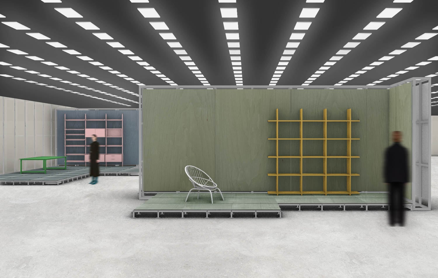
Interior Design: Your booth at Collective Design was called “My Reality.” What is your reality?
Harry Nuriev: My Reality ventures well beyond my day-to-day lifestyle. It’s how I speak my design language, how I live, and how I try to make this world more beautiful every day. But it also communicates how a little boy from the middle of nowhere in Russia moved to the Big Apple with even bigger dreams—and how he gets things done at rapid fire.
ID: You’ve been called Instagram’s favorite designer. Would you agree? What’s your relationship with the network?
HN: My team and I work tirelessly every day to ensure our designs are as memorable as humanly possible. So I guess the label is fair enough.
Instagram is very important to me. It’s a platform where I can freely share the minute yet resounding details that give my projects their unique verve. Through my own Instagram Stories, I reveal not only my inspirations, but the shapes and color schemes that appear throughout my portfolio. So it’s a hint of work in progress, which is perhaps even more interesting than the finished projects.

ID: Maybe Instagram gravitates toward your work due to your bold use of monochrome. How does color influence your design practice?
HN: Bright colors make people smile and feel good. It’s that simple.
ID: Speaking of color, you recently doused the entryway of Opening Ceremony’s SoHo boutique in Ultraviolet during NYCxDESIGN. How did this collaboration come about?
HN: I loved working with Opening Ceremony. They’re one of the most thoughtful and professional teams I’ve ever collaborated with. We first met in December to discuss launching a small collection of home accessories. Afterward, I thought “why not design a whole furniture collection?” So a month later we met again and they approved my proposal with no comments or changes. Then we added t-shirts and bags. It was so much fun. I knew working with the fashion world would be a great experience. It’s always been one of my biggest passions and dreams.

ID: That was one of your eight shows this spring, including a solo exhibition at Dallas Contemporary. Tell me about that.
HN: Artists normally present their work at shows two or three times throughout the year. This spring, I had eight, with 15 all year. We collaborated with OMA for an outdoor art installation in Belgium, presented a solo exhibition called “6 Fears” at Dallas Contemporary, and showed at Collective Design, Frieze New York, and Sight Unseen Offsite, among many others.
I think of it like Madonna embarking on an international tour, barely able to catch her breath between performances. It’s quite difficult, especially considering the amount of projects we manage at any given moment. But I have no complaints. We’ve only been around for four years, and I moved stateside a year ago, but everyone in the design industry seems to recognize who I am and appreciate what I do. The shows feel like a worthy investment.
ID: How does practicing architecture and design in New York differ from Moscow?
HN: It’s two completely different cultures. In New York, clients ask for what’s new and unique. My Russian clients prefer a more conservative approach while still requesting the latest trends. But both cultures seem to love Crosby Studios!
ID: What have you learned about running a business that you didn’t know when you started?
HN: Oh, there’s so much. In art and design, you must really learn to love yourself and your background regardless of your identity. Once you reach that point, the possibility to create something truly unique and groundbreaking is near-infinite. Otherwise you become stuck in references of references of references, which is a waste of time.
ID: What are a few recent projects?
HN: We’re currently working on eight commercial, four residential, and five art projects. One of my favorites is a concept jewelry boutique, covered entirely in taxicab yellow, that also sells coffee and home accessories. Another is a pastrami restaurant that prominently features only two materials: raw concrete and polished metal, which is actually roof pallets polished and patinated pink. Looks awesome!
ID: What are your favorite materials to work with, and why?
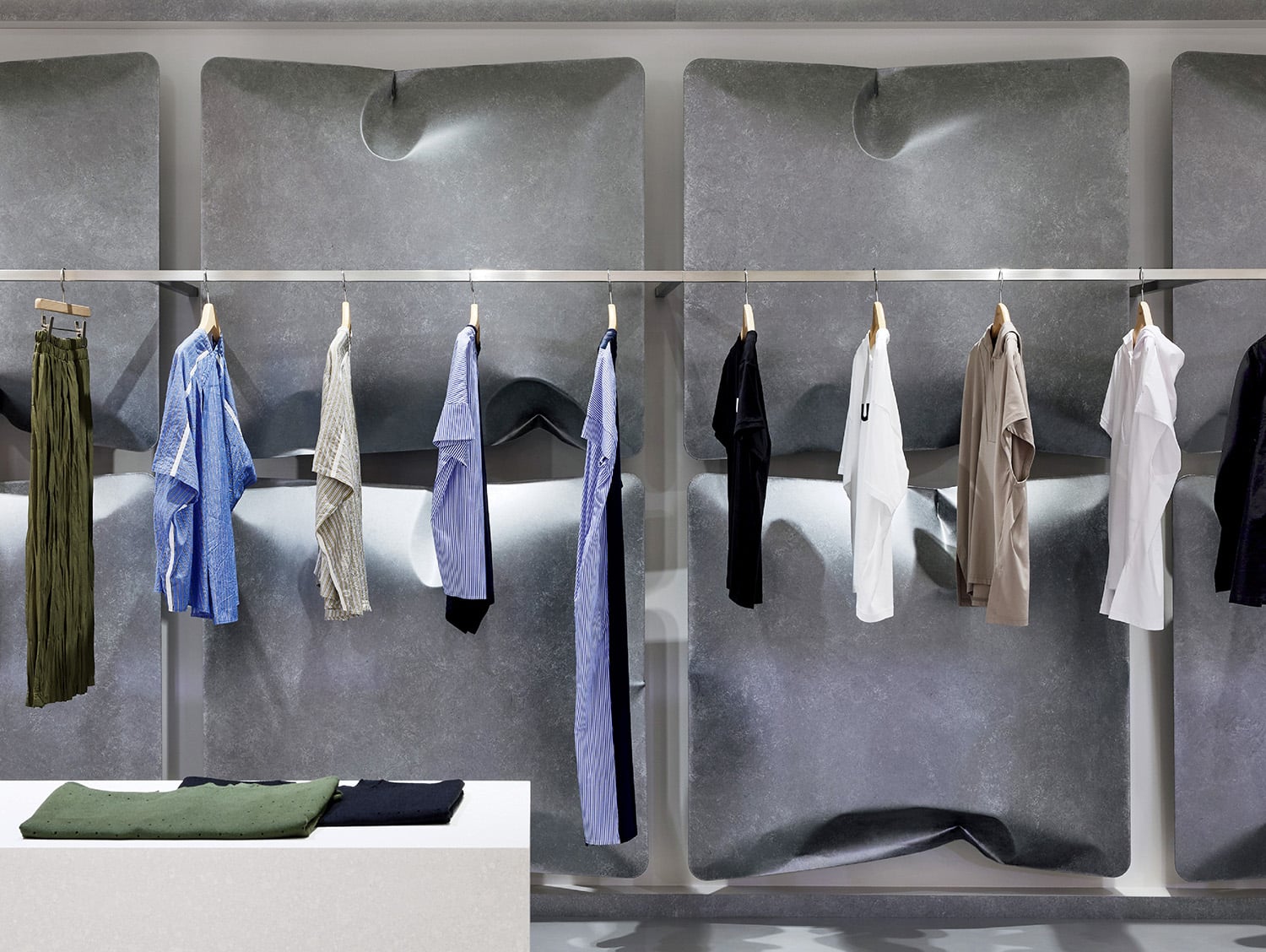
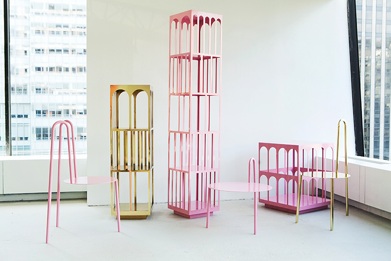
HN: It’s always different but my latest material obsession is metal. Bold use of color is a defining quality of my interiors, especially unconventional shades like pink and baby blue, and metal works really well for contrast.
ID: Which person, place, or thing—inside the industry or out—most inspires you?
HN: As you can see on my Instagram stories, the fashion world’s textiles, colors, and shapes are a huge inspiration right now. I can translate them into a distinct design language. John Galliano in particular is one of my latest obsessions.
