Benjamin Moore Introduces “First Light” as 2020 Color of the Year

As 2020 approaches, designers already are considering the palettes and patterns that will shape the look of interiors in the coming year. And selecting just the right hue of paint is vital to this process. A touch of paint holds the power to shift the mood of an entire room, whether functioning as a focal point or discretely fading into the background to accentuate other elements. However it’s used, paint selection is instrumental to nearly all aesthetics. So when Benjamin Moore, North America’s leading paint manufacturer, unveils its Color of the Year, designers take notice.
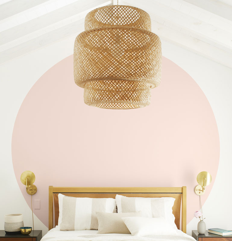
The historic brand opted for a cool pink named First Light for its 2020 Color of the Year. The stylish hue marks Benjamin Moore’s first foray into the pink spectrum for its choice, positioning the upbeat color as a refreshing start to the next decade. “We selected First Light as our Color of the Year 2020 to represent a new dawn of idealism, design, and living,” said Andrea Magno, Benjamin Moore director of color marketing and development. “First Light reflects a new definition of the home—a shift in mindset from the material to satisfying the core needs in life: community, comfort, security, self-expression, authenticity and ultimately, optimism.”
First Light also compliments the company’s Color Trends 2020 Palette, comprised largely of more modern and understated pastels including jade-green Crystalline AF-485; sky-blue Windmill Wings 2067-60; and sunny Golden Straw 2152-50, among others. The palette’s hues are far from contentious, seeking to bring people together under one roof. “Color is powerful but highly subjective, especially through the lens of different generations, relationships and moods,” Magno continues. “But from the saturated to bright and airy, all are easy to live with and easy to love—whether they stand alone, in a strong pair, or all cohabitate.”
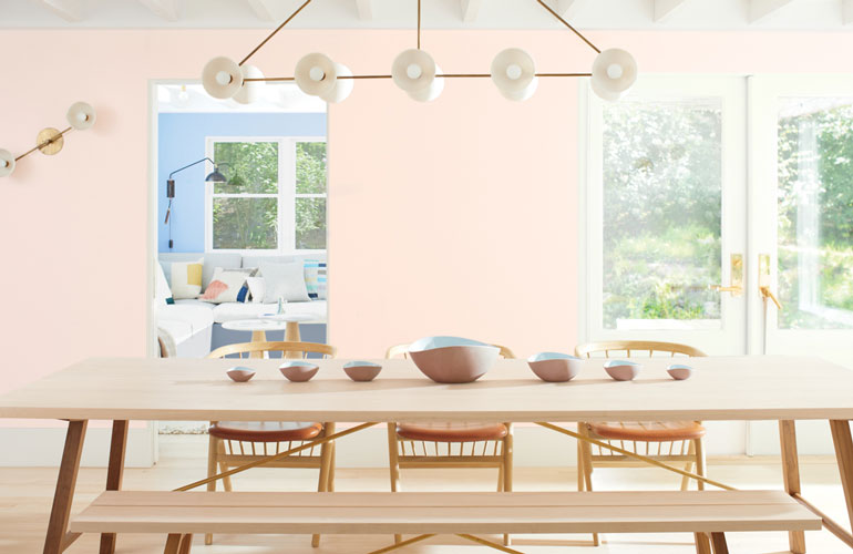
The trend toward expressive, saturated colors signifies a departure from Benjamin Moore’s more subdued 2019 Color of the Year, the off-white Metropolitan, as we welcome a new era of design rooted in fluidity to better suit multigenerational and multifunctional environments. “We’re always looking at years past and evolving,” says Hannah Yeo, color and design manager at Benjamin Moore. “Last year’s Metropolitan was neutral and we did that on purpose. We said, let’s a step back, relax, and find the comfort in our own homes. Once we’ve done that, we’re really ready for the next step.” And that next step is defined by rich, nuanced hues that reflect Benjamin Moore’s long-standing legacy as the premium paint manufacturer of choice.
All 3,500 Benjamin Moore colors are available in pint samples at local retailers along with Color Trends 2020 curated palette cards. Benjamin Moore products are exclusively found at the more than 5,000 Benjamin Moore independently owned paint and decorating retailers across the U.S. and Canada. To learn more about the Benjamin Moore Color of the Year and Color Trends 2020 palette, or to find the closest Benjamin Moore retailer, go here.
