Creative Voices: In Conversation With Artist Sophie Smallhorn
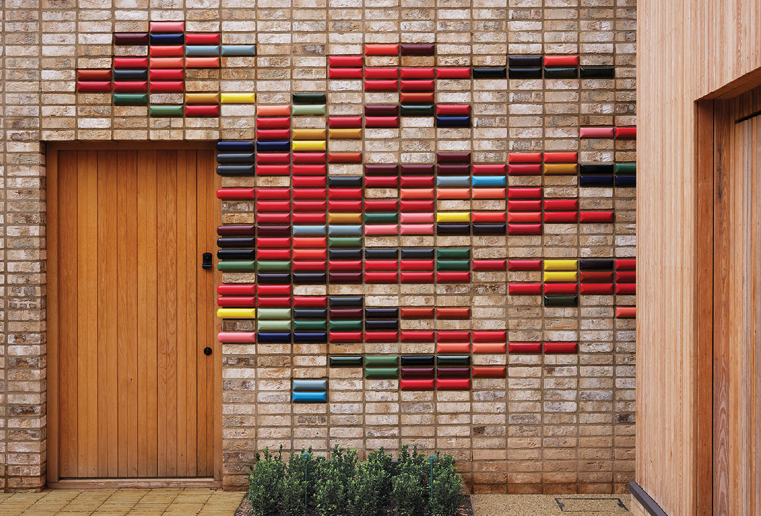
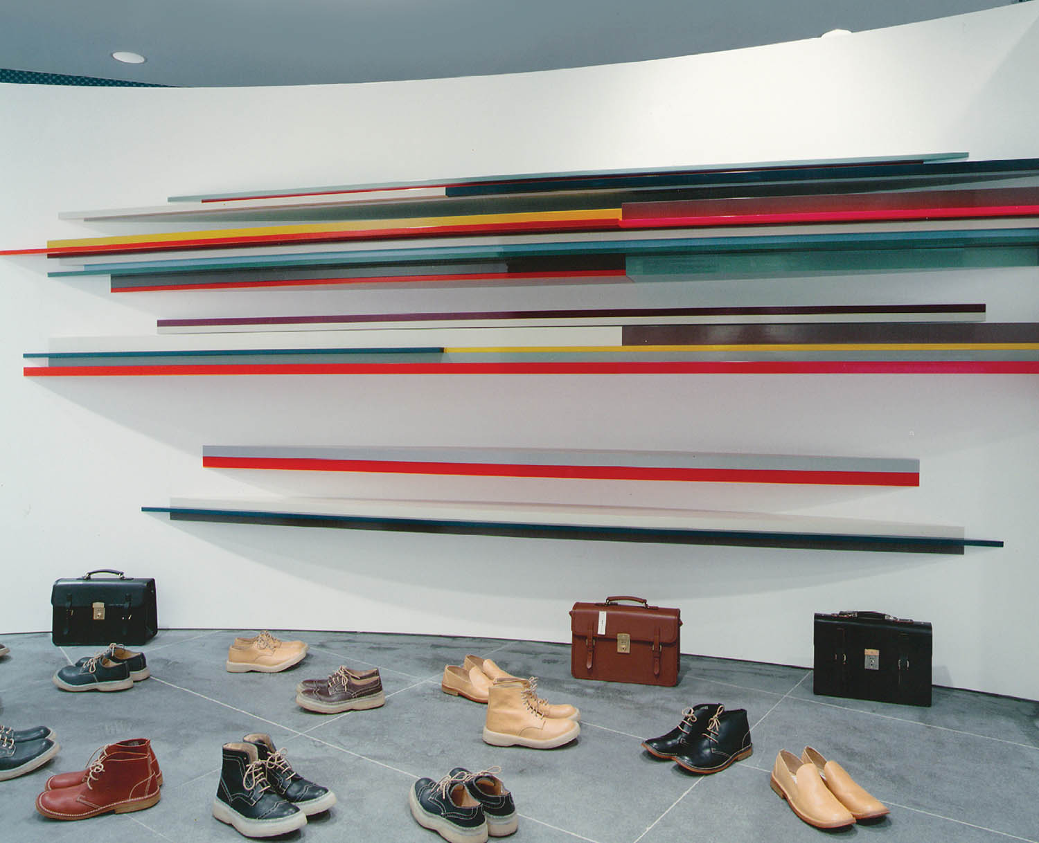
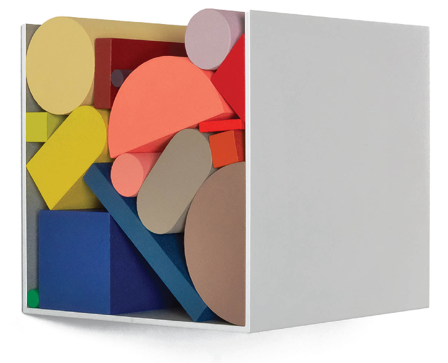
When British artist Sophie Smallhorn proclaims, “I cannot remember a time when wanting to be creative wasn’t in my world or way of thinking,” she’s being very literal. Her parents were industrial and textile designers, and she attended a Montessori school, where children interact with “sensorial materials”—brightly hued, precisely shaped wooden objects—to naturally master concepts of color, form, and dimension. The playful lessons evidently stuck: Smallhorn sees her work today as “exploring the relationships between color, volume, and proportion,” and her signature pieces—small wall-mounted sculptures composed of colorful geometric solids—are like sophisticated riffs on those early learning tools.
Not that Smallhorn necessarily set out to be an artist. After completing a degree program titled “Wood, Metal, Ceramics, and Plastics” at the University of Brighton, she began making stained-wood and cast-resin furniture. “They were sculptural pieces with a very small amount of function,” she now concedes. “The driving element was always color.” For pleasure, she made assemblages from leftover offcuts and, while uncertain exactly what they were, would occasionally sell a piece. It was only once a gallery presented her work as sculpture that she accepted it as fine art, although, “It’s a slightly uncomfortable area because my background is very much design and making.”
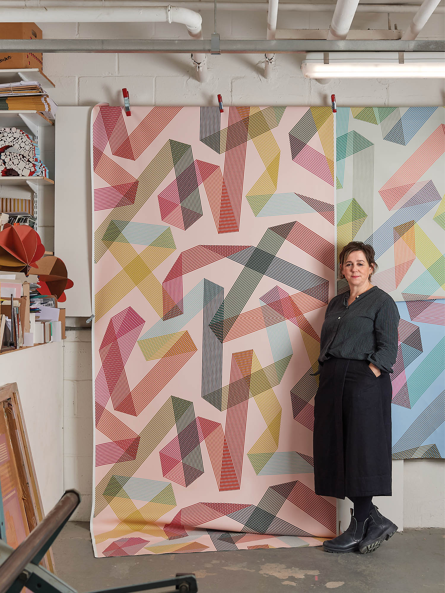
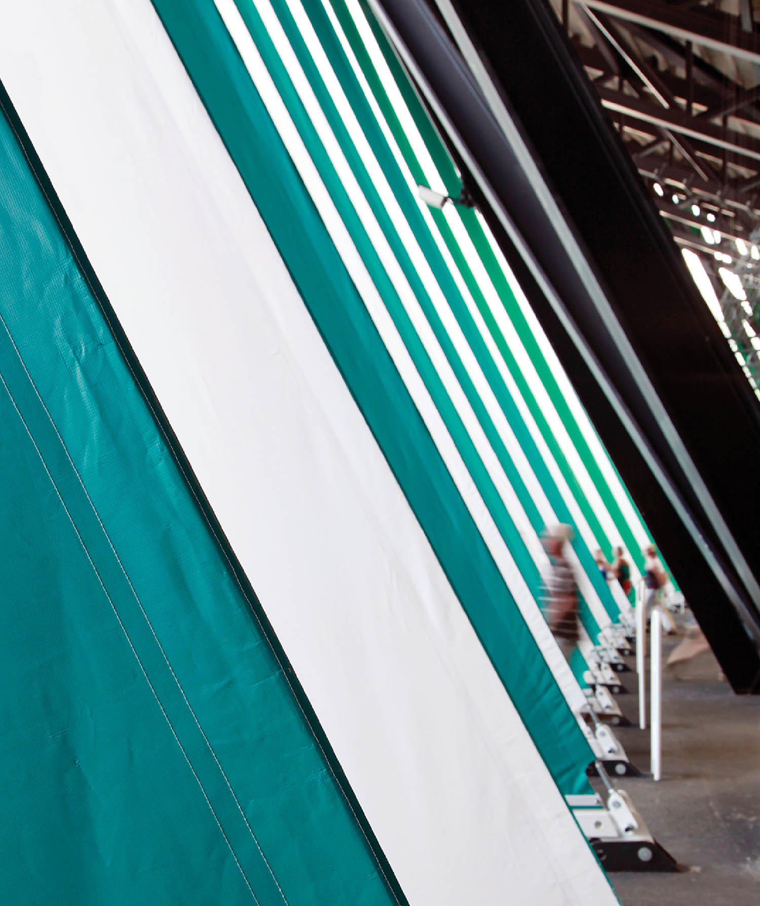
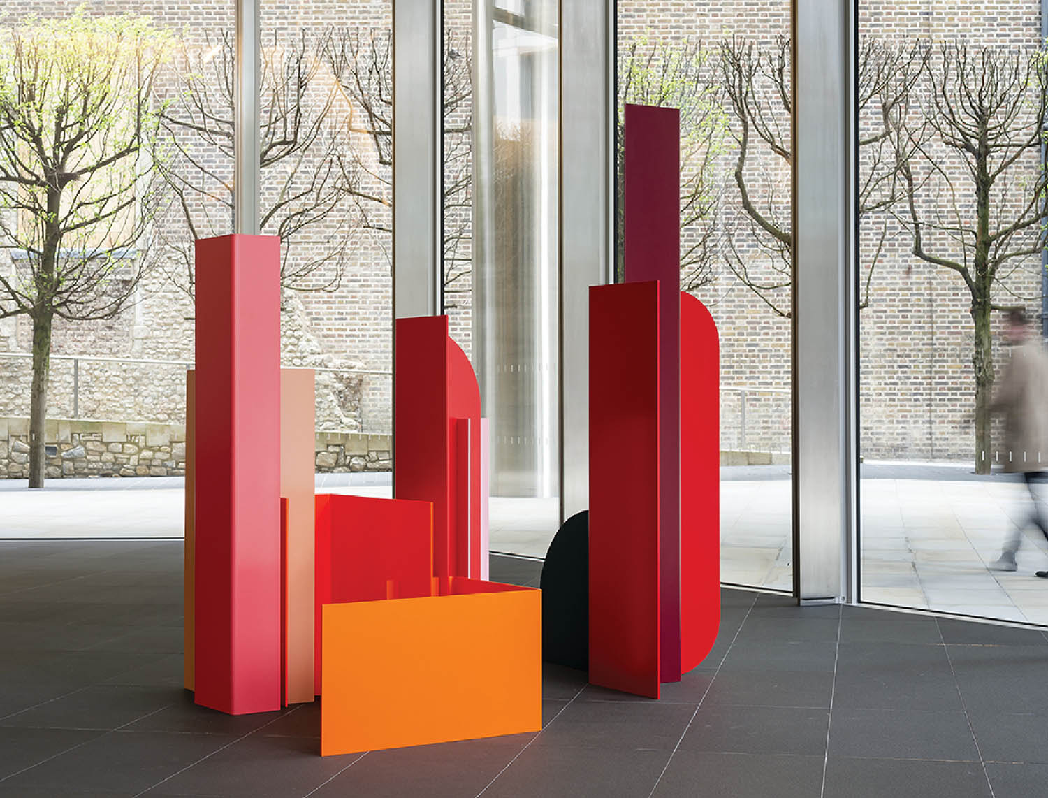
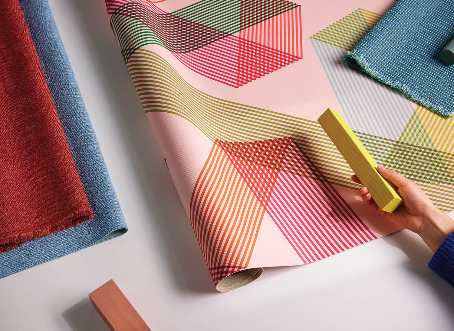
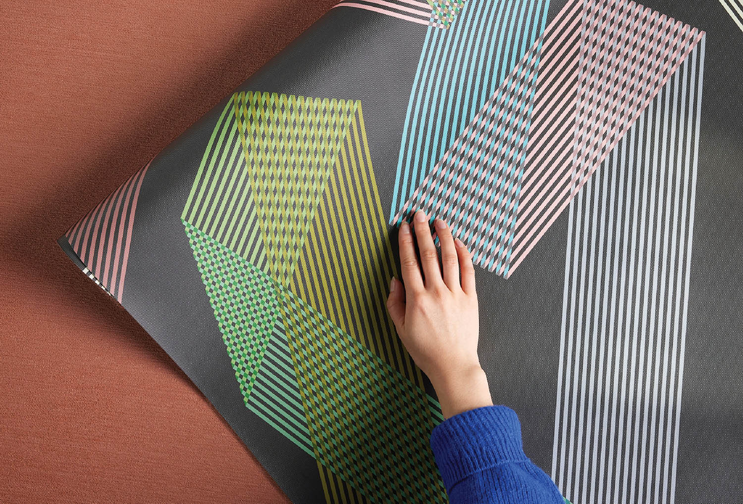
A pair of early, attention-grabbing commissions from the Japanese avant-garde fashion brand Comme des Garçons—site-specific installations at its Tokyo flagship—allowed Smallhorn to work at a large scale for the first time. “It really started a lot of other projects,” she notes, not least collaborating with Populous Architects to conjure a 56-color palette for London’s 2012 Olympic Stadium; exterior bladelike canvas banners, each a different hue, formed slits through which spectators entered the structure. Her latest collaboration is with Designtex, creating an upholstery pattern called Ribbon—surprisingly, her first foray into textile design. We asked her about this recent development and other projects.
Sophie Smallhorn Explores The Relationship Between Color + Dimension
Interior Design: You’ve been making sculptures, screen prints, and installations for three decades, but never tackled textile design before, despite it being your mother’s profession. Why not and why now?
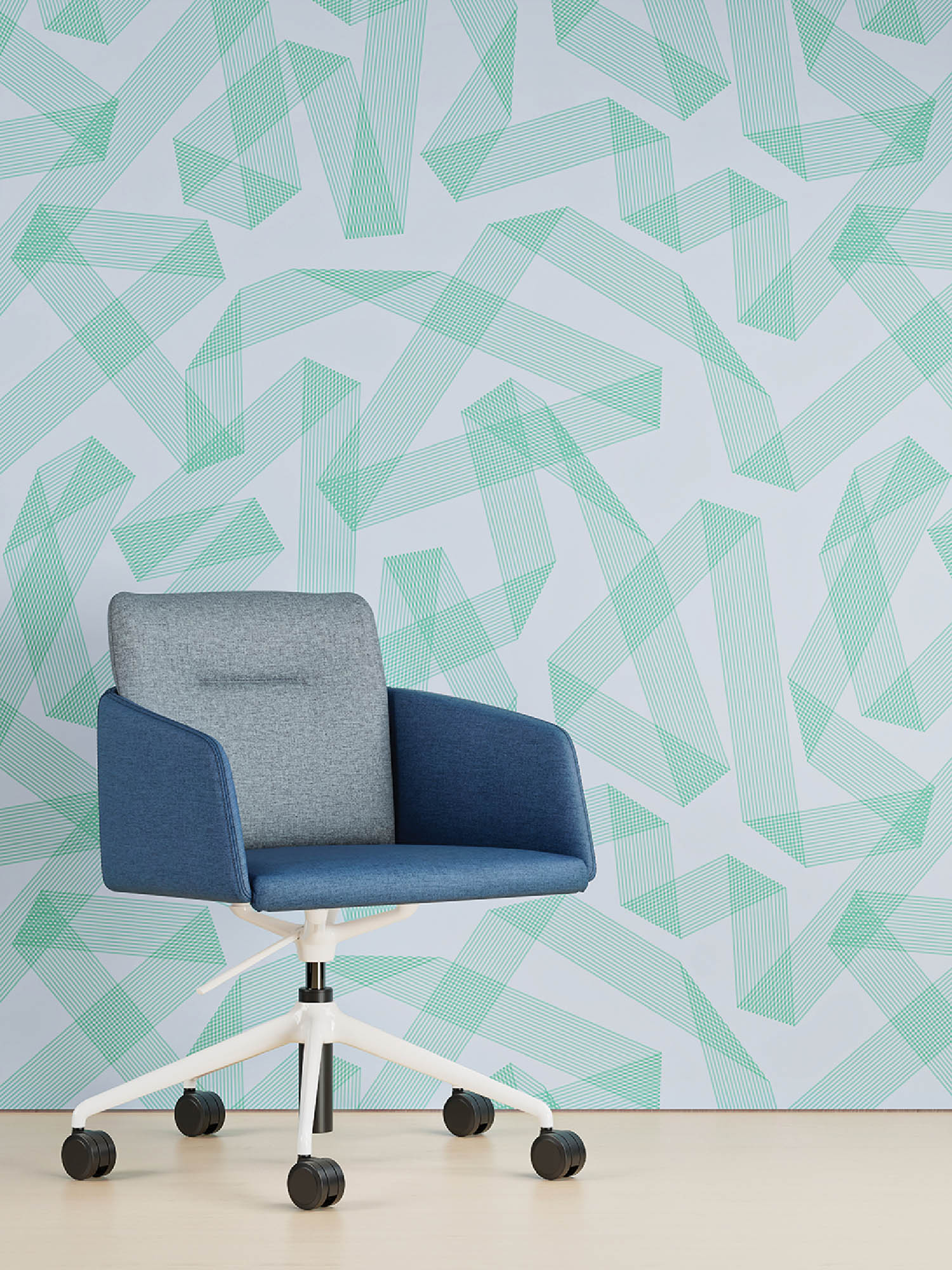
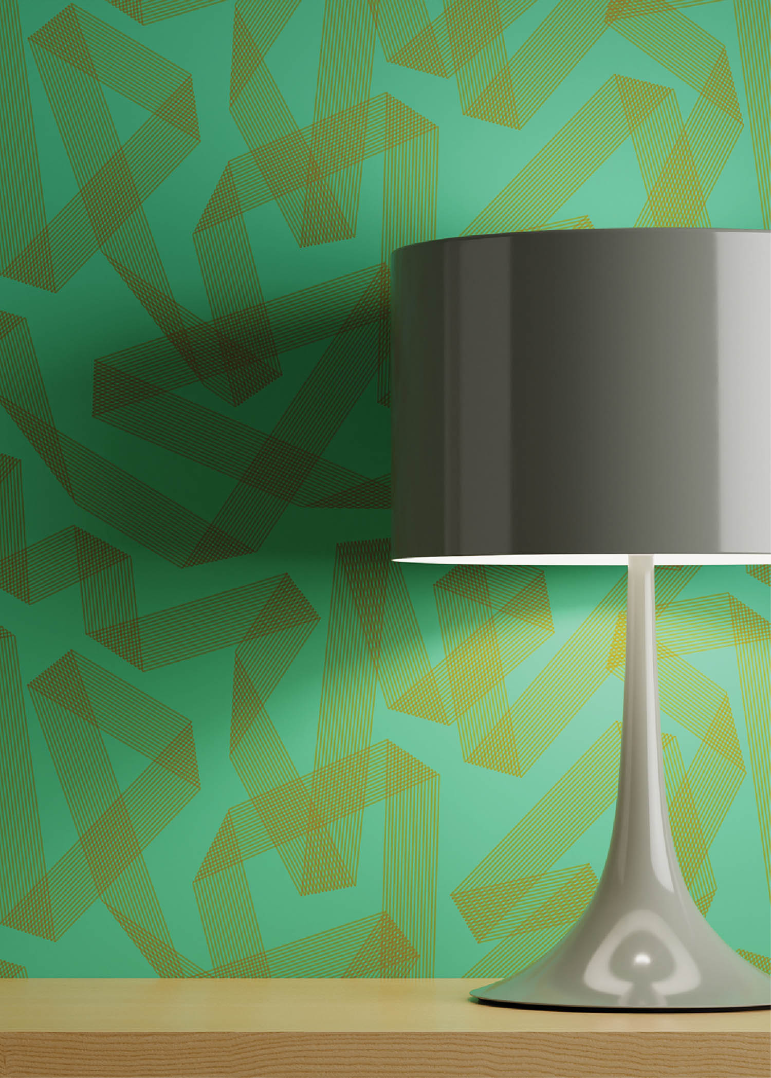
Sophie Smallhorn: I don’t like working on computers. There’s a disconnect dealing with digital color on a screen that I find difficult. Also, the open-ended possibilities of digital printing are rather debilitating; it’s just too much. So when Sara Balderi, the executive design director at Designtex, approached me some time ago, I was a bit resistant. But we reengaged toward the end of COVID, and she was so clear about the kind of coated upholstery Designtex wanted that I said yes. Working digitally has been a revelation actually, not nearly as overwhelming as I feared. Sara and her team gave me very free reign, so the hardest part was finding a way in, because how I think about fabric, pattern, repeats, and scale working across three-dimensional objects is completely different.
ID: What inspired the ribbon motif?
SS: I was drifting around the Victoria and Albert Museum and came across a beautiful enameled snuff box with an undulating ribbon on it. I’ve always loved ribbon, so I thought, I’m going to do something with that.
ID: How did you develop the idea?
SS: I began as I normally do, by playing with collage and colored acetates, twisting them, folding them. I translated that into a digital layout to work on the repeat, palette, and scale. It started out much smaller but ended up a really bold size—due to Designtex, mostly—which I love. It’s very graphic, very dynamic, with a lot of theater to it.
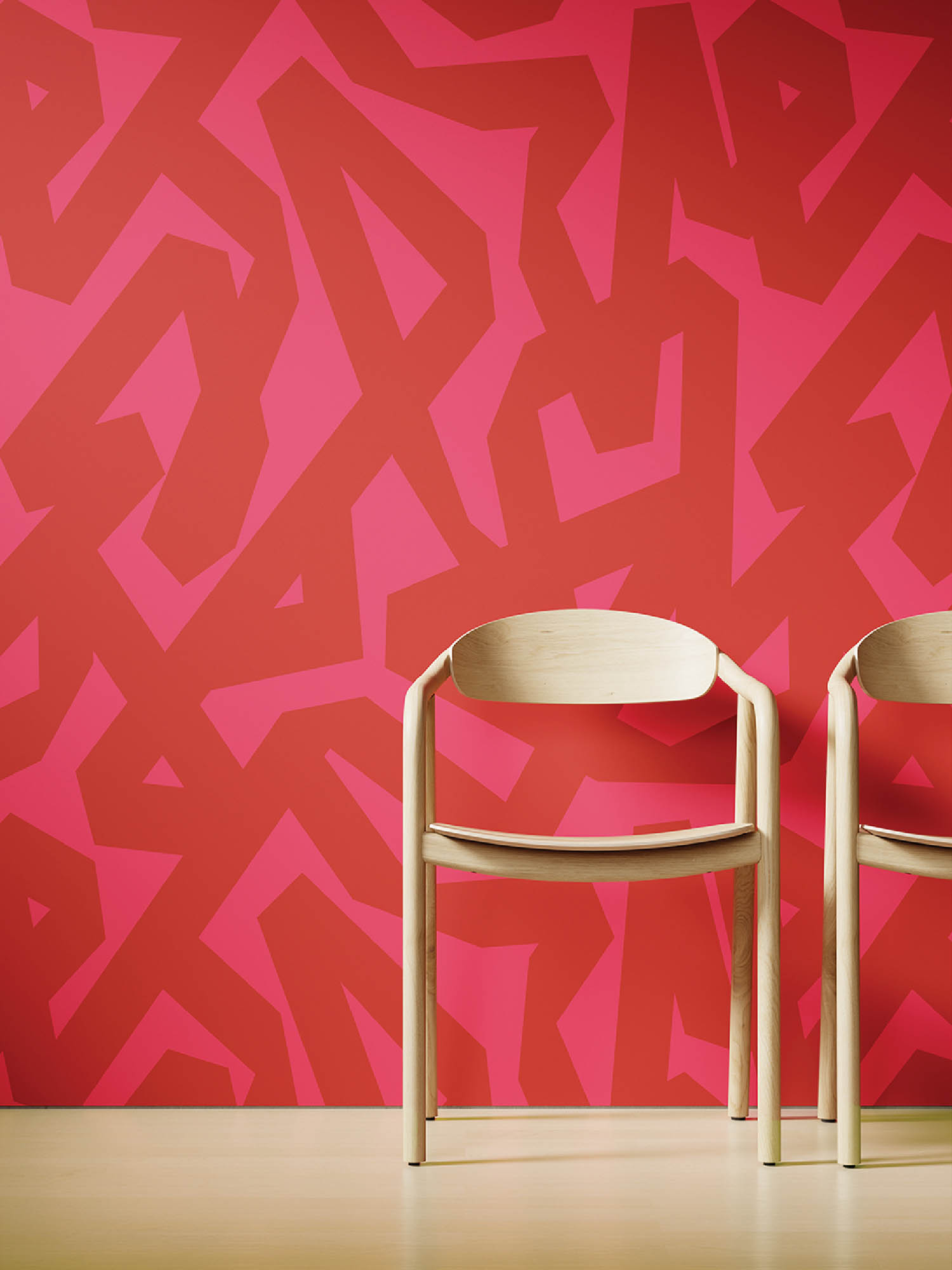
ID: The ribbon on the fabric isn’t solid but composed of parallel lines. Was it always that way?
SS: Yes, right from the beginning I used the lines to give the twisting ribbon a quality I love in screen printing, when two transparent colors overlap to create a third one. It’s a graphic element that’s playful and energizing. There’s a solid version of the pattern called Flat Ribbon that’s offered as a customizable wallcovering on the company’s Digital Studio website.
ID: What’s the relationship between your two-dimensional work and your sculptures and installations?
SS: There’s a lot of crossover because they’re all compositions of hard-edged formal shapes. I use screen printing to turn over ideas quickly and playfully since the process allows that. One thing I can’t achieve in the three-dimensional work is layering transparent colors, but in many respects working on the print table is like sketching—there’s a lot of serendipity that I find inspiring, coming up with color scenarios that I then feed into the sculptural pieces. I use the same acrylic paint for both the prints and the assemblages, which I see as vehicles for holding a palette. There have to be enough components in a piece to create an interesting conversation between the colors—enough bandwidth to provide a balance of what I describe as ‘easy’ and ‘less easy’ or ‘awkward’ and ‘less awkward’ colors. Sometimes I’ll repaint a piece 10 times to achieve the sweet spot where there’s an equilibrium that feels right—there’s no system, it’s pure intuition.
ID: How does that fit in with your work for brands like Comme des Garçons and COS?
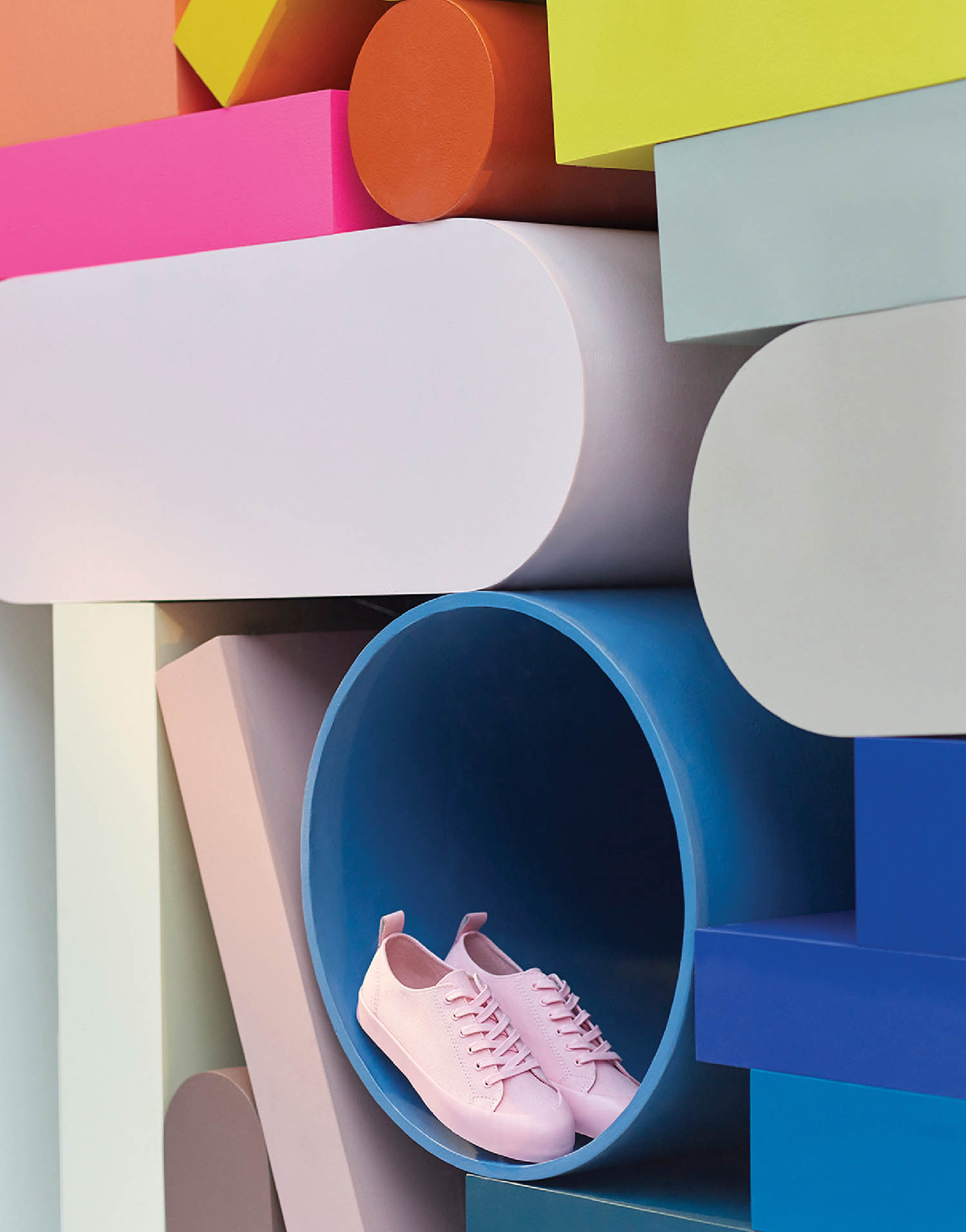
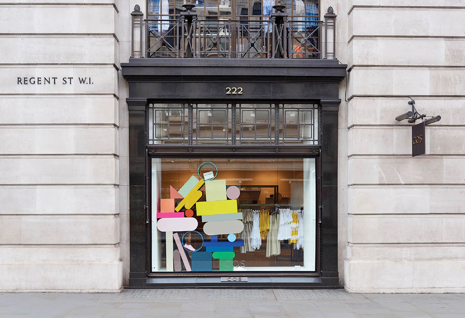
SS: A lot of brands do color very well, being clever and brave with it. I’m pleased to work with labels where there’s some obvious compatibility in our thinking. COS saw synergy with my work, so the company commissioned window displays for five key stores around the world. I made large, overgrown stacks of shapes that could be propped with product. Some artists might be less happy with that, but I like having a foot in both camps. It works for me.
ID: Sophie Smallhorn Injects Synergy Into Her Chromatic Pieces
Experience Sophie Smallhorn’s Foray Into Textiles
read more
DesignWire
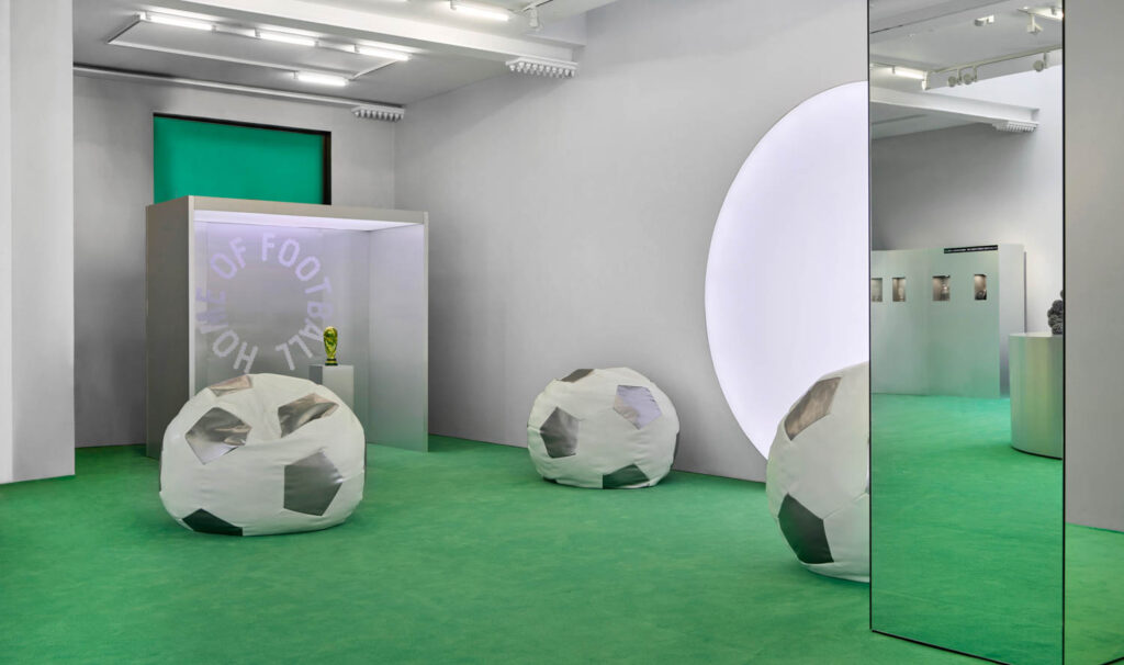
This New York Exhibit Reimagines Soccer’s Cultural Influence
As soccer (or football) fever sweeps New York City this summer, Crosby Studios is offering a look at the sport from a new vantage point.
DesignWire
Michael Ford And Momentum Translate Hip Hop Into Design
Michael Ford, architect and educator, joins Once Upon a Project to talk about translating hip hop into design through his recent Momentum collaboration.