Q&A: Cindy Allen and Michael Vanderbyl Talk Graphics and Branding
Interior Design editor-in-chief Cindy Allen sits down with designer and educator Michael Vanderbyl of Vanderbyl Design (who was inducted into the Hall of Fame in 2012) to discuss typefaces, wine bottles, and the importance of branding in today’s design landscape.
Cindy Allen: Hi amazing Michael!
Michael Vanderbyl: Hey Cindy, you gorgeous creature, what’s going on?
CA: Let’s chat about graphics and branding and the pivotal role they play in almost all of today’s commercial design projects!
MV: Tesla, Apple: all these types of companies understand it’s 360 degrees, it’s not just a logo. It’s how it’s applied, how it goes on the product, what the product looks like. It’s what the space is that the product is sold in—it’s all part of the “brand” and people are finally understanding that power.
CA: So now, space and the idea of how you communicate in it is more important than ever. It brings in the whole graphic component and so many firms now have that aspect in their studios… which makes me wonder, how does that affect the graphic design companies?
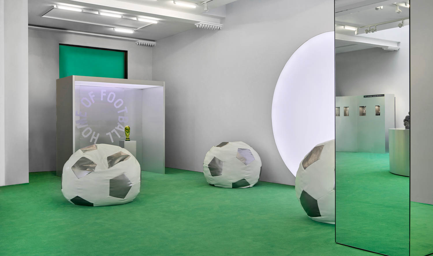
MV: I think it makes it more competitive, so the best rise to the top… because a lot of times a client was looking for an architect AND looking for a branding person… and I think the interiors firms were smart enough to realize that they are there first and they have a chance to really work with the client and brand a project. Especially retail branding, which is over the top, and amazing right now. It’s a very immersive sort of thing.
CA: Of course! And it’s in almost every commercial project I publish… like workplace, hospitality, even education. We are communicating through the branded environment! And let’s not forget technology!
MV: You and I love print, and it will always be here, but the idea of interactive, motion graphics, that good stuff now becomes part of all the things we do.
CA: What cool projects are you working on now?
MV: It’s kind of funny, we are working on branding a young entrepreneur who is doing an organic energy product in a squeeze pouch. And it’s called “Bear Squeeze.” And we’re doing all the branding, the website, and the retail store is online… so it’s an interesting, youthful experience.
And of course, continuing to work with my long-term client, Teknion; we just finished their L.A. showroom. Working on their next brand theme, which will be something along the lines of measuring how space makes you feel… and we used examples of a cathedral, a space station, or more specifically, the Barcelona Pavilion, and the idea of how a space is tailored to an activity and not vice versa.
CA: Wow… evoking emotion, right?
MV: Exactly, in fact, that used to be thing that I would say to architect friends: that the difference between a graphic designer and an architect is that when architects walk the space they look at the fenestration and the sense of arrival… they look at so many details, whereas graphic designers look at what the space feels like when you walk in, how it’s presented to you, and how it’s layered. Almost more on graphic, emotional terms. Whereas the architects, at least in my time, were more formalist.
CA: Speaking of emotion, tell me: where you are most inspired these days?
MV: Well I’ve been so buried with work, but my house in Napa Valley always inspires me. It’s my place of rejuvenation. Soon I’ll be building another little building next to it; a two-bedroom guest house… so you’ll have a place to stay!
CA: I love that! A little hideaway?
MV: Exactly, and it really does inspire me; it’s the only place where I can really clear my head.
CA: And of course, I imagine, there is wine drinking there…speaking of which, are you doing any new wine label designing?
MV: You know it. I am actually doing one for Stratus now. It’s an abstract blue graphic of a stone—a quartz from Ontario called Sylestine—on a pure black label and bottle. Very quiet and elegant.
CA: And what was that really funny label again?
MV: Oh, “Screw!” Well it didn’t have an official name per se except “Red Wine”… but it was simply an image of a giant screw on the label.
CA: Haha, such a whit you are! Okay, so enough with all this boozy talk. Back to graphics and the AIGA. Tell me about your long-term relationship with the organization.
MV: I’ve served on the national board five times, and the last time I served as the national board president. It’s amazing, the largest graphic design-oriented association in the the world, over a hundred years old, and Antoni Gaudí was one of the founding members.
CA: Wow… and as you know this is the first time we are doing this new Graphics and Branding category for Best of Year (BoY) and really bringing together two great disciplines, AIGA and Interior Design.
MV: I feel like the disciplines are so symbiotic; they so much rely on each other. So much of what people respond to in the A+D community is usually first some sort of graphic representation, a photograph or something that sets the tone for the products they use. They’ll think “this is a much better project than this” if the graphics are better.
CA: Absolutely. We do that in the magazine too—we look for photography that speaks to us, and many times it’s something that’s very, very graphic. So is there a favorite typeface you’re into these days?
MV: Well mine lately has been a typeface called Sackers. It’s very simple, straightforward San-Serif. It’s kind of utilitarian and modern but also elegant. I’ve used it on a few wine labels.
CA: Where does it sit between Helvetica and DIN?
MV: Oh it’s more DIN. It’s not as refined as the real Helvetica. Cindy, did you know that I designed a whole new typeface for Teknion? We designed it for their logo, it’s called Teknion Modern, its their exclusive typeface. It can be used as body or headline and it shows where graphic design and branding works for a company. Not just a logo, but everything that they put in words has a visual voice for the company.
CA: And we’ve come full circle! Design, and in this case, graphics, is a critical part of the whole; it matters to our work, our life, everything we do, and everything we are.
Designers: submit your work for our first-ever graphics and branding BoY award here.