BEHR Color Trends 2021 Palette Invites Designers to Embrace Elevated Comfort

This year, people around the globe dramatically shifted the way they interact with built environments. From hospitality to healthcare spaces, the need for designers to adapt and evolve how they approach each project has never played a more important role, especially when it comes to creating environments that promote emotional and physical well-being while offering a sense of comfort and safety. These shifts in the industry set the stage for BEHR®, a leading manufacturer of architectural coatings including paints, primers, wood stains, and floor coatings, to elevate the colors and shades that will pave the way forward.
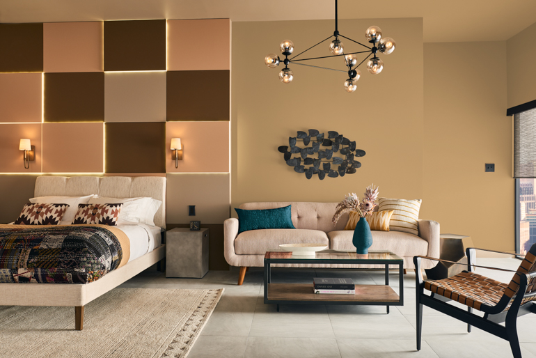
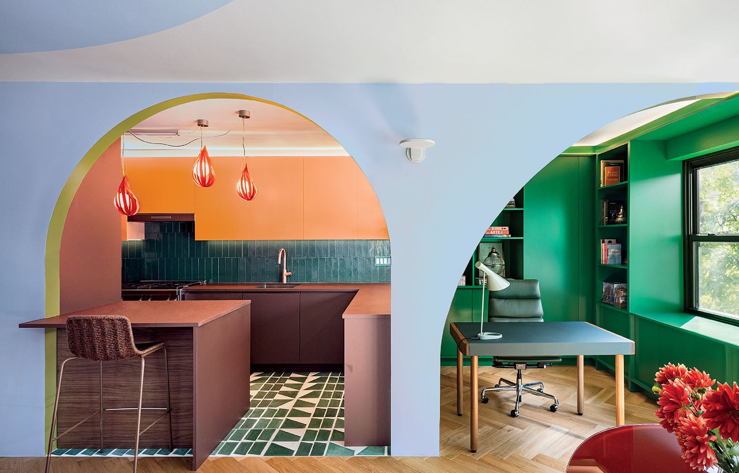
From soft neutrals to bold hues, the latest BEHR Color Trends 2021 Palette invites designers to embrace the creativity of color design, centered around the theme of “Elevated Comfort.” With cool blues and greens, like Caribe PPU13-1 and Jojoba N390-3, which provide calm and solace, as well as rich yellows and oranges, like Maple Glaze PPU3-16 and Cellini Gold HDC-CL-18, which bring a vital burst of energy, a fresh yet comforting environment can be created in any space.
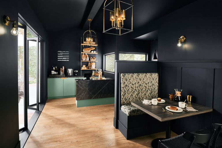
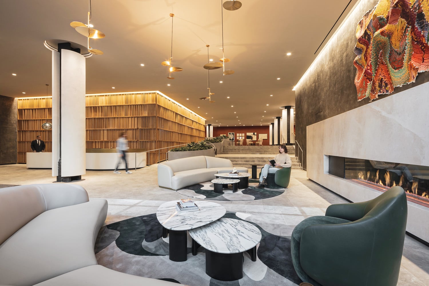
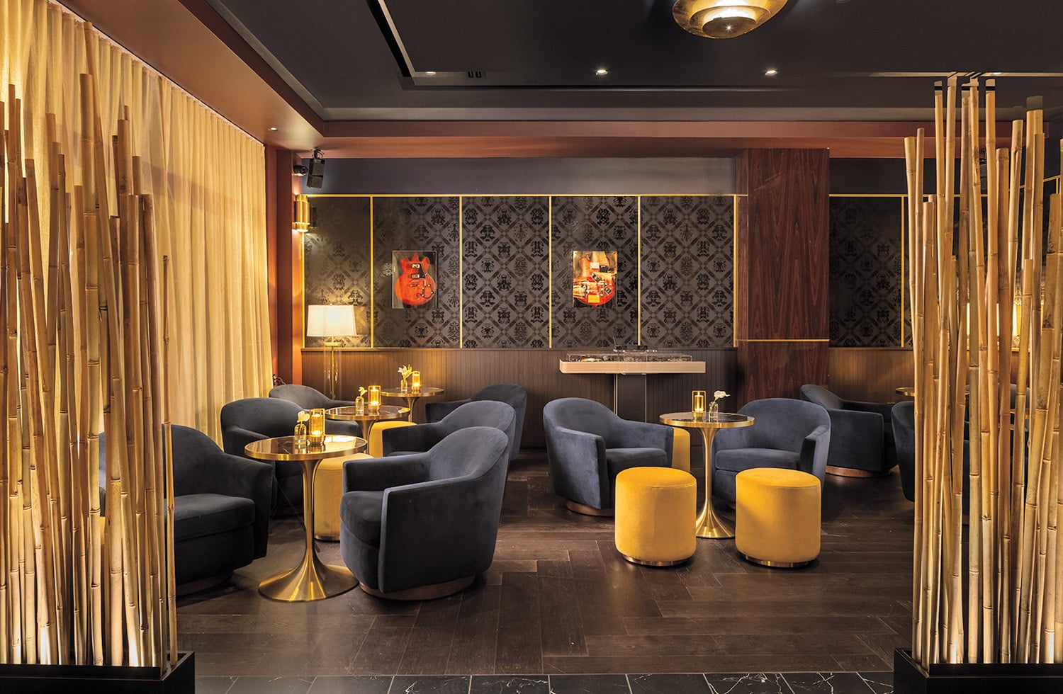
The palette is organized into four color themes—each evokes a sense of positivity and complements the others in the collection, allowing for a cohesive aesthetic when mixing and matching shades. Neutrals in warm tones, like Almond Wisp PPU6-12 and Canyon Dusk S210-4 from the Mindful Escape category, offer a contemporary update to a classic color spectrum while the darker and bolder shades in Dramatic Revival, such as Royal Orchard PPU11-1 and Broadway PPU18-20 cover walls in rich colors and offer a “new-stalgic” mix of vintage and modern elements. Between the pastels of Curated Clarity including Wishful Green M410-2 and Dayflower MQ3-54 providing a calm backdrop to the bright colors of Mediterranean-inspired Optimistic Glam that energize any environment , designers can easily expand and redraw the lines of residential and commercial environments

Extensive trend-forecasting by BEHR points towards a reduction in open-floor plans but an increase in the demand for rooms that feel light and spacious. Whether it’s for returning students in a classroom, welcoming colleagues back into the office, inviting guests into an updated retail or hotel experience, or offering residents a safe haven in a multifamily community, Behr’s colors envelop a space with ease, enabling designers to enhance and redefine boundaries in built environments with a versatile palette.
