Take a Deep Dive into This Contemporary Kitchen by Bilotta Kitchen & Home and Dufner Heighes
Some house-hunters have a wine cellar or infinity-edge pool at the top of their lust list; others covet a four-car garage or a double-sided fireplace. Erica Holborn dreamt of one day owning a house with a butler’s pantry. The Sandow Design Group CEO finally got her wish two years ago when she and her husband, Andrew, purchased a historic property in Pelham, New York, with a generously sized scullery tucked between the kitchen, dining room, and entry hall. So when the couple embarked on a renovation of the kitchen proper, they naturally intended to keep the pantry separate.
But as the Holborns’s interior designers, Daniel Heighes Wismer and Greg Dufner of Dufner Heighes, started hashing out the new scheme with cabinetry specialist Bilotta Kitchen & Home, it quickly become apparent that something had to give. “We were working on a plan maintaining the original footprint,” Heighes Wismer explains. “But the main kitchen space had an unusual and problematic shape and was quite small; Andrew cooks a lot and felt that it just was too snug.” Plus, the designer adds, the center island was underscaled and awkward—conducive neither to cooking nor eating. “It only sat two people and was weirdly square.” The configuration just wasn’t proving functional for heavy-duty family use.
Collaborator Sarah Witkin of Bilotta Architecture suggested rethinking the option of tearing down the structural wall between the butler’s pantry and kitchen and combining the two zones. Such a move would not only open up the floor plan, freeing up enough square footage to design around how the family really lives, but it would also maximize natural light, since the contemporary kitchen would gain one more window in the process. Although merging the spaces would certainly entail a more comprehensive renovation—new structural steel, rerouting plumbing and electrical, etc.—the team ultimately decided it made the most sense. “My dream has always been to have a butler’s pantry,” says Holborn, “and then I finally get one—and go, ‘tear it out!’” Luckily, she and her family gained much in the process. Here’s how the space came together—and a close-up of its key features.

custom cabinetry ties together old and new
When choosing the cabinetry, the goal was to select a design simpatico with the century-old oak millwork yet contemporary enough to speak to the Holborns’s lifestyle and décor, which skews more midcentury-mod. “The intention was not to insert a modern kitchen; we didn’t want the room to stand out from the rest of the house,” Dufner explains. The design team homed in on the Bilotta Collection, a private-label Shaker-style series featuring a distinctive inch-thick, recessed-panel door with deep-bevel inside profile. Choosing a locally manufactured in-house line from a New York–based company allowed for ample customization, such as wider-than-standard rails. Holborn loves the design—and the low-maintenance: “I’ve lived with Shaker cabinets before, and what I haven’t liked about them in the past is how dust typically collects in the corners and crevices—whereas the Bilotta Collection cabinets have the cool bevel detail that keeps them clean, which I love,” she enthuses. Other covetable features include lift-up retractable doors, a spice drawer insert, and a pull-out knife block. “Much of our design process involves sitting down with the homeowner and rethinking the way their life”—and not just their cutlery—“is organized,” Bilotta co-partner Regina Bilotta says.

Cabinets were specified in Dove White paint, which disguises the classical detailing somewhat to assert a more modern vibe. That same reasoning informed the choice of square-top trim (rather than crown molding) along the ceiling. “That way, it doesn’t distract from the more classical original woodwork of the door frames,” Bilotta says. “We were very conscious of the abundant detail in the rest of the house.” Brass hardware plays surprisingly nicely with the brushed stainless-steel finish of the exposed appliances (only the refrigerator is hidden behind panels). “The mix of gold and silver tones works really well here, especially with the overall gray-and-black palette,” Bilotta says. Adds Witkin, “It’s a classic white kitchen but the finishes and furnishings make it playful and extraordinarily unique.”
stone topped the wishlist for the contemporary kitchen backsplash and countertop

The clients wanted the backsplash and countertop materials to provide a visual break vis-à-vis the cabinetry and to withstand the rigors of family meal prep. For the backsplash and perimeter counter, they chose Jet Mist granite from Artistic Tile in a honed finish with a slightly velvety touch. The domestic stone, quarried in Virginia, is incredibly hardy and has a lush, inky coloration that contrasts artfully with the cream-painted cabinets. Jet Mist is a perennial favorite for kitchen applications, Artistic Tile CEO Joshua Levinson notes. “It’s got that salt-and-pepper granite look—but elevated, with intrigue,” he says. “It’s a great background material that isn’t remotely boring.” (The quiet patterning, with its soft, wispy veining, results from the slow cooling process through which the stone is formed.)
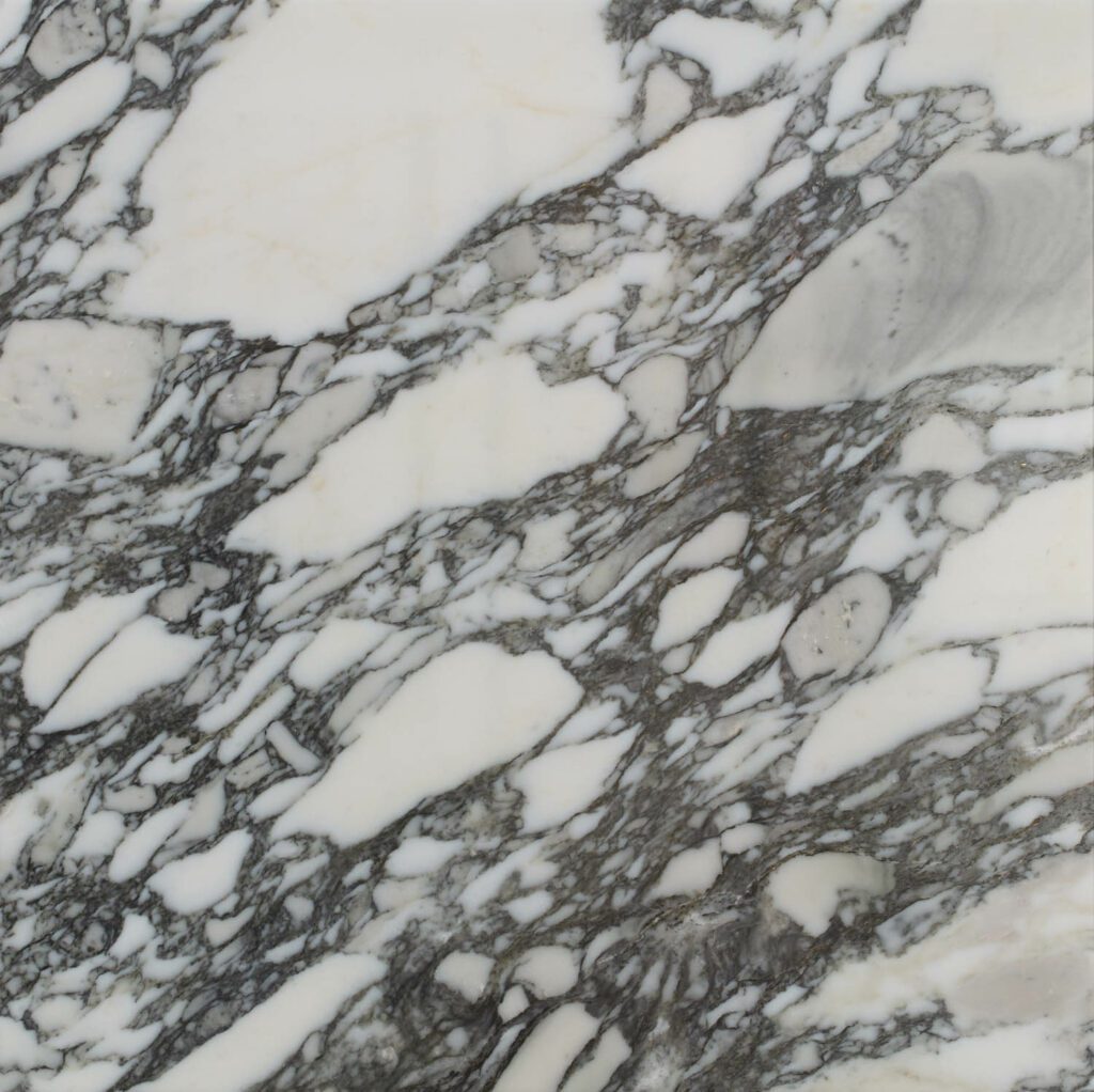
The newly enlarged and elongated island, which now seats four at Hans Wegner stools, is topped with Arabescato Corchia, an exuberantly brecciated Italian marble with assertive strokes of gray, brown, and cream that pull together all the colors of the surrounding finishes and features. “That particular slab has an amazing distribution of veining,” Levinson offers. “The composition is so lovely with those big white ‘eggs’, as we call them. Typically, the most visible kitchen elements are the cabinetry and the backsplash, whereas here, the island is the star of the show.“

a playful pattern defines this tile floor
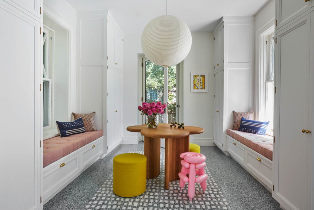
“There’s a moment in every project when the vision—and a confidence in the energy of the project as a whole—emerges,” says Witkin. “For me, that was when Greg and Daniel brought out the playful flooring from Artistic Tile and I thought, Yes! This is going to be a fun, whimsical space and not just another white Shaker kitchen.” Indeed, no plain Jane scheme here. Dufner Heighes deployed two tile patterns: one a gray-toned terrazzo, the other, dubbed Geotzzo, incorporating large Bianco Dolomiti marble chips. The latter was used to create area rug–like accents that delineate and anchor spatial zones, such as the island and the breakfast nook. “We initially considered covering the entire floor in Geotzzo,” Holborn says, “but we thought it might be a bit much visually in this particular space.” The combination of the two materials, notes Levinson, is a smart budget choice “and makes the Geotzzo seem even more special.”



an airy dining nook completes the contemporary kitchen
The stone wall below the breakfast nook windows is a holdover from when the space was an outdoor porch. Dufner Heighes designed a built-in wraparound banquette to maximize space and create more room for circulation than a traditional table/chairs setup would allow. The stone did make for tricky millwork installation, Bilotta recalls. “We had to fool around a lot with the paneling to get the bench just right, but the result is amazing.” The Wishbone chairs are by Hans Wegner.

the mudroom serves as an extension of the contemporary kitchen
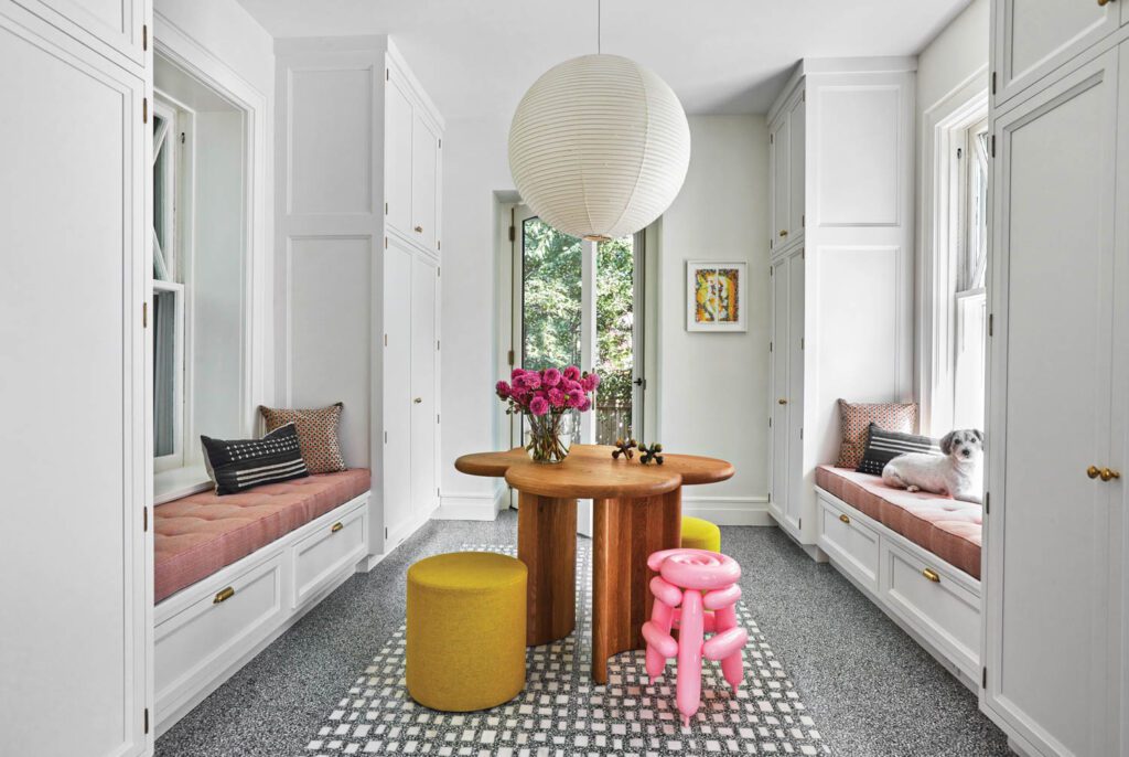
When the Holborns purchased the property, the zone adjacent to the kitchen served as a small family room. The homeowners decided to convert the space, which connects to the back entrance, into a mudroom. “The shape of the little den wasn’t really conducive to hanging out, and the space is right off the driveway, so the conversion made sense,” Holborn explains. (A newly added second door now leads to the backyard, making it more accessible.) The design team specified the same cabinetry and flooring that was used in the kitchen proper, so the two spaces read as continuous. The mudroom functions as a hardworking hub for hanging coats, donning shoes, and storing kitchen gadgets; plus, the addition of window seats and a central table suits it to use as a breakfast nook, too.
Cabinetry is increasingly being specified in locations beyond the kitchen and bath—from bars to libraries to TV rooms, Bilotta notes. “Our business really focuses on whatever room can have cabinetry in it, and as open-plan and one-room living have boomed, we’re doing more in those types of spaces than ever before.”
bespoke accent tables add a touch of whimsy throughout
The kitchen and mudroom are not the only areas of the house that showcase stunning stones. Dufner Heighes specified the material for decorative touches in other rooms, too, including bespoke accent tables. In the sunroom, a multi-height Iacoli & McAllister coffee table sports a custom top in Turkish rainbow onyx from Artistic Tile; intriguingly, the veining runs in a different direction on each level. “That’s one of my favorite pieces in the entire house,” Holborn notes. “Everyone who comes over comments on that table. It makes the room.”
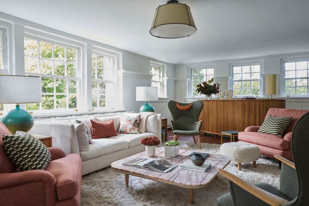
And in the family room, pinky Cosmopolitan quartzite tops a Fly cocktail table designed by Space Copenhagen. The Brazilian stone floats atop the table base rather than wrap around it—an effect at once grounded and elevated. “The table comes standard with a white-stone top and we thought, ooh, let’s put something more interesting on that,” Dufner recalls. “Using bold, traditional marbles on really simple modern pieces creates such a nice dynamic.” The use of slabs for small accent tables is great way to play around with a more exuberantly veined or patterned variety, Levinson agrees notes. “Both the Rainbow onyx and the Cosmopolitan are pretty intense when you see the full slabs on display in our Secaucus slab gallery, but fabricated and put in place, they’re definitely not overpowering.”


PRODUCT SOURCES
KITCHEN
Mud Room
read more
Projects
Dufner Heighes Transforms a Historic House in Pelham, New York into a Modern Family Home
For a growing family looking to put down roots, Dufner Heighes modernized this historic home in Pelham, New York.
Projects
Elements of Surprise Define a Dreamy Manhattan Aerie by Dufner Heighes
When SANDOW President Erica Holborn and her husband, Andrew, purchased the 900- square-foot co-op, it had only one bathroom and a kitchen barely big enough to stand in. Fortunately, designer Gregory Dufner and architect …
Products
8 Solid and Sturdy Kitchen and Bath Products
Is it time for a kitchen and bath upgrade? From monochromatic appliances to durable materials, these eight products are sure to center any space.
recent stories
Projects
4 Urban Abodes With Style And Flair
From Madrid to New York, four apartments reveal the pleasures and possibilities of city living today.
Projects
Turning A Vacant New York Office Building Into A Residential Development
CetraRuddy Architecture has completed the country’s largest workplace-to-residential conversion to date in New York’s Financial District.
Projects
Inside Philippe Chow’s Restaurant In Tennessee’s Cummins Station
Built in 1906, the recently revitalized Cummins Station in Tennessee now features the fourth location of chef Philippe Chow’s eponymous restaurant.
