Emmanuelle Moureaux Celebrates Beloved Japanese Brand for a Tokyo Installation
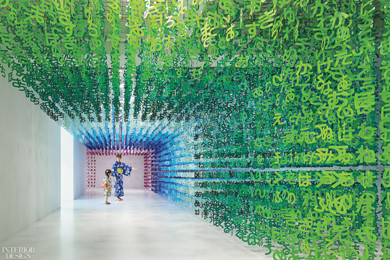
Ask Emmanuelle Moureaux to name her favorite color, and she’ll laugh at the ridiculousness of the question. Ask her to name her top 100 favorite colors, however, and she’ll happily oblige. Emmanuelle Moureaux Architecture + Design relies on color as a primary tool for shaping and dividing space while conveying emotion. The French-born, Tokyo-based architect even has a punny Japanese portmanteau word for the concept, shikiri. To select the rainbow palette she’s been using for her vibrant 100 Colors series of installations, she sorted through a mind-boggling 8,000 shades. A recent iteration of the series celebrated the 100th birthday of the Japanese beverage Calpis.

Calpis Co. came to her with a very specific request: to create an installation that represents the festival of Tanabata. The festival centers on the ill-fated love between the stars Vega and Altair, banished by the emperor of heaven to distant corners of the Milky Way and allowed to meet only once a year, on the night of July 7. As this also happens to be the exact date, a century ago, when Calpis first passed the lips of Japanese consumers, Tanabata is a touchstone for the brand. Blue dots on the wrapper of the bottle—containing a sweet and refreshing concoction of milk fermented with yeast and lactic acid bacteria—are meant to represent the Milky Way.

For Tanabata, people write their wishes on colored strips of paper, then hang them from bamboo stalks, so Moureaux was asked to make that tradition a key symbol in her design. “I think the company imagined a lot of paper rectangles,” she says. “But I decided to ignore the rectangle and focus on the writing instead.” More specifically, she chose the Japanese writing system called hiragana, a script that’s much simpler to read than the characters adapted from Chinese. Since hiragana is the first writing that children learn, it tends to evoke a childlike, nostalgic mood. “It gives people an opportunity to think about their wishes and emotions,” she explains.

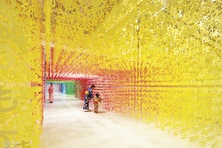
Each of hiragana’s 46 symbols was cut out of medium-weight paper in 100 different colors, yielding 140,000 pieces about 5 inches high. These cutouts were then strung onto thread to be suspended from the ceiling at the installation site, a former Tokyo school converted into a community center called 3331 Arts Chiyoda. Although the arrangement of the hiragana was random, Moureaux spent copious time making sure that combinations didn’t accidentally spell out anything with negative connotations.
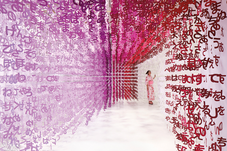
Visitors arrived via a white tunnel, which delivered them into the 4,000-square-foot U-shape gallery containing the main installation, Universe of Words. From there, every step forward delivered a new kaleidoscopic view of tranquil pathways defined by blocks of color composed of the hiragana, suspended at equal intervals to form a three-dimensional grid. (Moureaux previously used numerals to create a similar effect for installations including Forest of Numbers, featured on the March 2017 cover of Interior Design.)

One path through the floating hiragana of Universe of Words led to a smaller room, approximately 1,000 square feet, containing a related installation. This one, 100 Message Bottles, focused on another theme of the Calpis anniversary, the importance of spending time with loved ones. That, of course, is the central message of the Tanabata festival overall—and an ever more pertinent subject in today’s digital world. Takuya Nire, a representative of Calpis’s parent company, Asahi Soft Drinks Co., puts it this way: “Calpis has always placed value on human connections. As we reached our 100th year and look forward to another 100, it was important to us to offer people a place where they could spend time, in person, with someone they care about.”
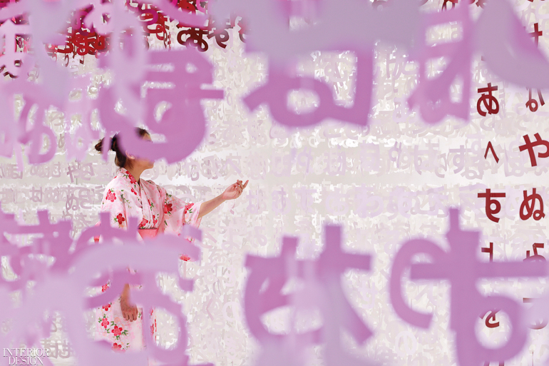
While Universe of Words did that in a generalized way, 100 Message Bottles got the idea across more pointedly. Moureaux started by asking her client to come up with 100 simple terms that could describe a relationship, such as love, warmth, and old friend. She then spelled out each word in colored paper hiragana cutouts, again suspended from the ceiling but this time weighted at the bottom with a similarly colored bottle of Calpis. Visitors were invited to find the word that best represented their relationship with whomever they had come with.

Both installations continue to explore a theme that has been central to Moureaux’s work ever since she arrived in Tokyo. Captivated by the intense, layered lights of the city, she says, “I really saw color for the first time.” She adds that her color interventions may appear in varied contexts, from a bank branch to a municipal auditorium, but her goal remains constant: “For people to feel color with their entire body.”
