Graphics and History Rule at New York City’s Poster House by LTL Architects
Before Apple Stores, equipped with Genius Bars, New Yorkers used to trundle their sluggish iMacs and the occasional twitchy mouse to Tekserve, the repair shop and authorized Apple retailer in Chelsea. Paul Lewis, one of the two L’s in LTL Architects, recalls splurging on a desktop there in the 1990s “when a monitor cost $1,000.” After Tekserve eventually got liquidated, he, identical twin David J. Lewis, and Marc Tsurumaki, as principal in charge, signed on to completely refit the space as Poster House, a niche museum for commercial illustration and political art, from billboards to broadsides. Viewed from today’s digital vantage point, Tsurumaki allows, “You might think posters are increasingly irrelevant.” But their history merits exploration. Throughout the 20th century, especially before TV, posters were state-of-the-art. Call them the IRL forerunners of Instagram.
The first museum of its kind in the U.S., Poster House was established by a group of anonymous donors, along with an advisory board that includes Cooper Hewitt curator Ellen Lupton and Pentagram partner Paula Scher. The types of posters showcased here—not to be confused with limited-edition prints or anything else produced primarily for decoration purposes—unapologetically cross political, cultural, and socioeconomic lines. Start with the bikini-clad Farrah Fawcett cheesecake poster in the gift shop. Then contrast that with the impassioned placards from the 2017 nationwide Women’s Marches, the subject of an exhibition opening October 17.

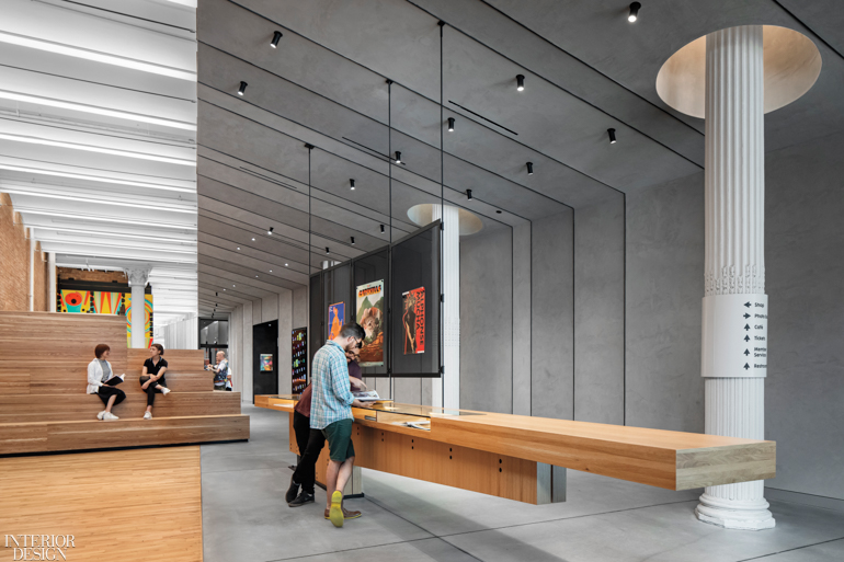
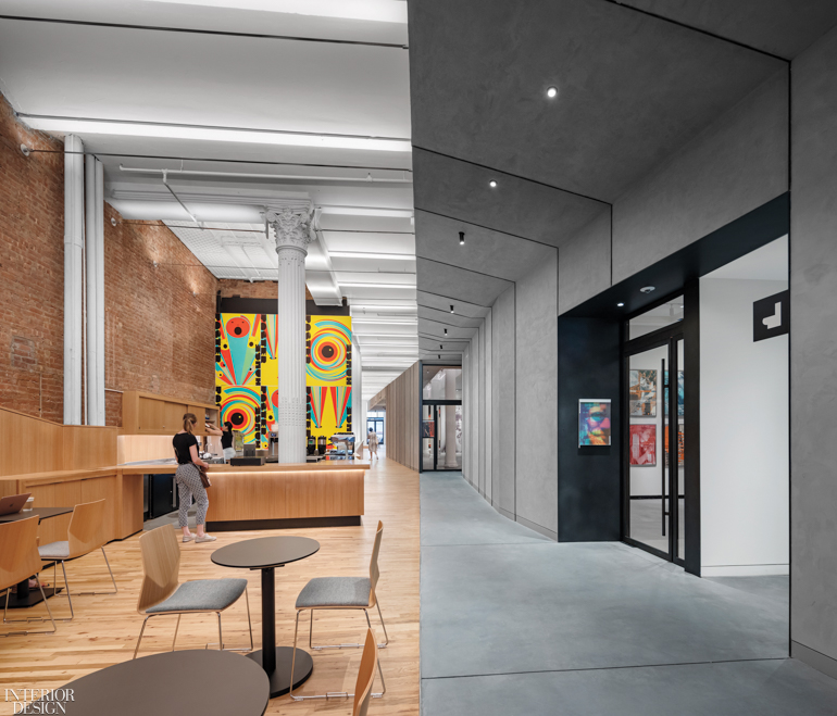
All this takes place in 14,000 square feet split between the ground level and basement of a building constructed for a cloak company at the turn of the 20th century. The double-height ground level, with its colossal cast-iron Corinthian columns, tunnels all the way through the block, which suits a museum perfectly. (Indeed, the Museum of Modern Art has the same sort of through-block arrangement, with entries from two sides.) LTL organized the Poster House floor plan using a circulation route that Tsurumaki terms a “cross street” to connect the two entries. A street metaphor is especially apt, he explains: “The natural habitat for a poster is the street.” The outdoors is not the best habitat for a work on paper, unfortunately. Because the main circulation route necessarily opens to the weather at both ends, LTL protected the galleries behind glass doors. An intervention inside the neoclassical architectural shell, this vaporproof, climate-controlled oasis is “like a ship built in a bottle,” David J. Lewis says.
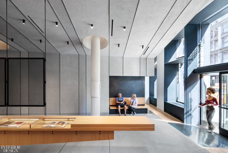
The galleries hug one wall of the ground level. To make a delineation between that side and the amenities opposite, flooring in the galleries and directly outside them is concrete in contrast to the original oak elsewhere. Think of a “sidewalk” for that internal “street.” (Or, as David J. Lewis notes, of the concrete floors in Chelsea art galleries.) Overhead, a thrusting angled canopy seemingly shelters the “sidewalk,” terminating precisely at its edge. When concrete proved unfeasible for the awning and its supporting wall, LTL surfaced them in clay plaster tinted gray to match. Blackened-steel strips, separating the plaster wall panels, are drilled with holes for hanging hooks, should curators wish to mount temporary displays there.
Before any of this could be installed, LTL gutted what remained of Tekserve, dispelling any lingering nerdy vibes. Out came the dated shop fittings and the wonky mezzanines. Then the oak floorboards got sanded, and the exposed brick was repaired as minimally as possible. “We loved the rawness,” Paul Lewis says.

Virtually all the columns’ acanthus capitals remain in view, even when that required making cutouts in the canopy. Visible beyond the canopy, the ceiling’s vaults were re-painted white. Stretched along the beams between vaults, tensioned LED strips provide ambient illumination. During the planning stage for this sweeping overhaul, meticulous measuring revealed an urban anomaly: There is a substantial difference in the street levels at the front and rear doors. This made the floor slant, a defect that LTL ultimately left alone, especially since a slope is ideal for universal accessibility. “Then we perversely decided to introduce other slopes and angles elsewhere,” Tsurumaki says with a laugh.

This proved a mind-bender many times over, particularly for the woodworkers who built a series of related oak elements. Starting with a dramatically cantilevered display counter for the gift shop, they continue in the form of bleachers, the ticket desk tucked behind them, the café’s banquette and serving counter, and finally built-in benches for a lounge to welcome school groups. The same wood joins folded panels of blackened steel for the staircase that leads down to a children’s exhibit, a multimedia gallery, and staff offices.
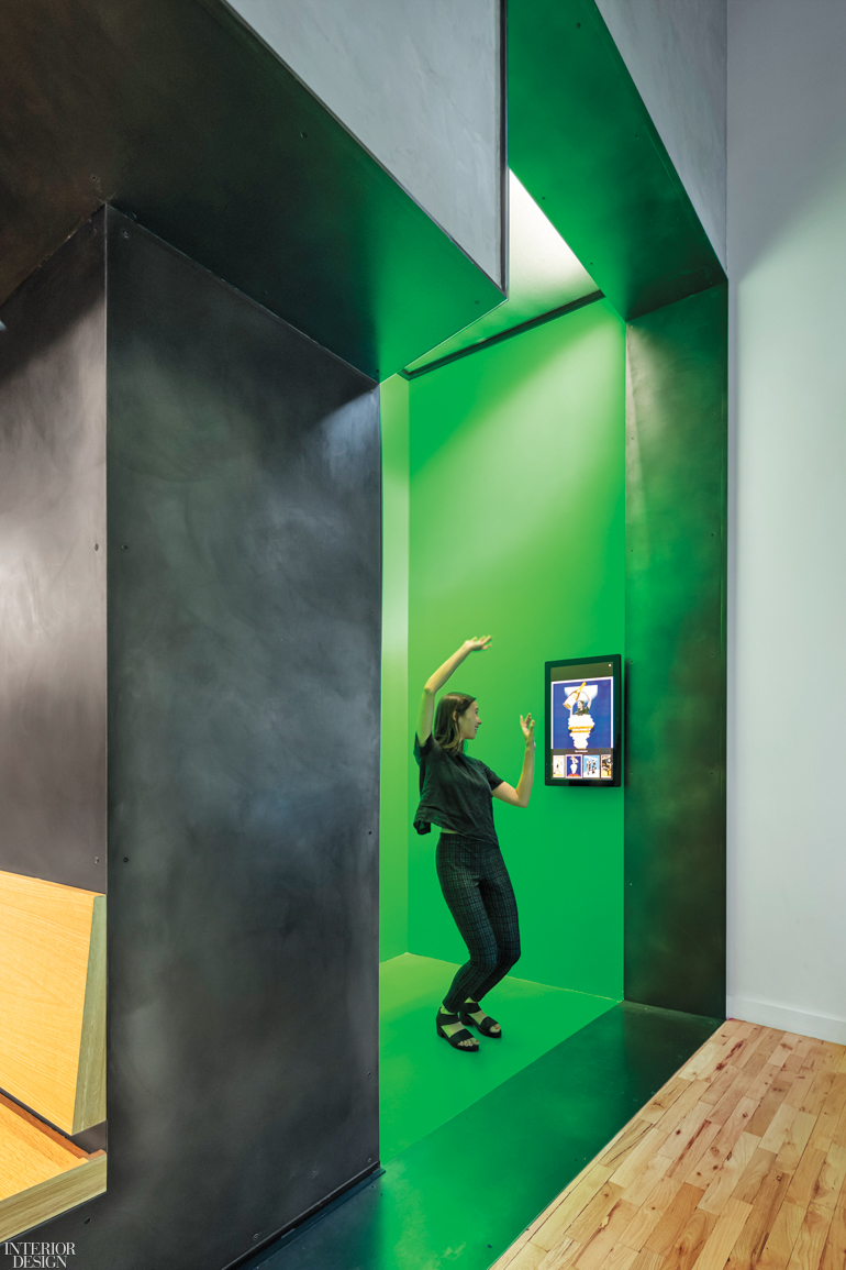
Tsurumaki also points out an oak bench for people waiting to try an interactive attraction strategically positioned to catch the eyes of passersby, through one of the front windows. It’s a green-screen alcove that allows visitors to insert themselves into iconic posters. Just picture your girlfriend, her bicep flexed like World War II’s Rosie the Riveter, appearing right next to Rosie beneath her famous exhortation, “We Can Do It!” Combining the graphic arts with the technological legacy of Tekserve’s eggheads, the result is a poster perfectly up-to-date for the selfie age.
Keep scrolling to view more images from this project >



Project Team: Michael Schissel; Anna Knoell; Jillian Blakey; Jenny Hong; Sonia Flamberge: LTL Architects. Pentagram: Graphics Consultant. Lumen Architecture: Lighting Consultant. Conduit Projects: Exhibit Designer. Silman: Structural Engineer. Polise Consulting Engineers: MEP. Tatco Installations: Woodwork. Veyko: Metalwork. Richter + Ratner Builders: Construction Manager.
Product Sources: Vitsœ: Shelving (Gift Shop). Hightower: Chairs (Café). Nevins: Tables. Optic Arts: Counter Linear Fixture (Café), Linear Fixture (Gallery). Dex-O-Tex: Flooring (Alcove). Q-Tran: LEDs (Column). LSI: Track Lighting (Gallery). PPG Vitro: Glass (Exterior). Rockwood: Door Pulls. Ecosense: Light Fixtures. Case[werks]: Glass Panels (Lounge). Throughout: Flos: Spotlights. Acolyte: Linear Fixtures. Pure Edge Lightings: Linear Fixture Hardware. Kawneer: Custom Windows, Custom Doors. Clayworks: Plaster. Anemostat: HVAC Diffusers. Bona: Wood Floor Sealant. Prosoco: Concrete Floor Sealant. Isolatek: Column Paint. Benjamin Moore & Co.: Paint.
