Make it Snappy: Fast-Casual Restaurant Design
Often missing from a Baconator Triple or a Soft Taco Supreme is a key ingredient, inspiration. You could say the same about design at Wendy’s or Taco Bell, where cheap and convenient describe the plastic laminate on the counters as aptly as the food being served. That’s changing, however, as an industry trend to improve fast food has spawned a more upscale category, “fast casual.” Hoping to impress customers willing to pay a bit more for higher quality, these restaurant chains are emphasizing interiors.

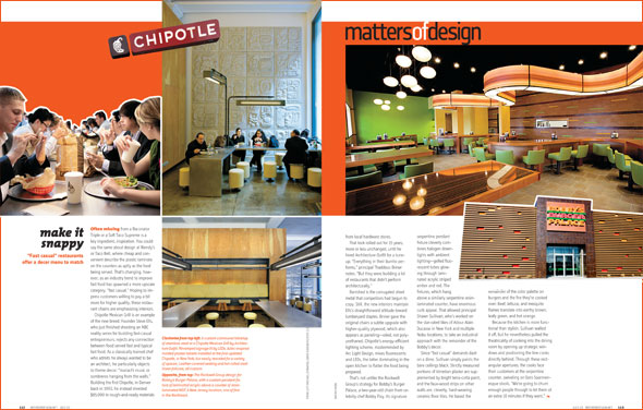
Chipotle Mexican Grill is an example of the new breed. Founder Steve Ells, who just finished shooting an NBC reality series for budding fast-casual entrepreneurs, rejects any connection between food served fast and typical fast food. As a classically trained chef who admits he always wanted to be an architect, he particularly objects to theme decor: “mariachi music or sombreros hanging from the walls.” Building the first Chipotle, in Denver back in 1993, he instead invested $85,000 in rough-and-ready materials from local hardware stores.
That look rolled out for 15 years, more or less unchanged, until he hired Architecture Outfit for a tune-up. “Everything in their burrito performs,” principal Thaddeus Briner notes. “But they were building a lot of restaurants that didn’t perform architecturally.”
Banished is the corrugated sheet metal that competitors had begun to copy. Still, the new interiors maintain Ells’s straightforward attitude toward lumberyard staples. Briner gave the original chairs a subtle upgrade with higher-quality plywood, which also appears as paneling—oiled, not polyurethaned. Chipotle’s energy-efficient lighting scheme, masterminded by Arc Light Design, mixes fluorescents and LEDs, the latter dominating in the open kitchen to flatter the food being prepared.
That’s not unlike the Rockwell Group‘s strategy for Bobby’s Burger Palace, a two-year-old chain from celebrity chef Bobby Flay. Its signature serpentine pendant fixture cleverly combines halogen downlights with ambient lighting-gelled fluorescent tubes glowing through laminated acrylic striped amber and red. The fixtures, which hang above a similarly serpentine resin-laminated counter, have enormous curb appeal. That allowed principal Shawn Sullivan, who’s worked on the star-rated likes of Adour Alain Ducasse in New York and multiple Nobu locations, to take an industrial approach with the remainder of the Bobby’s decor.
Since “fast casual” demands dash on a dime, Sullivan simply paints the bare ceilings black. Strictly measured portions of Venetian plaster are supplemented by bright terra-cotta paint, and the faux-wood strips on other walls are, cleverly, hard-wearing ceramic floor tiles. He based the remainder of the color palette on burgers and the fire they’re cooked over: Beef, lettuce, and mesquite flames translate into earthy brown, leafy green, and hot orange.
Because the kitchen is more functional than stylish, Sullivan walled it off, but he nevertheless pulled the theatricality of cooking into the dining room by opening up strategic windows and positioning the line cooks directly behind. Through these rectangular apertures, the cooks face their customers at the serpentine counter, swiveling on Eero Saarinen-esque stools. “We’re going to churn enough people through to let them sit an extra 10 minutes if they want,” Flay’s business partner, Laurence Kretchmer, says of the stools’ comfortable padding.
The accelerated turnover in many fast-casual restaurants poses a design challenge, Nemaworkshop‘s Anurag Nema notes—a point perfectly illustrated by two adjacent New York restaurants he completed for the same owner. At the popular Delicatessen, which is full-service despite the name, diners typically linger for an hour or more, enough time to appreciate such refinements as chairs by Charles and Ray Eames. Meanwhile, at Macbar, a tiny macaroni-and-cheese café and takeout joint, there are fewer layers of design to discover. “You have 15 minutes to get your message across,” he explains. The simple floor plan curves like elbow pasta, and automotive paint on the walls is the yellow of cheddar cheese.
Nema once worked for Studio Gaia, which has been proving the difference that design can make not only for fast casual but also for the ultimate in fast food. McDonald’s franchisees across the U.S. have now built 50 restaurants using one of the three packages developed by the firm. All three demonstrate lessons that principal Ilan Waisbrod, the designer of dozens of loungelike high-end restaurants, has learned about lounging-in lots of different kinds of chairs, in spaces trimmed with wood and outfitted with chandeliers.
His Fresh and Vibrant concept for McDonald’s features oversize photos of vegetables. He compares Young and Cheerful to a “techy” iPod. And Simply Modern is indeed refreshingly clean-lined. No fiberglass Hamburglers in sight.


