Mark Zeff Puts the Finishing Touch on a Scenic Unit in a Norman Foster Tower
The place where Manhattan’s concrete meets the surrounding rivers has, over the centuries, inspired poets, painters, and dreamers. Walt Whitman’s poem “Mannahatta” famously tied New York’s very essence to the water: “City of hurried and sparkling waters! city of spires and masts!” Those masts might not be as plentiful as they were in Whitman’s time, but we are certainly at Peak Spire, with starchitect creations rising at unprecedented rates, including on the Hudson River edge of Chelsea. Particularly prized, in a prime location just off the High Line park, is a Foster + Partners tower, its crisp grid of white concrete outlined with anodized aluminum. “It’s a very swish building,” Mark Zeff says.
When a longtime client asked Zeff’s firm, known as Markzeff, to finesse a 3,900-square-foot three-bedroom near the top of the tower, he knew just where to look for inspiration. “The idea was the river,” he says. “The view is 240 degrees of the Hudson and downtown, with almost no buildings in front. So instead of trying to fill the place up, we went spare to keep the view as the main moment.” Norman Foster’s architecture already underscored the view’s primacy, in fact, with windows framed in anodized aluminum and surrounded by a curved treatment in fiberglass-reinforced gypsum. “The technology is really brilliant,” Zeff says. “It must have taken many tries to get right.”
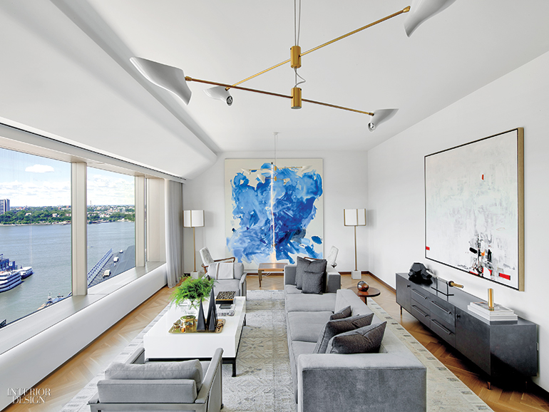
Brass shows up on the living room’s spiky chandelier, with white sails for diffusers, and on the masts of a pair of floor lamps. In the dining area, the chandelier is also brass, in this case burnished. A paler metal plays a part as well—a specific request from the owner, who had admired a collection of white-bronze furniture that Zeff launched a couple of years earlier. “When I was developing the Bronze Age collection, everybody in the world was doing dark bronze,” he says. “We came up with this manufacturing concept where the patina is on top of the bronze, which makes it look almost like nickel. It’s a really exciting look, something you haven’t seen before.” Here, it appears on the bases of an oversize sofa and club chairs.
Metallic finishes aside, Zeff restricted himself to a maritime palette of watery blues and grays. In the living room, that sofa is upholstered in a sumptuous pearl-gray velvet, while gray-and-cream cowhide covers the Vladimir Kagan armchairs. A cocktail table has a laquered top and antiqued brass legs, bronze pulls accent a leather-fronted credenza… and that’s more or less it. “If I lived here, this room would be full of stuff,” Zeff admits with a laugh. “But the owner prefers it very purposefully pared back.” The library is particularly understated. A Danish mid-century sled-base desk—positioned perpendicular to the window to keep the view accessible but not distracting—sits on a gray wool rug. “We were going to put all sorts of things on the wall behind the desk,” he says. “Instead, we kept it even-keeled. We just went with beautiful linen screens that look very masculine. It was about staying in control and following the architecture.”
And sometimes leaving well enough alone. Foster’s oak-veneered shelving for
the library remains. He also specified master bathrooms with vast freestanding tubs and great slabs of black granite for the floors. “Keep it pure, keep it Foster, and keep it moving forward” was the strategy, Zeff notes—the “forward” part being represented by Italian alabaster bath accessories as a finishing touch. He scrapped an initial plan for a glass wall to separate the dining area from the kitchen. The work of visual separation is now done by the deep-brown oak of the dining table and the black leather of the chairs, dark contrasts to the cerused oak cabinetry and gray-veined white polished marble counters beyond.

Bedrooms occupy half the apartment. The master bedroom’s walls are finished in stormy-gray Venetian plaster, warmed by the glow of Lindsey Adelman Studio’s branching chandelier. Guest rooms are simpler, with white walls and some mass-market furnishings. Blackout curtains on the north-facing windows can block the ever twinkling skyline.

In both the private and the public zones, art is eye-popping. Zeff says he got his client “energized” to start a collection. Discoveries include a guest room’s graffiti-heart composition, the living room’s sky-blue painting resembling a giant Rorschach inkblot, and the foyer’s rainbow wall sculpture, created by draping strips of colorful marine vinyl. Knickknacks, too, are bright and cheerful. To adorn bedside tables, for example, he supplied oversize red versions of children’s jacks. They came from his own store, Blackbarn, across the East River.
Project Team: Catalina Castano: Markzeff. Thames Builders: General Contractor.
> See more from the September 2017 issue of Interior Design