9 Fearless Uses Of Color Seen At Milan Design Week 2026
The trend for bold, expressive color showed no sign of slowing at Milan Design Week 2026. We noticed it moved far beyond surface treatment, emerging instead as a structural and conceptual force. Whether it’s tonal layering of saturated hues or material contrast to shape atmosphere and define form, color always provokes emotion. From vivid consoles to a statement-worthy toilet, compositional lighting and more, these nine products demonstrate how chromatic thinking is redefining contemporary design, one vivid gesture at a time. f15a2f
Don’t miss all our 2026 Milan Design Week highlights, from SaloneSatellite to Alcova and more installations.
Color Shines In These Innovative Product Picks From Milan Design Week
Concerto by Marrimor
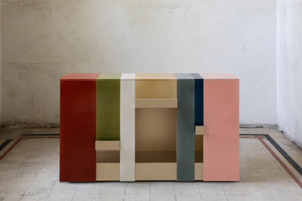
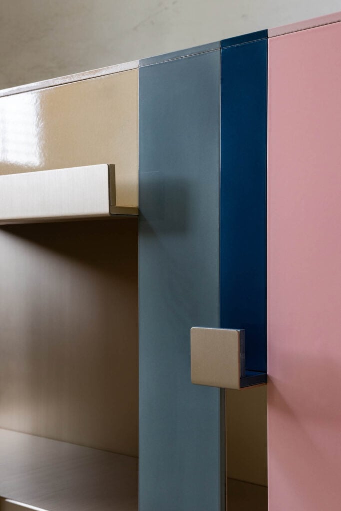
Glossy ceramic, an unconventional material for a console, is paired with leather, metal, and textile elements for Concerto by design studio Marrimor, included in the In Good Company collection. The material juxtaposition is heightened by the atmospheric layering of several different contrasting hues.
Altesse Smart Toilet by Trone
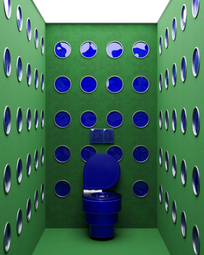
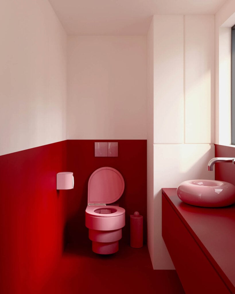
In a category long dominated by neutral white, the Altesse Smart Toilet by bathroom manufacturer Trone offers five distinct finishes that pop, in a body presented by stacked spheres and a distinctive angled lid. Integrated lighting, a tucked-away remote, front and rear wash and dry functions, two user profiles for customized settings, and self-cleaning before and after each are the clever inner workings behind the pretty face.
Non Random by Lodes
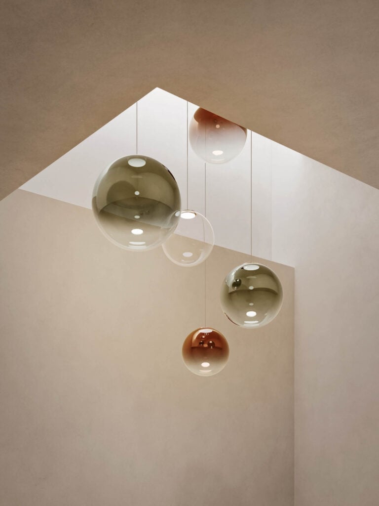
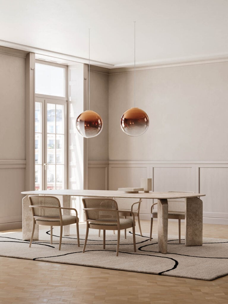
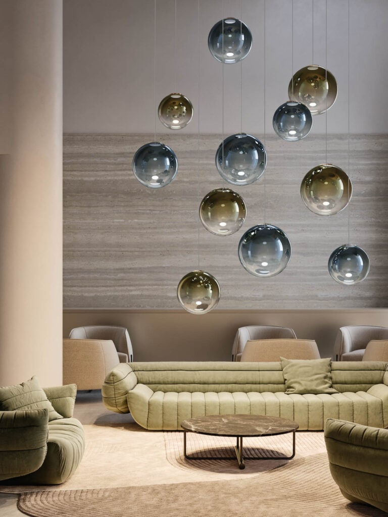
Moving away from the traditional neutrality of glass spheres, the Non Random suspension lamp by lighting producer Lodes asserts color as presence. Six finishes such as Mandarin Orange, Golden Sage, and Deep Azure Steel transform the lamp into a focal point, whether installed individually or in visually arresting clusters. Three different diameters expand arrangement potential.
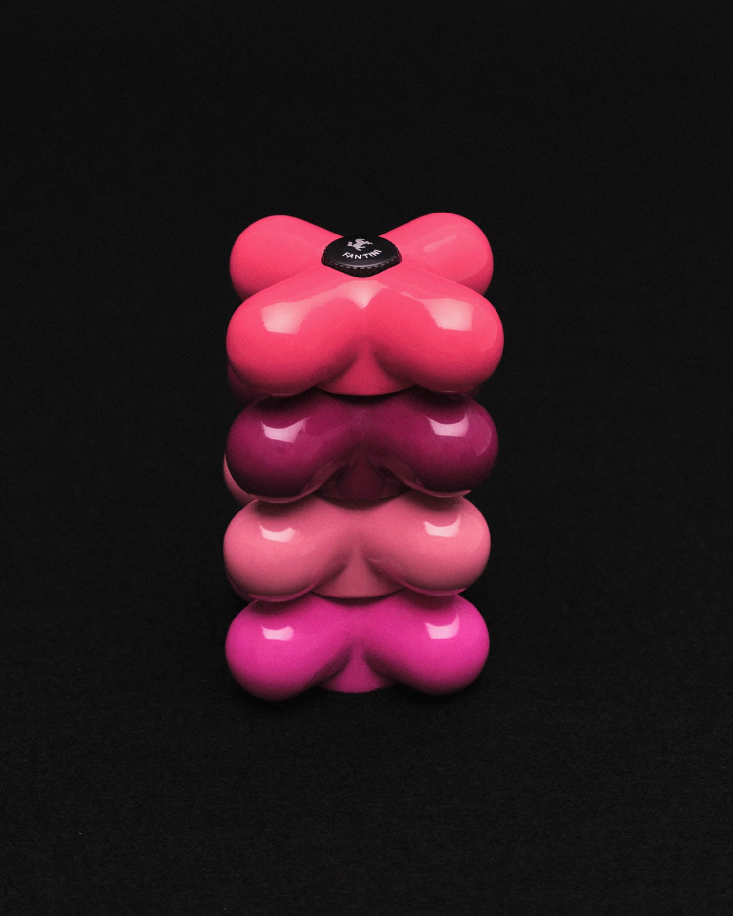
I Balocchi by Paolo Pedrizzetti & Davide Mercatali for Fantini
Photography courtesy of Fantini. 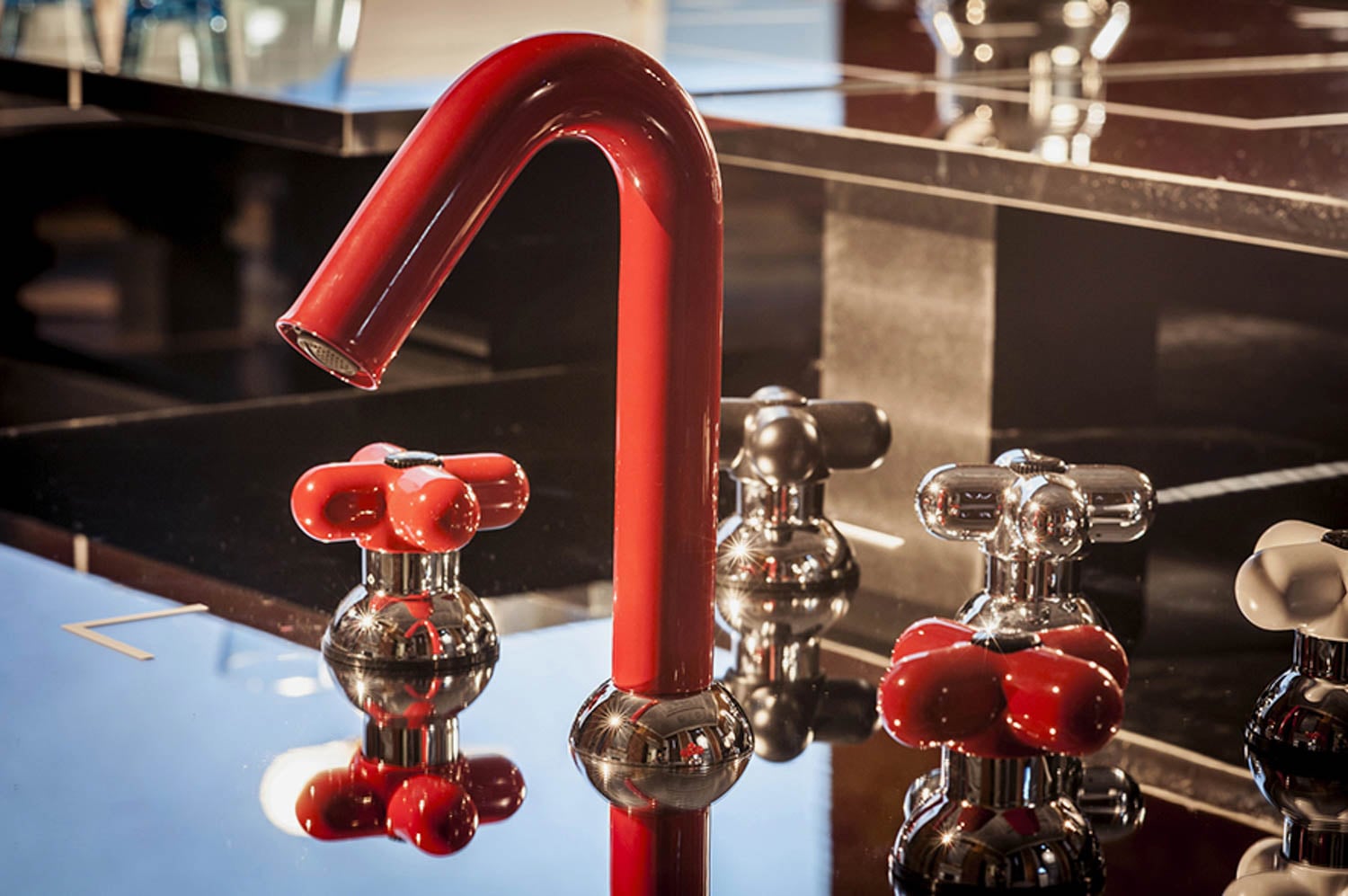
Photography courtesy of Fantini/copyright Valentine Sommariva. 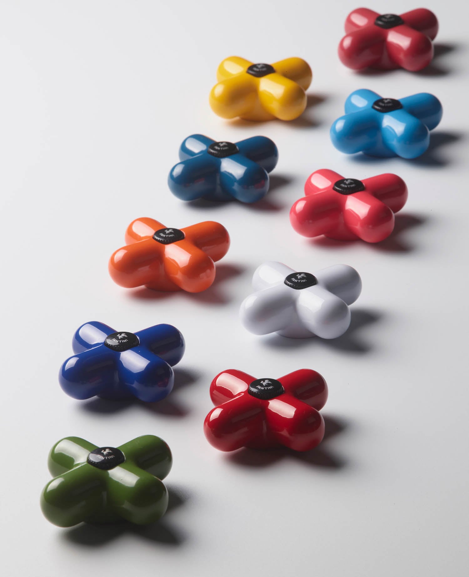
Photography courtesy of Fantini.
Demonstrating the enduring power of color, faucet collection I Balocchi, marks its 50th anniversary with bright new colorways. Originally conceived for bathroom manufacturer Fantini in 1976 by Paolo Pedrizzetti and Davide Mercatali, the design transformed a purely functional object into a playful, sculptural statement. Saturated hues—think yellow, red, orange, alongside black, white, and brown—introduced bold cheer to bathroom design at a time when such exuberance was virtually unheard of.
36e8 Formae Kitchen from Lago
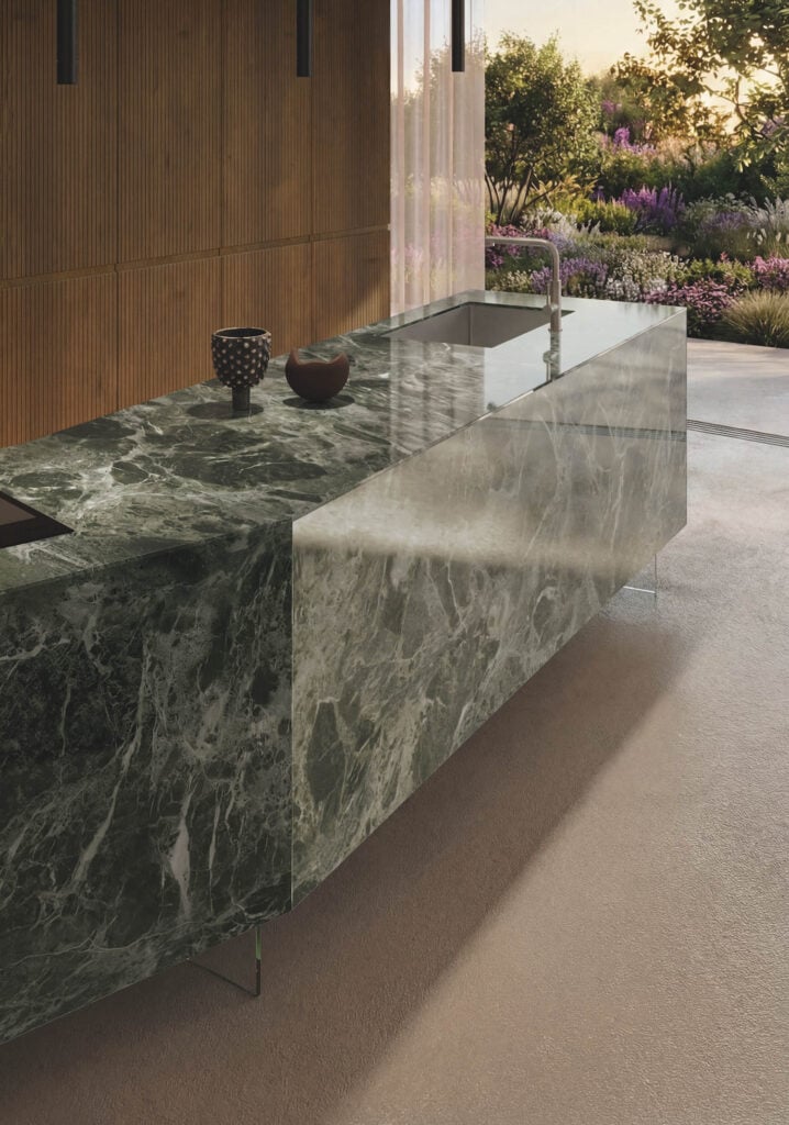
A verdant green solid-surfacing material enhances the perception of volume and continuity in furniture manufacturer Lago’s 36e8 Formae kitchen—elevating it to sculptural centerpiece. Finished in glossy XGlass Verde Alpi, surfaces extend seamlessly across fronts and worktops, allowing veining and tone to flow uninterrupted. The angular kitchen, crafted entirely without handles, has a monolithic clarity, while suspended elements add visual lightness.
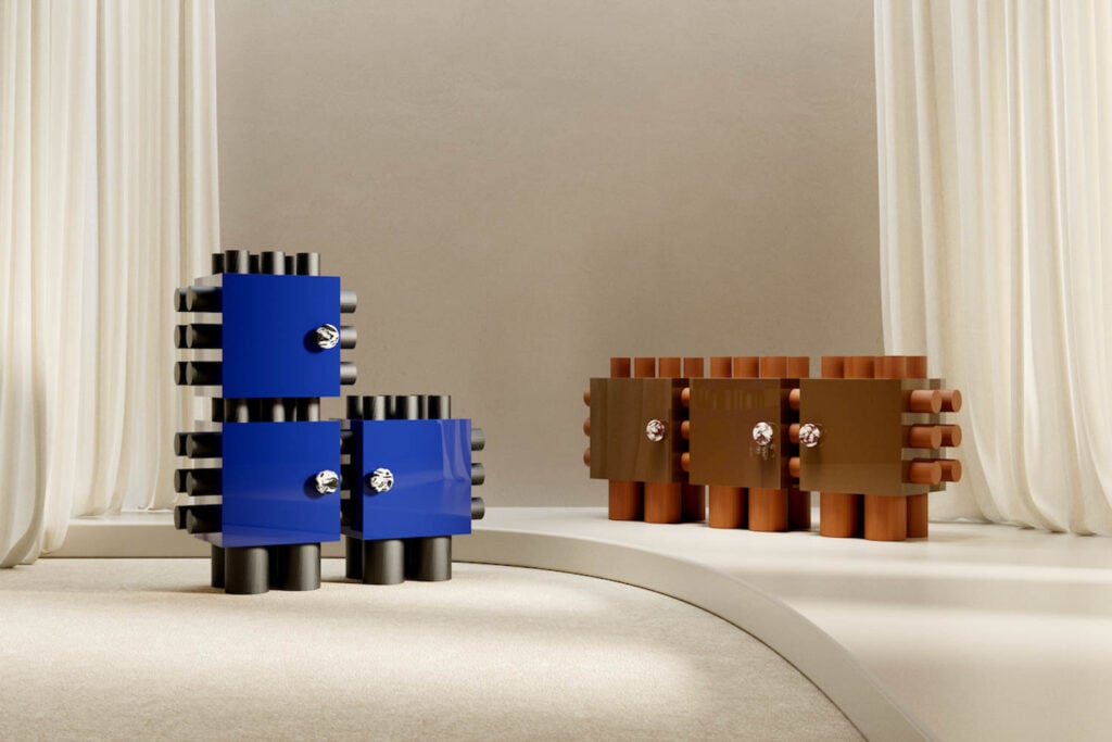
Totémique by APPRT2

Photography courtesy of APPRT2. 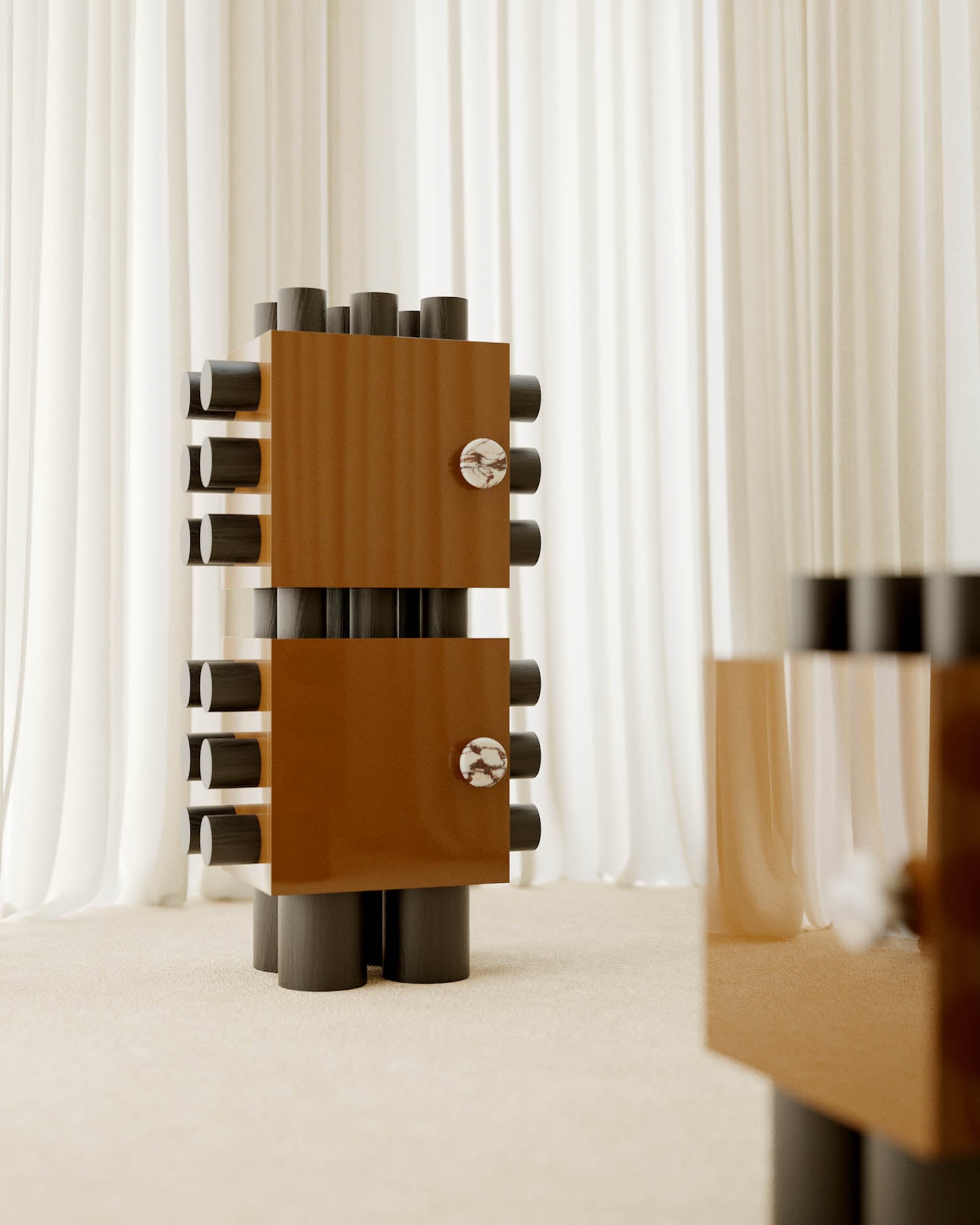
Photography courtesy of APPRT2. 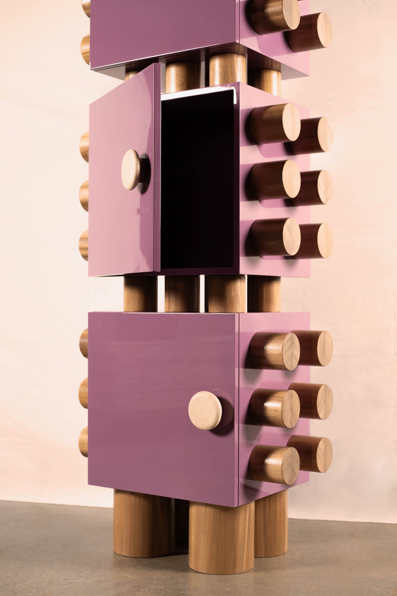
Photography courtesy of APPRT2.
Storage is transformed into a striking composition of color and form with the Totémique cabinet by furniture design studio APPRT2. Constructed from stackable, customizable modular elements in materials such as solid oak, lacquered MDF, and marble, each configuration becomes a personalized sculptural statement. Hues such as deep olive tones and oxidized reds emphasize the graphic interplay between modules, reinforcing the cabinet’s architectural presence. The piece was one of over 50 by 28 French designers and design brands featured in the exhibition “Le French Design,” as part of the group show “Le Design Défilé,” curated by the collective French Living in Motion and designed by Jakob+MacFarlane.
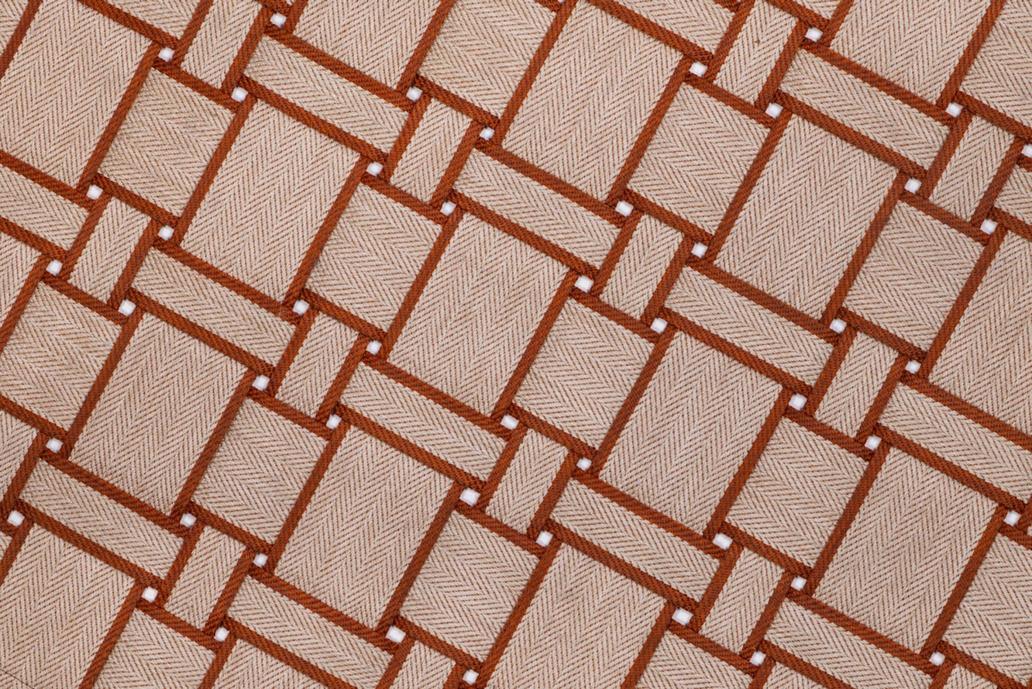
Ribbons by DEDON Design Studio for DEDON
Photography courtesy of DEDON. 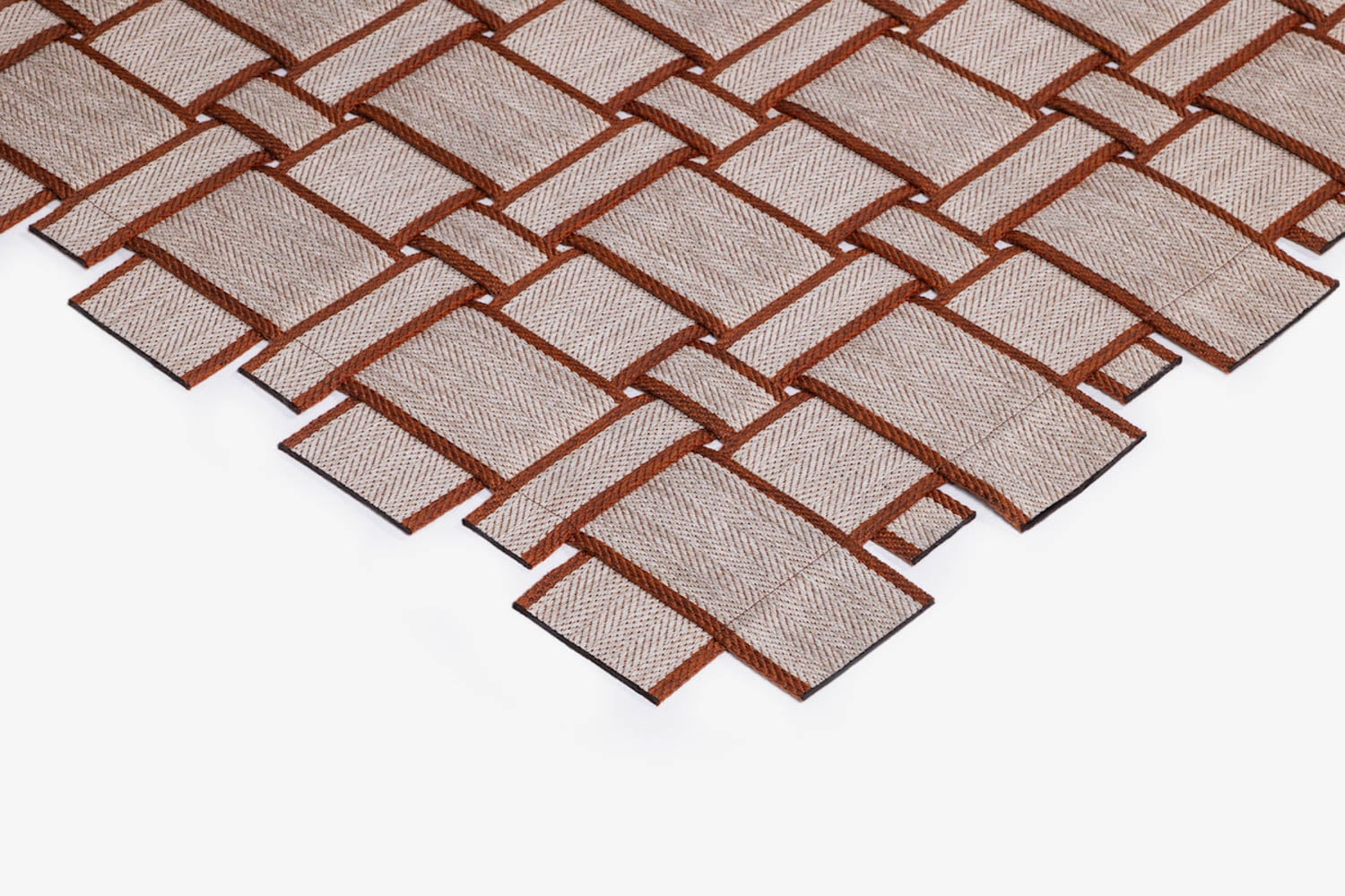
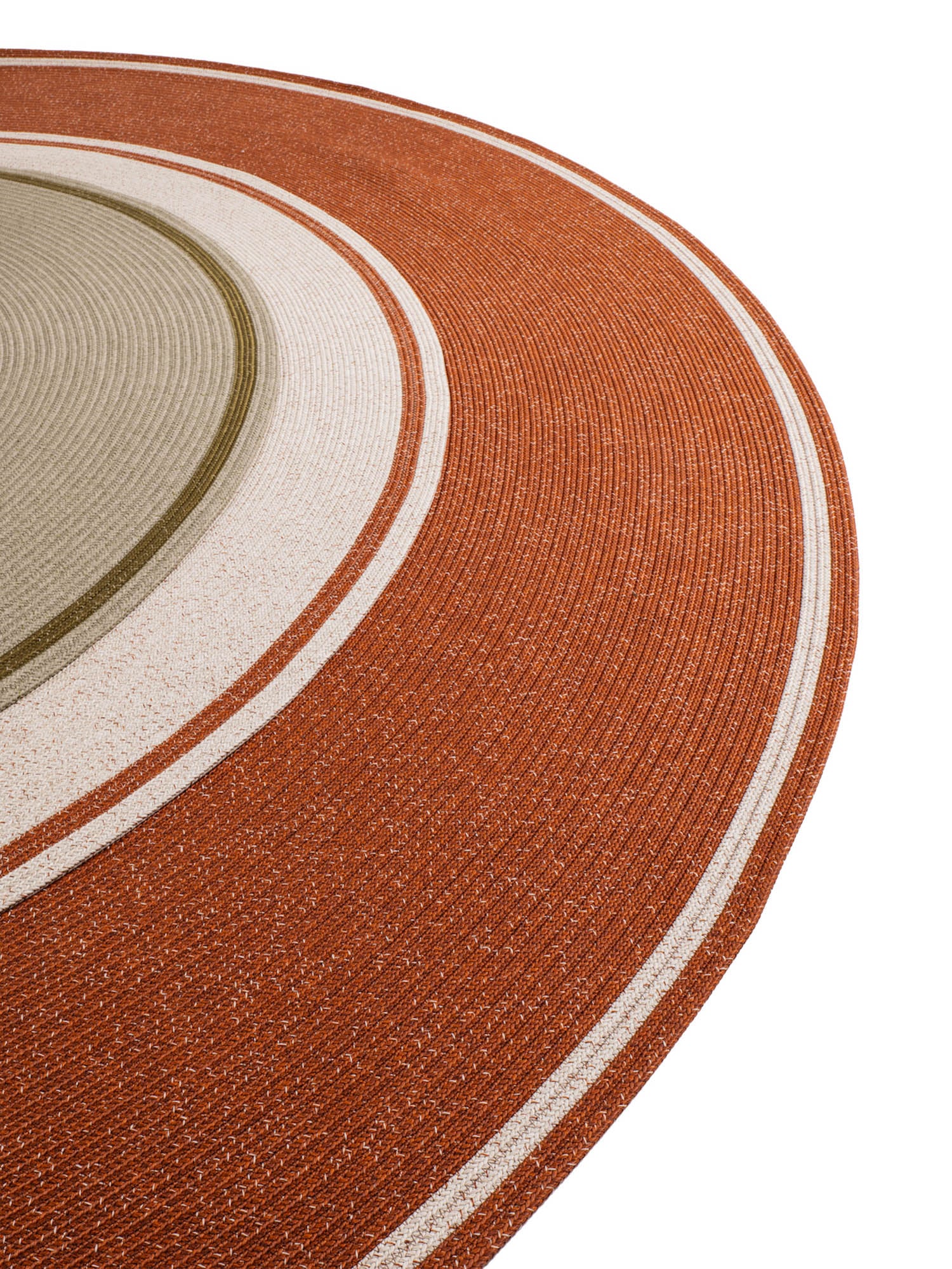
The Ribbons collection from the in-house design studio at outdoor furniture manufacturer DEDON translates color into two large-scale woven carpets intended for the outdoors. A tactile invitation to casual summer living, broad fabric bands intersect in an over-under grid for rectangular formats, while braided coiling defines the round variations. Graphic patterns in nature-inspired palettes—Harvest, Wild, and Sprout—use tonal variation to create depth and rhythm. Made of DEDON’s proprietary weatherproof polycarbonate fiber, each carpet is designed to drain naturally after it rains.
Nido by Joana Bulhões de Castro Cunha Netto for Rossi di Albizzate
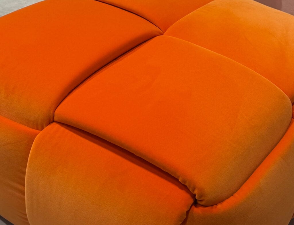
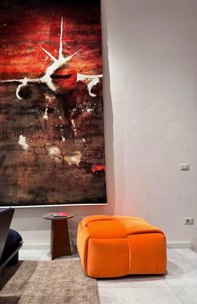
A system of integrated pockets forms the tactile exterior of the Nido pouf by Joana Bulhões de Castro Cunha Netto. Built on a primarily wood internal base, it is upholstered using traditional sofa upholstery fabrication methods. Upholstered fabric bands are then braided around the surface. Doubling as storage, the pouf’s layered visual rhythm is an engaging way to keep everyday objects discreetly within reach. Orange velvet made it an eyecatcher at SaloneSatellite, Salone’s platform for young designers.
Bonbon by Barber Osgerby for Kasthall
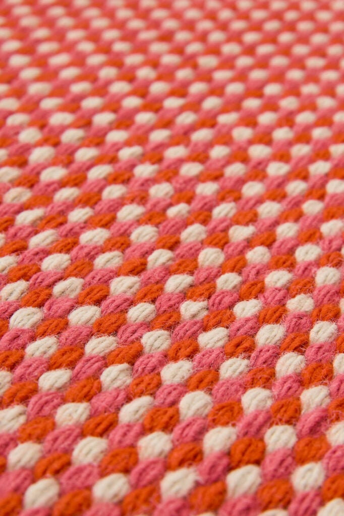
Hues embedded into the structure of the weave adds texture and depth to the 100 percent wool Bonbon rug by Barber Osgerby for rug manufacturer Kasthall. Subtle shifts in tone and warp give the surface a sense of movement, while the tailored triple-shuttle looped edge adds a refined finish. It’s available in energizing fruit-inspired shades including Berry, Rhubarb, and Lemon.
read more
DesignWire
‘The Century Of Gehry’ Retrospective Opens In Porto, Portugal
“The Century of Gehry” at Porto’s Serralves Museum of Contemporary Art showcases 19 landmark projects, tracing the visionary architect’s transformative impact.
DesignWire
Nick Cave & Marie Watt Create An Installation For The Obama Presidential Center
Nick Cave and Marie Watt’s 45-foot-tall installation at the Obama Presidential Center weaves together Indigenous and Black material traditions.