10 Questions With… Production Designer Sara K White
When designing for a place and time often depicted through the lens of political propaganda, Sara K White, the production designer for Peacock’s Cold War espionage series Ponies, says rooting a space in research and lived reality is crucial. Every detail, from patterns and colors to decor, had to reflect the complex socio-economic and cultural realities, as well as the push and pull between both sides. Since a young age, White was fascinated by how people and spaces feed off each other, which is a sentiment she now translates into her projects: “It’s so important for me to understand why a space will surround a character in any scene, and how that space communicates with that character,” she says.
In addition to Ponies, White has received an ADG Award nomination and an Emmy nomination for her work on The Flight Attendant, and designed Amazon Prime Video’s Swarm and The Wilds, among others. Currently, White is working on the newest Exorcist film. Here, White shares with Interior Design her strive to create immersive worlds, how societal norms shape design around us, and the importance of color, pattern, and texture in storytelling.
Sara K White Builds Immersive Worlds For Television
Interior Design: How and where did you grow up? Were you interested in design or film as a child?
Sara K White: I grew up outside Dayton, Ohio, a classic suburb kid. I even had a paper route, and I’d spend the time between houses daydreaming about what stories were taking place in each—the cozy grandma in the modest starter home from the ’50s or the brusque father in the colonnaded Greek Revival house, which felt as grand as the White House. That fascination with the way people and spaces feed off each other has never changed, but it wasn’t until I watched big spectacle-like movies like Titanic or Memoirs of a Geisha that I started to see design on film.
ID: You started your career in architecture and interior design. How did you transition to production design?
SKW: When I moved to New York after college, I fell in with a group of recent film school grads who were working on their first projects—short films, music videos, little things. Because I had a regular, paying job in the arts, I ended up helping them with their sets for free, which was a great way to learn about the creative spirit of filmmaking. I started to have a lot of “sick days,” picking up days here and there as my interests and opportunities grew. I made the decision to transition right when the Great Recession hit, and asked to be laid off so I could join the lucrative world of indie films. Thankfully, I could cash in on a good severance package. It was a few years of scraping by and odd jobs, but eventually it paid off!
ID: What art and architecture design inspirations do you reference when you work on an upcoming TV show or film?
SKW: It changes based on each project; there’s no one inspiration or source of research that I rely on. I’m compelled by the architecture and decor influences of an era or a socio-economic class that a character lives in. It’s so important for me to understand why a space will surround a character in any scene, and how that space communicates with that character—making them feel comfortable or confused or powerful. Rooting the space in the real is critical, but the fun is playing with that reality to elevate the experience of the scene.
ID: When you got started on Ponies, what were some of your inspirations for the story?
SKW: I spent a lot of time researching what forces created the built environment in ’70s era Moscow. Understanding the politics and economics at play was incredibly helpful when I arrived in Budapest, a city with Soviet, but certainly not Russian, history. For tone, I followed the lead of our co-creators, David Iserson and Susanna Fogel. To tell this story right, we had to put the ’70s aesthetics of both cultures on an even playing field. Once we let the Soviets have color and pattern, it became more accurate to the lived experience, and more fun, than many of the films we see from the Western perspective. To that end, I watched a lot of popular Soviet films of the era, and was specifically influenced by the comedies like Autumn Marathon and The Irony of Fate, which both critiqued Soviet culture and the built environment.
ID: The show is breaking away from the usual desaturated and cool-toned image of the USSR at that time. How did you use color, pattern, and decor to achieve it?
SKW: When we were developing the palette for the show, it was critical to keep the colors bright and full chroma, leaning into the primary colors, rich earth & jewel tones that made up the pop culture of the time. Along with properly representing the era, we wanted to underline the buddy-comedy energy of the show that’s so palpable between our two leads. Sure, we have plenty of spy craft, but I was definitely more interested in pulling from The Spy Who Loved Me than Bridge of Spies.
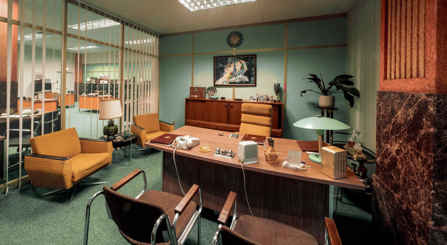
ID: Ultimately, it is still a Cold War spy story; how did you use production design to make the distinctions between American and Soviet spaces?
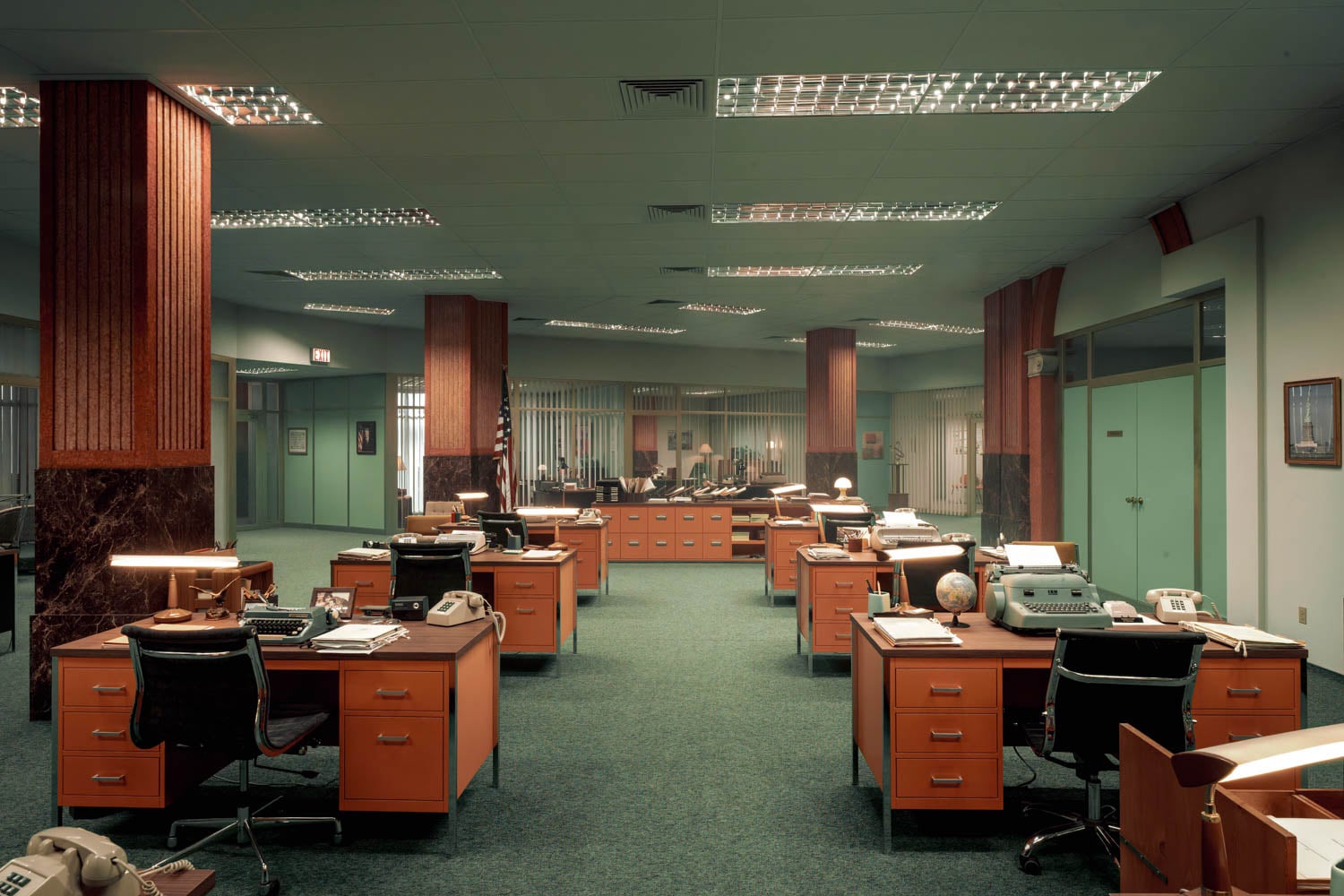
SKW: Though both countries were running massive intelligence and counter-intelligence operations, both had huge propaganda machines, and both were concealing the truth of their accomplishments from their citizens, the methodologies were very different. I worked to convey the spirit of “American Freedom” through wide open-planned spaces and bold, solid colors, which gave the impression that everything was newly possible, out in the open, easy to understand. The Embassy Office uses layered walls and doors of clear glass to separate spaces, giving the impression that nothing is hidden.
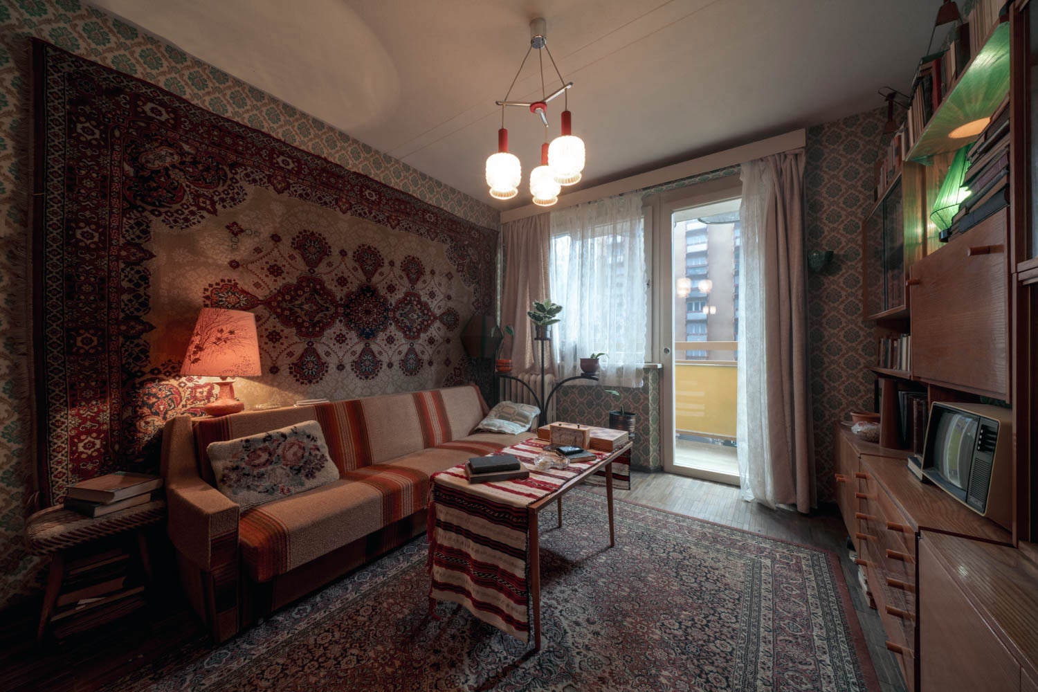
In the Soviet sets, we chopped them up. Each room was often small, with tight hallways and obscuring doors between every room, opening onto a twisting network of spaces. Patterns were more complex and layered in those spaces as well, drawing from the deep and rich history of Russian design and decor. Sasha’s apartment is particularly interesting in that regard. Pulling from real floor plans, we mimicked a true Kruschevka apartment layout, with tight, tiny hallways, and each room could be closed off from the other rooms, so what was happening on one side of the door could be hidden from the other. This is crucial when Bea is breaking in for the first time!
In palette, American spaces were often leaning a bit cooler; the greens and teals of the office were particularly fun to play with. As a counterpoint, we held onto red marbles and in a lot of the Russian-built elements and spaces. Sometimes, it crept into the American spaces, as spies are wont to do. But the richness of tone between the two countries was equal.
ID: The hotel is such a unique space with the circular layout. How did you find it and renovate to your needs?
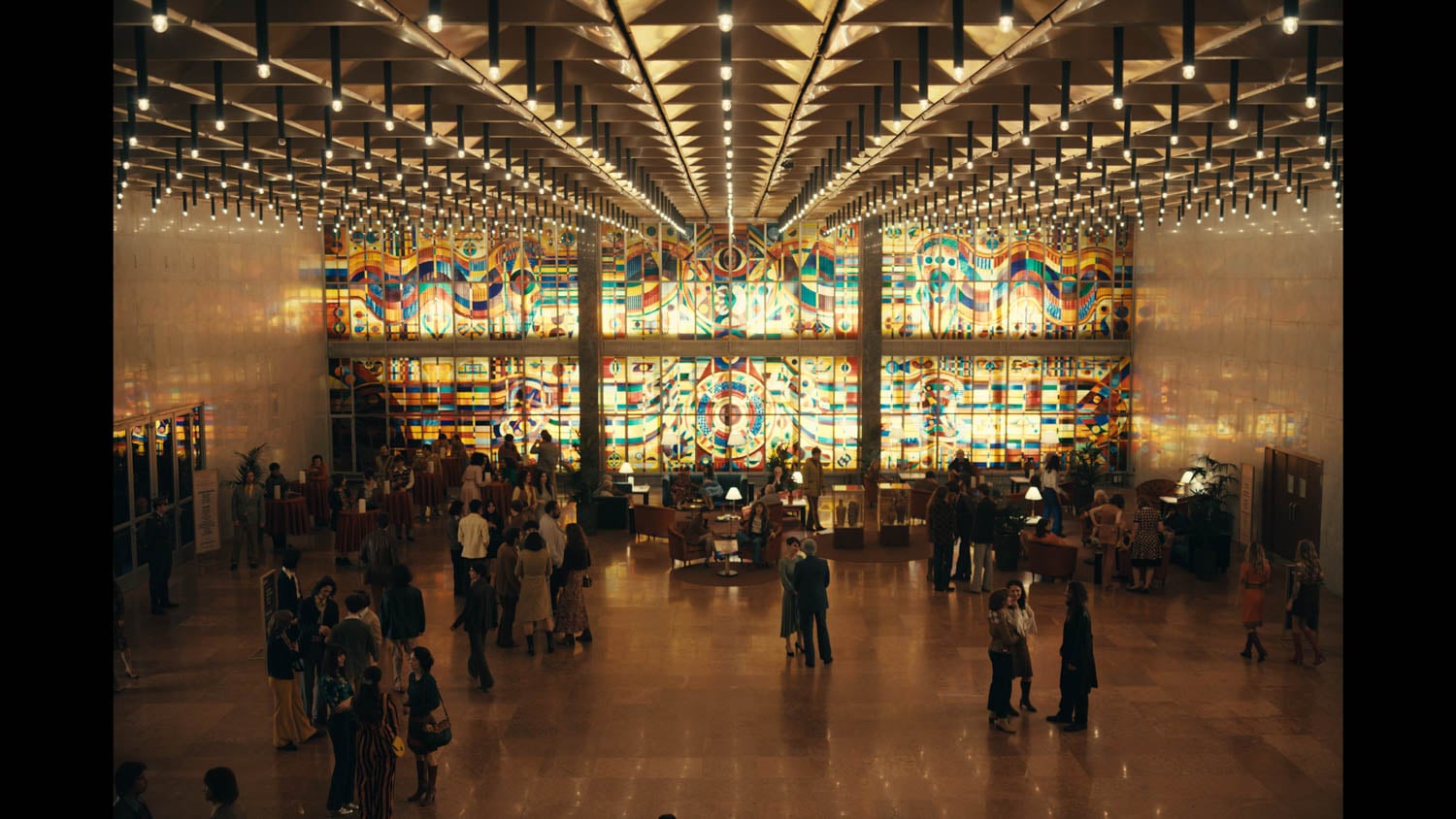
SKW: It was so exciting to find and salvage the historic Hotel Budapest for our Hotel Intourist. The iconic midcentury hotel that was slated for demolition, but we knew we had to convince them to pause their work so we could put the stunning lobby on screen. In our research, we found vintage travel brochures advertising Hotel Intourist in Moscow, and worked to fuse those details with our location. We brought in similar furnishings, recreated the stunning stained glass mural in the lobby, and splashed bright orange on everything. Because the actual rooms in Hotel Budapest were too small for our footprint, we built our own in an abandoned conference space. It was great fun to run wild with the geometric wallpapers and to custom paint the sexy burgundy and tangerine tiles and fixtures in the en suite.
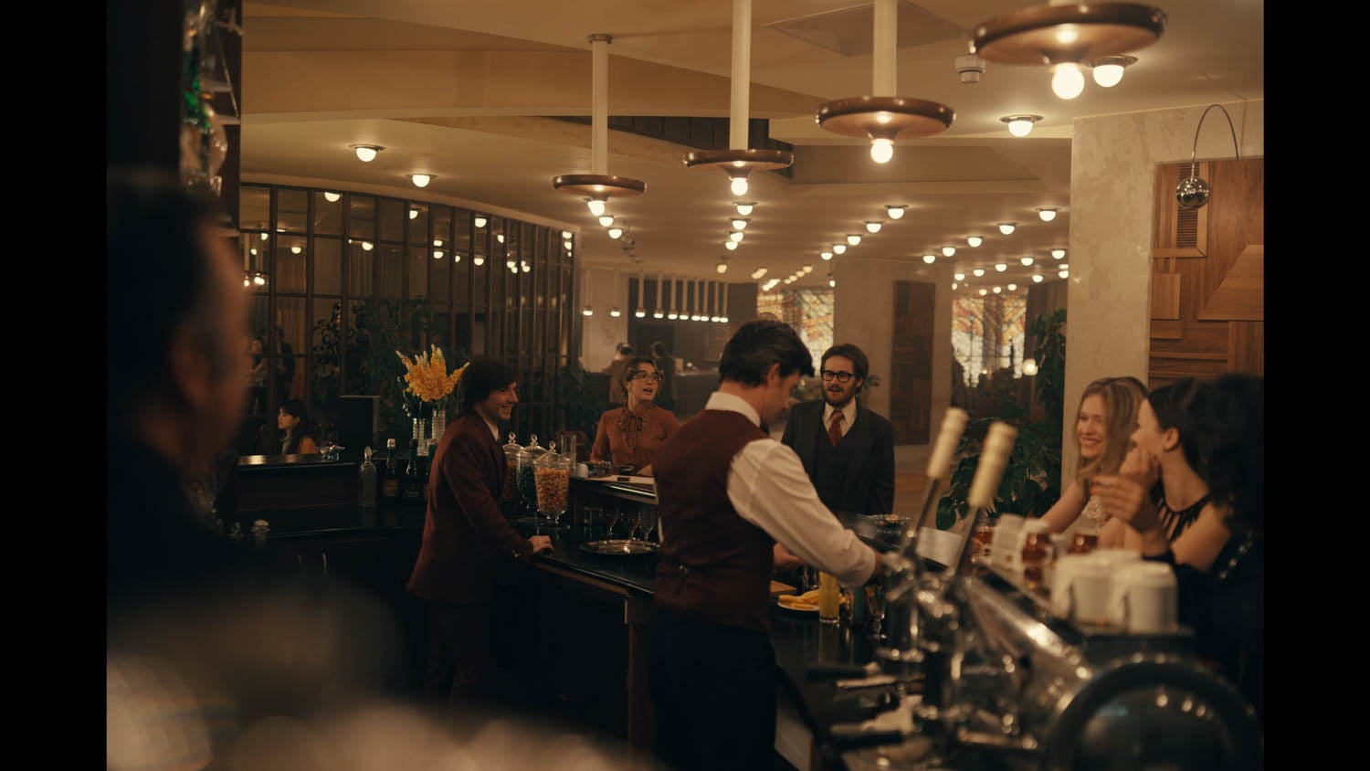
ID: The show features some other gorgeous locations including the restaurant and the Elton John concert. Can you walk us through how to achieve the final look?
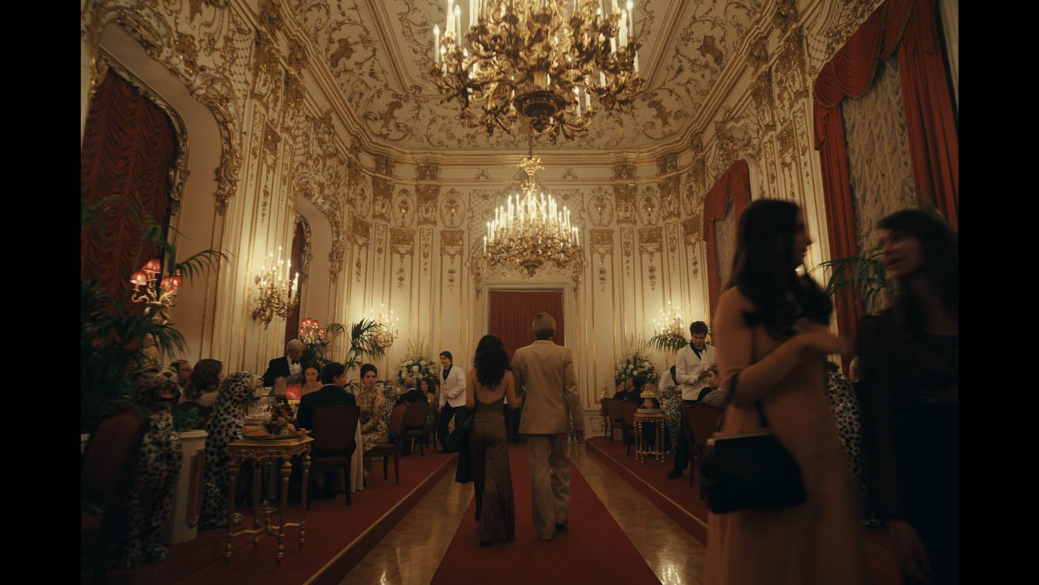
SKW: The restaurant and high-roller poker club Andrei takes Bea to was an absolute delight to find and design. The original intention had been to keep the space low-key, but when we found the Metropolitan Ervin Szabo Library, we immediately pivoted. The history of Russian architecture is so rich, and we hadn’t had another opportunity to exploit the grandeur—so we took it and ran. We pulled out all the study tables and books and brought in our own delicious details—the crimson carpet, lampshades, and velvet balloon curtains, a detail I was thrilled to get into the show! My set decorator, Panni Lutter, and her assistant Attila Kiss, custom-created the planters and found a dozen life-size ceramic snow leopards that leaned into the excess that would come to define the look of the 80s, and subtly underline the dangerous situation Bea is walking into.
Once we were in the poker room, rich mahogany leathers and golds gave us a masculine vibe and complimented the blood red accents. The animal prints also got more colorful with lions, tigers, and cheetah prints surrounding the ladies lounging on the sofas. The threats are palpable here, and Bea is seen by the men and the women as fresh meat.
From the moment we saw it, we knew we had to find a scene to put in front of the majestic stained glass mural in the lobby of the Semmelweis Medical University, and the Elton John Concert was it. Out in the atrium, we just leaned into the gorgeous colors and let the space talk. But backstage, we slathered on a deep purple. Elton’s dressing room was fitted with the most spectacular ’70s dressing table, upholstered in a bright purple faux-fur-like velvet. It was so over the top that we had to bring every other material into the mauve color space so it didn’t pull focus. The hallways were all white when we got there, but it didn’t give us the tension we needed for the scene. So we bought buckets of deep Blackberry to make it as sexy as it was scary. Anastasia Magoutas, our costume designer, and I worked closely to make sure that the wardrobe of our cast popped in those dark halls.
ID: You made the CIA Bubble not only functional but also stylish. What was the process like?
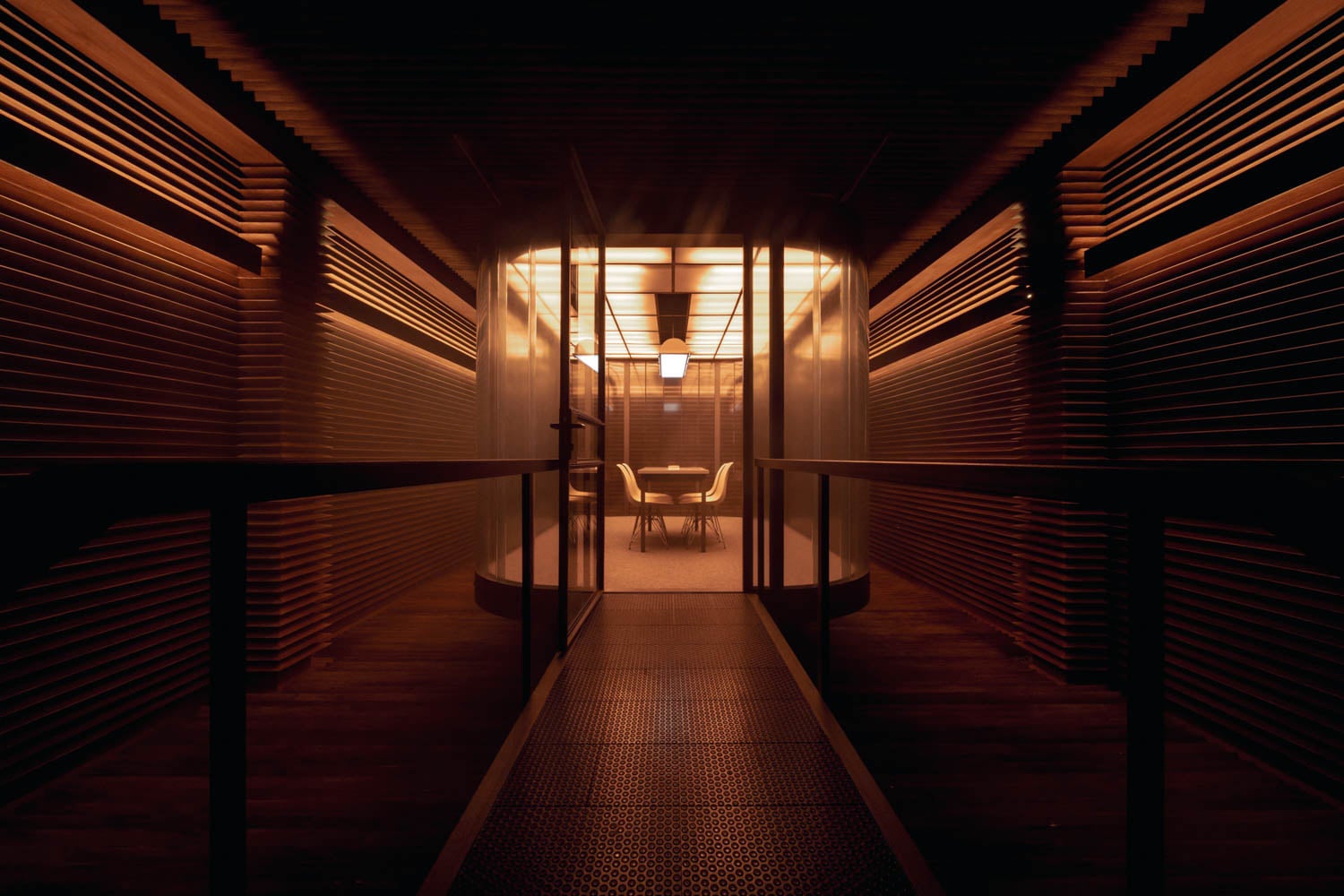
SKW: Creating the Bubble turned out to be one of the most satisfying design experiences of the project. The relatively simple brief—make a secure-looking space that includes an elevated glass-enclosed conference room—left the door wide open for interpretation. It had to feel as powerful and impactful to the audience as it truly was to the functionality and secrecy of the CIA. It’s also a kind of space that has been wonderfully envisioned by countless other designers for similar projects, so, as a designer, the bar felt very high.
The buildings I was scouting for the show were constantly bringing me in contact with ferrous channel glass that created glowing lobbies and stairwells that hid the outside world. I knew I wanted to lean into the material and work with its subtle curve to create a rounded space that evoked “Bubble” as directly as it could. In order to allow each section of the wall to work for the camera, we had to custom shape plexiglass and skin them in a slightly opaque and tinted film so we weren’t painting out tons of reflections.
We had a heck of a time finding a vendor, but my art director on that set, Gergő Kukucska, did not give up. His attention to engineering that set was critical to pulling it off. Recording studios of the era, specifically in Eastern Europe, were often covered in layered strips of open-pored soft woods, which I aesthetically merged with pyramid acoustic foam to create this serrated space that felt a bit dangerous—the sharpness of the points implied that you couldn’t step off the path onto that floor. And you truly could not! We had to create custom padded panels to lay on the floor, which would distribute the weight of the crew and gear without damaging the points. On the room’s walls, we had to keep the materials light so we could wheel them out for the camera, so each piece was custom-cut from foam and hand-painted to create the wood grain that matched the floor. It was painstaking work, but ultimately worth it.
ID: What’s next for you and do you have a dream project you would like to work on?
SKW: I’m so excited to be working on the newest Exorcist movie with Mike Flanagan. Though I’m not a horror fan, I’m finding the experience of creating future nightmares as intriguing as any fantasy project. Though I’d be happy to lean into mermaid lairs or spaceships on the next one!
read more

DesignWire
Submit Now To Interior Design’s 2026 Best Of Year Awards
Submissions for Interior Design’s Best of Year Awards—the leading global design awards program—are open, with a new Made in America category.

DesignWire
The Hoxton And Artist Jon-Paul Wheatley Collaborate On Soccer Installation
As World Cup excitement builds, The Hoxton’s U.S. hotels showcase artist Jon-Paul Wheatley’s sculptural soccer balls in a special installation.