Elkus Manfredi Architects Designs Dynamic Life Science Campus
66 Galen Street, Watertown, Massachusetts
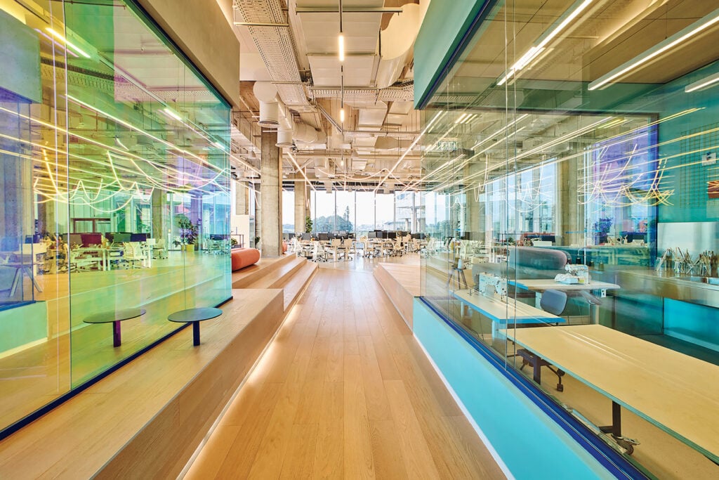
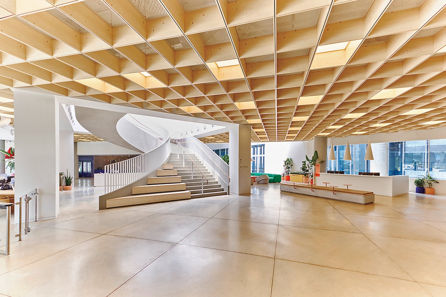
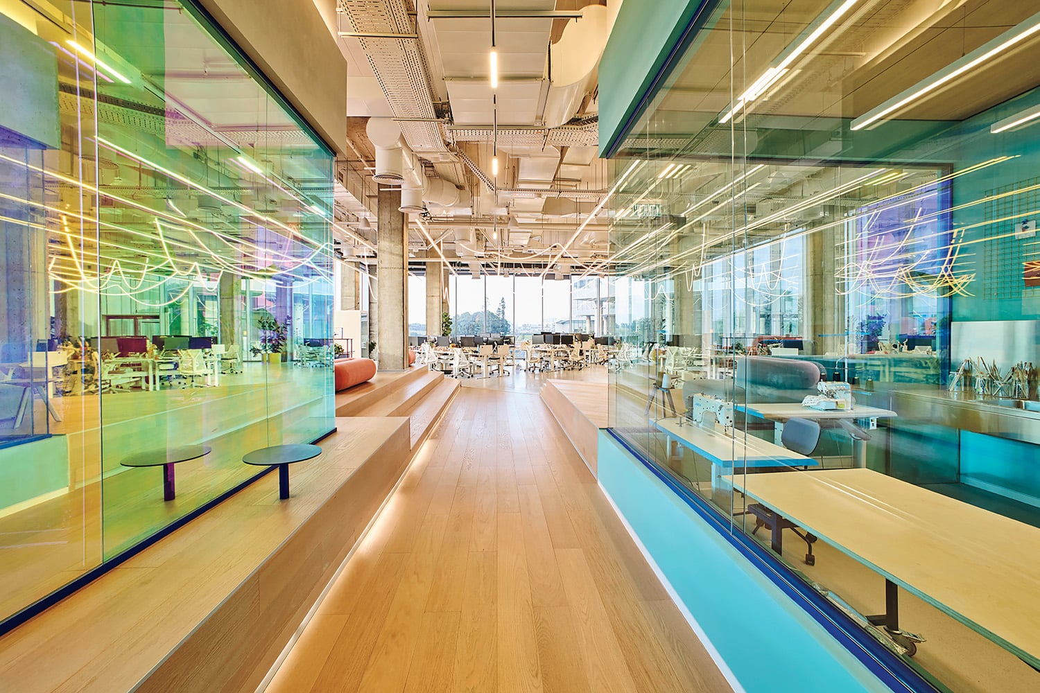
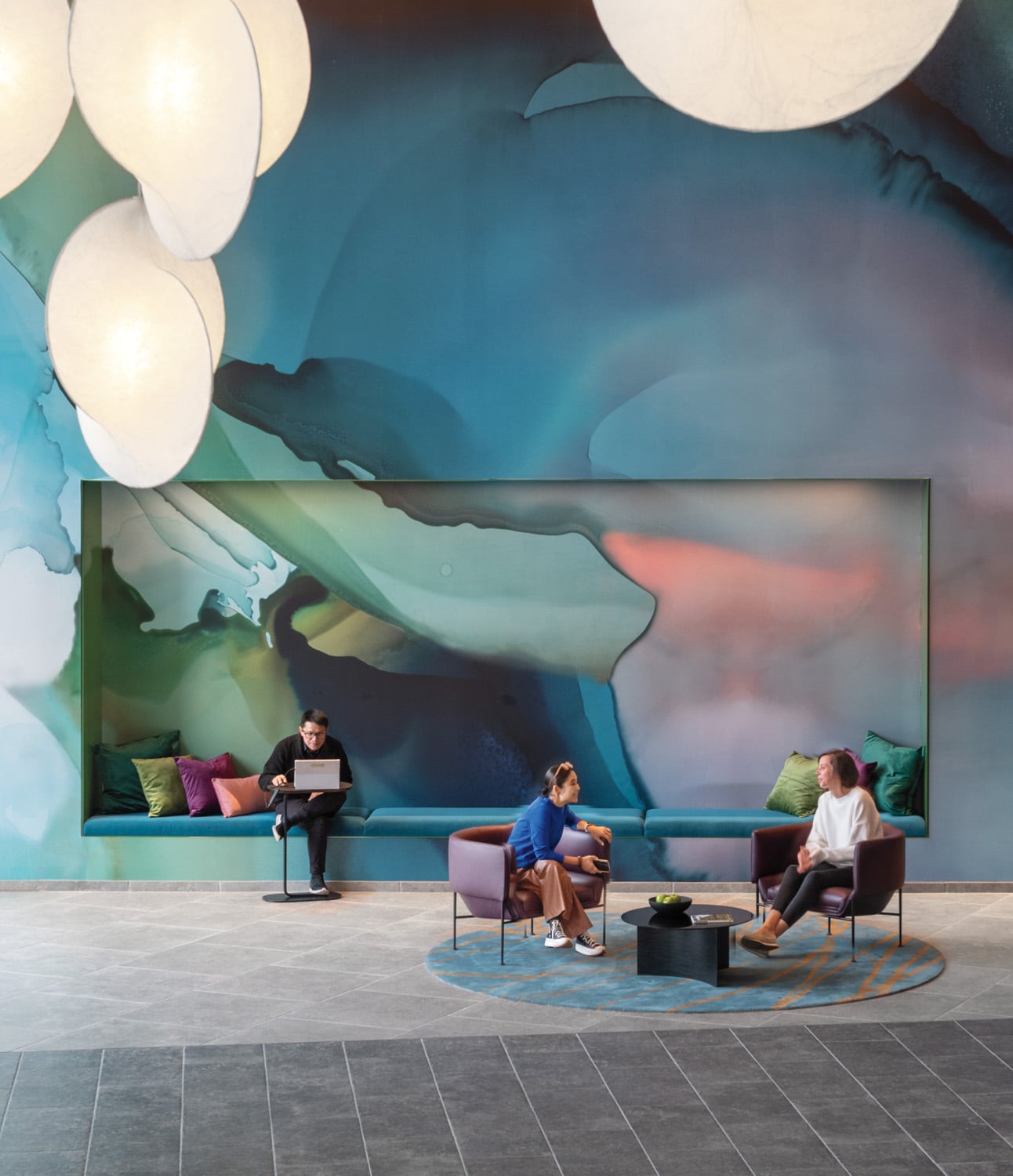
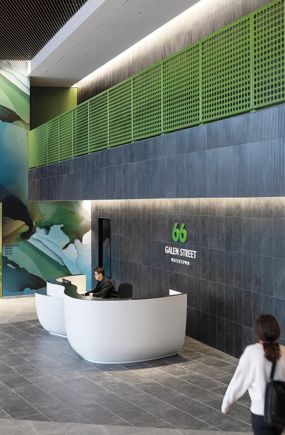
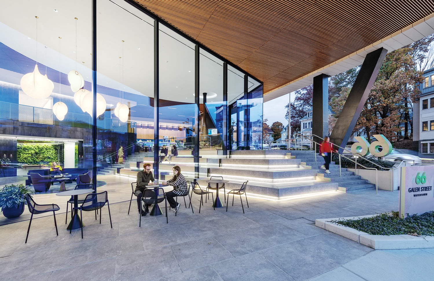
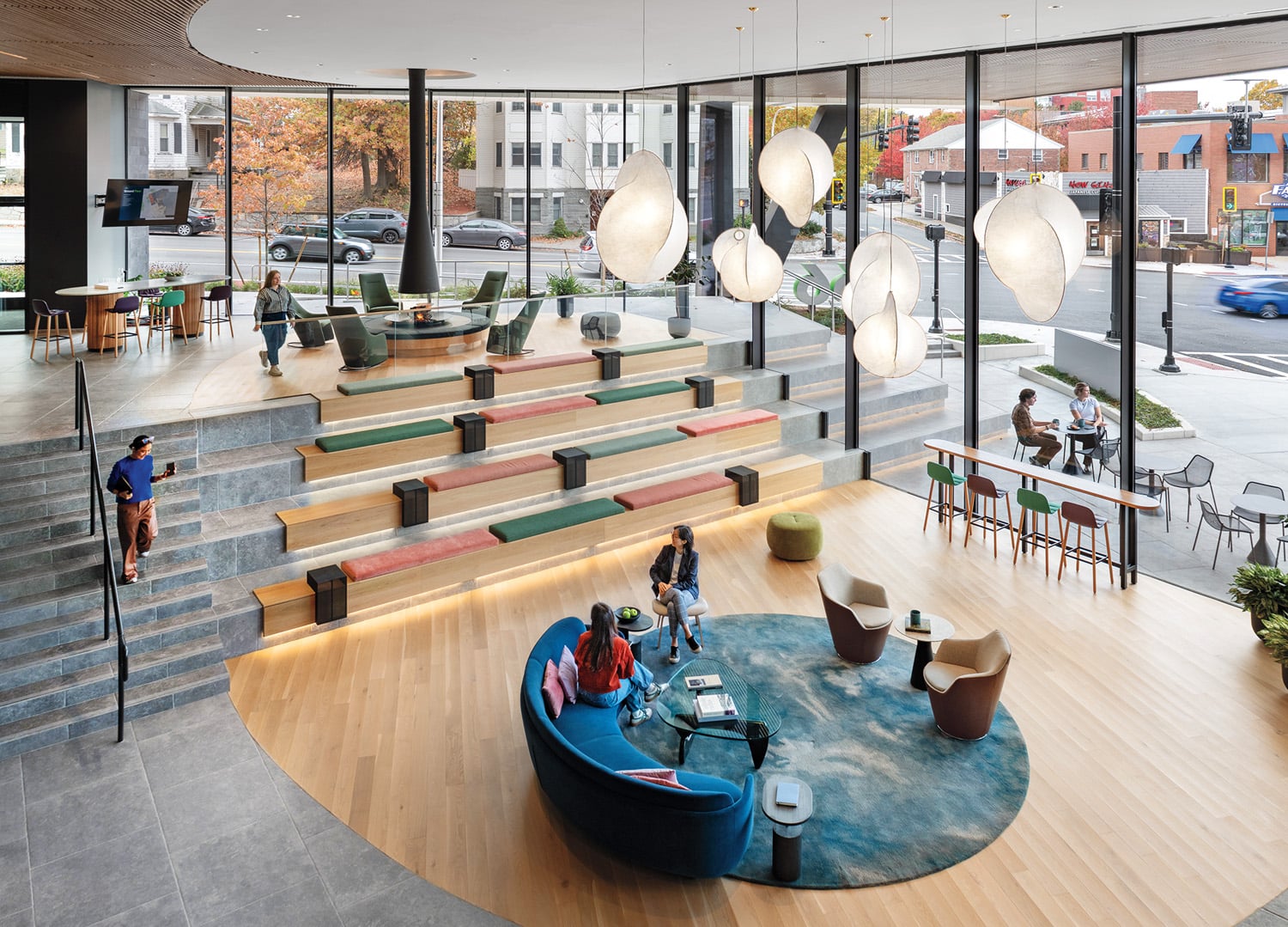
An underutilized site just steps from the Charles River has been transformed into a community-connected life science campus, where innovation is echoed in both the architecture and interiors. Elkus Manfredi Architects designed the 225,000-square-foot lab facility to offer flexible, wellness-focused spaces that draw inspiration from multifamily housing and contemporary workplaces. The building introduces a crucial connective urban element to a once unnavigable neighborhood, with nearly 40 percent of the site dedicated to open space and pathways linking major transit options. From the lobby, bleachers pierce through a double-height glass facade to become public-facing exterior seating, creating gathering spaces both inside and out. An expansive interior wall is washed with large-scale watercolor-style graphics that evoke movement and progress. A recessed section of this wall forms a cushioned niche for casual work, while circular rugs define intimate seating areas for informal confabs. Stretched-fabric light fixtures are suspended at varying heights overhead, complementing the abundance of natural light that floods in through glazing. With a suite of high-performance design strategies and integrated renewable energy features—including a rooftop solar array and EV charging infrastructure—the building is as considerate of the environment as it is of its users and the Watertown community at large.
read more

Projects
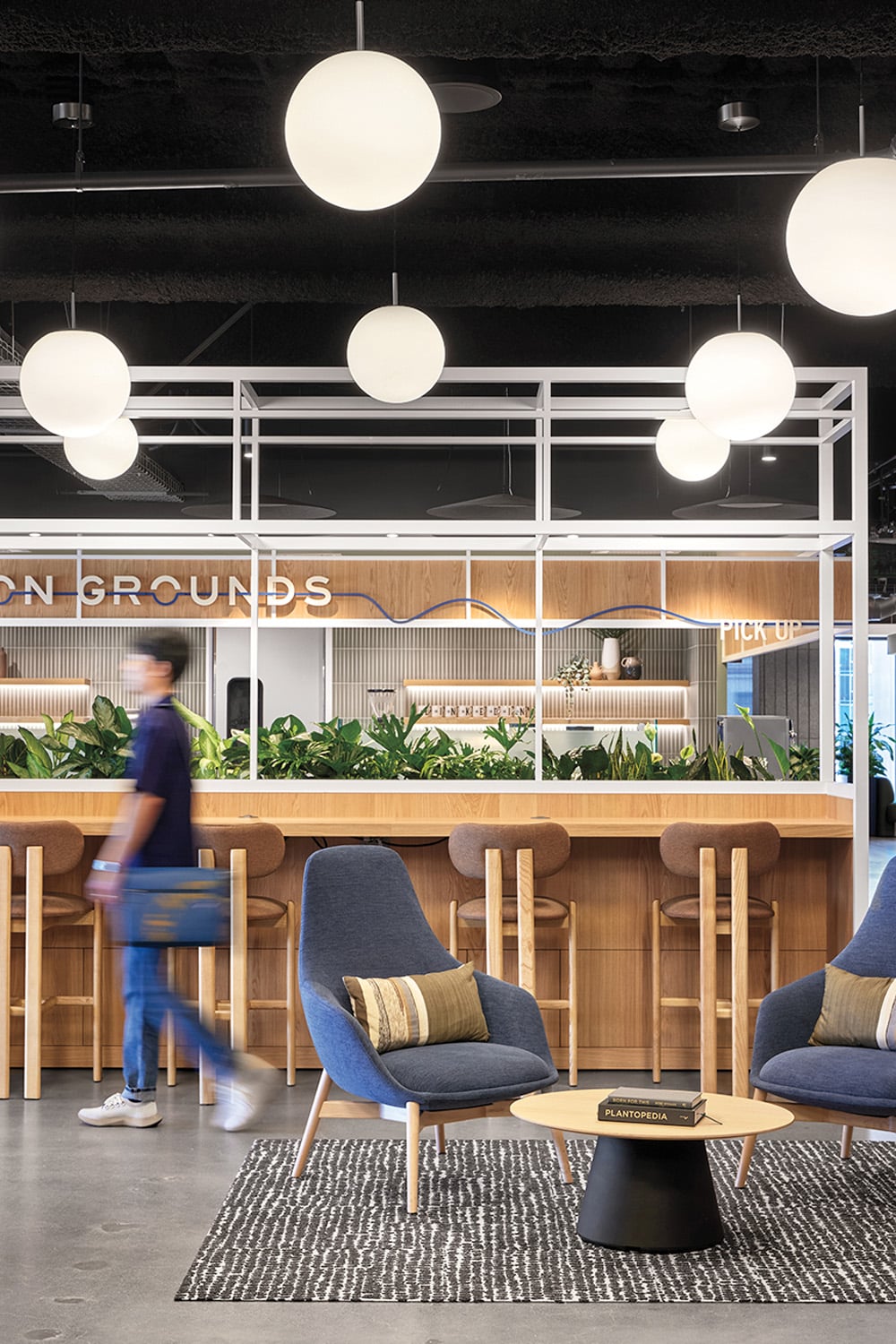
SmithGroup Designs Its Own Future-Focused Workplace
SmithGroup’s new San Diego workplace, one of 20 throughout the U.S, is supremely tied to place yet references the firm’s widespread legacy.

Projects
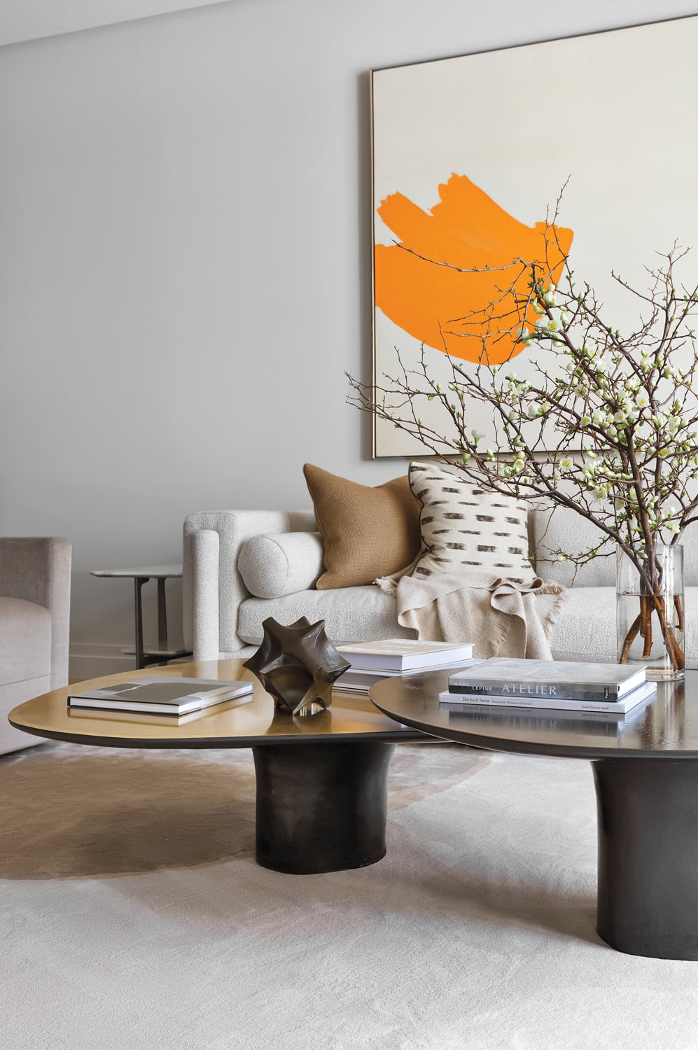
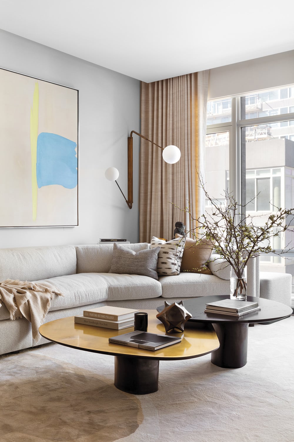
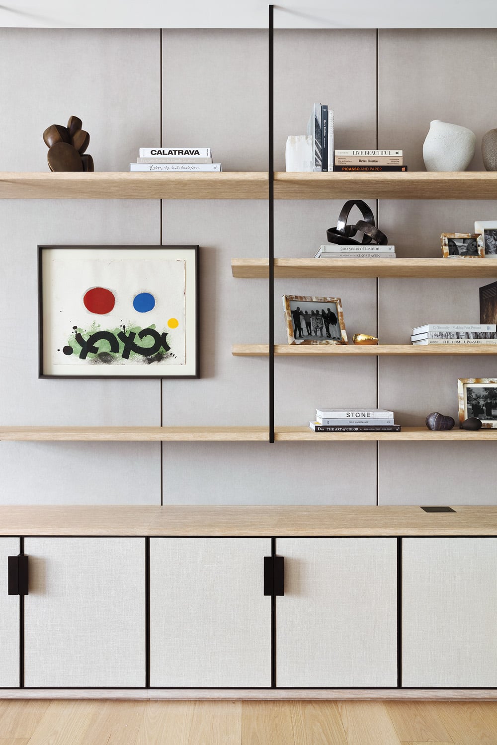
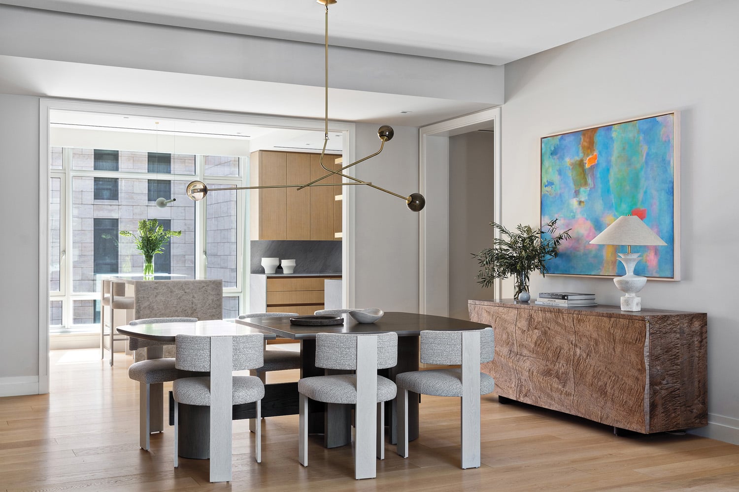
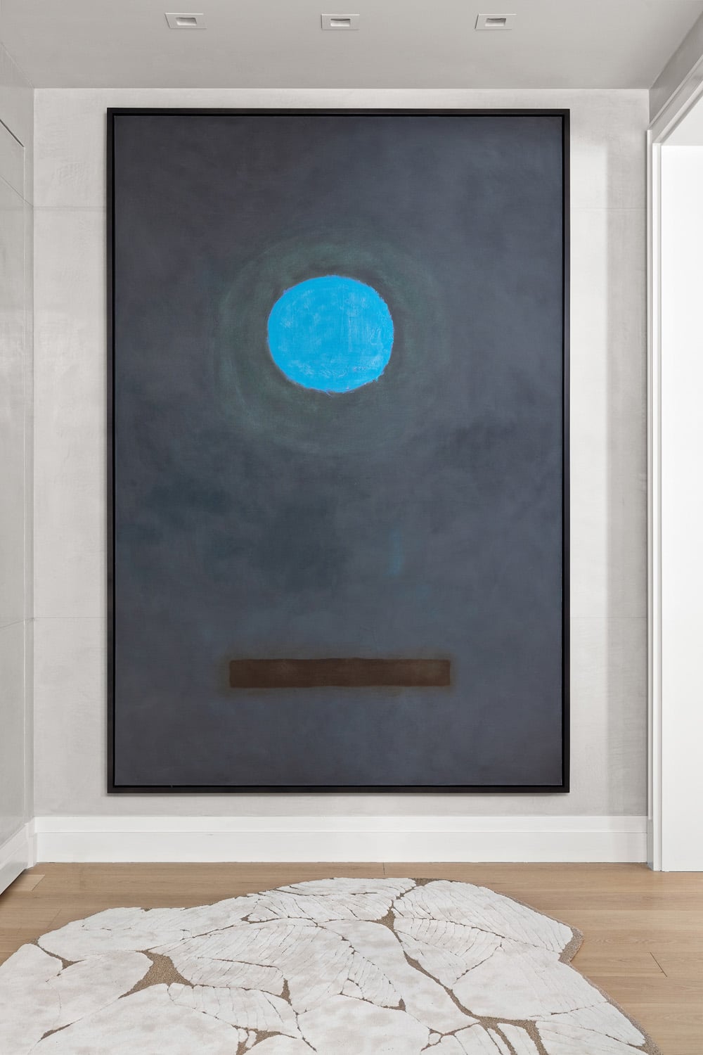
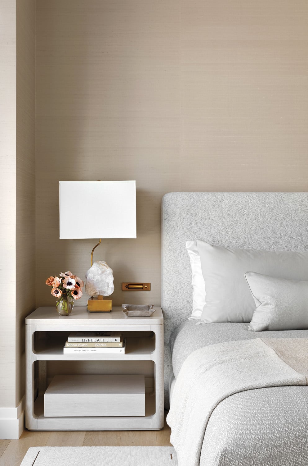
A New York Pied-à-Terre For A Fun-Loving Family
Walk through a 2,540-square-foot pied-à-terre in New York for a fun-loving family designed by Workshop/APD.
Projects
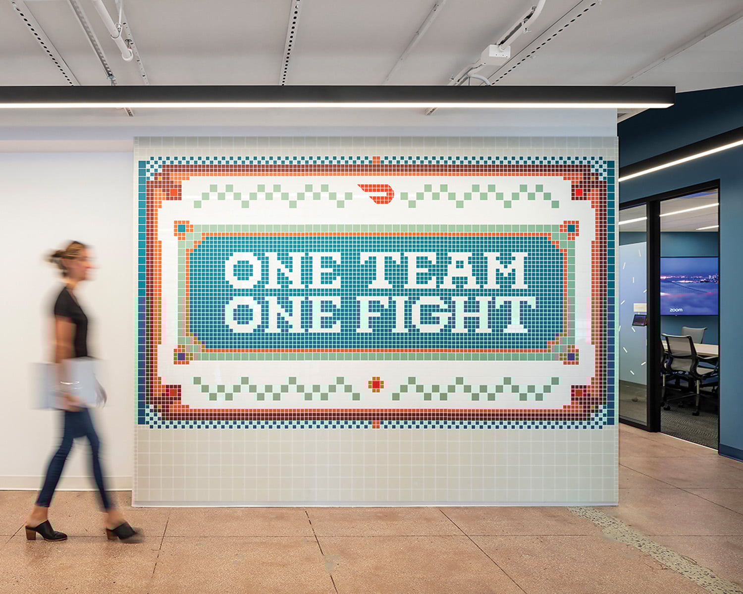
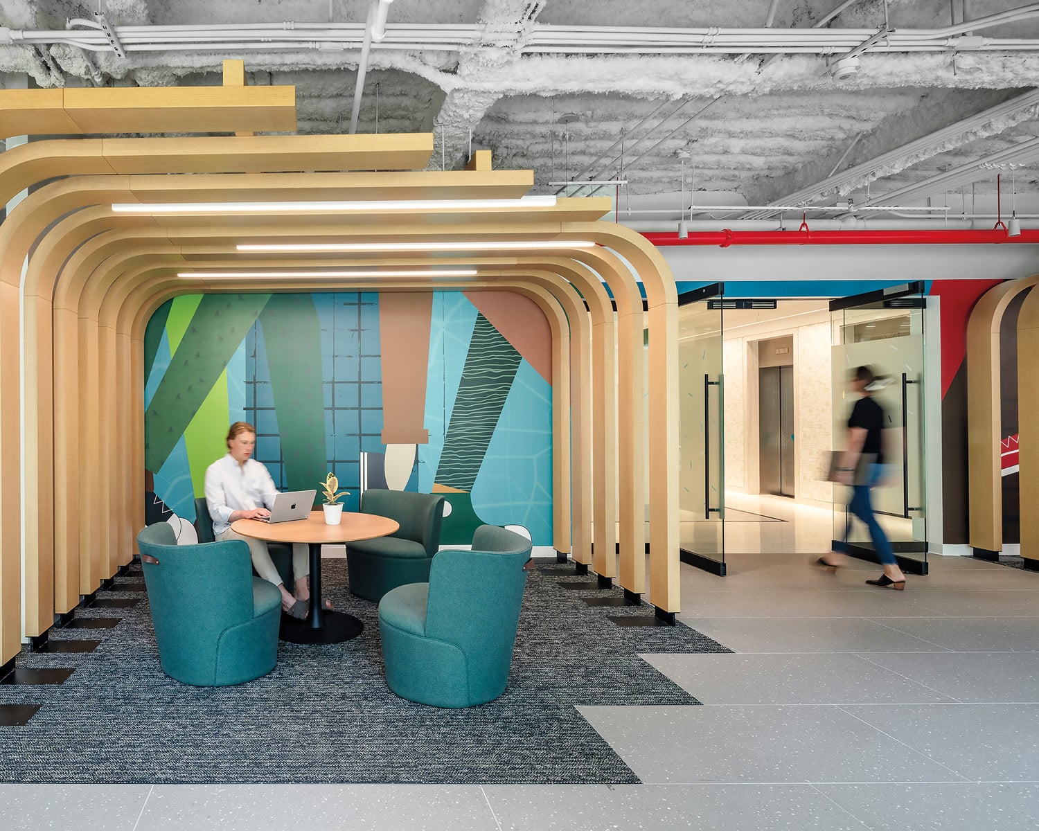
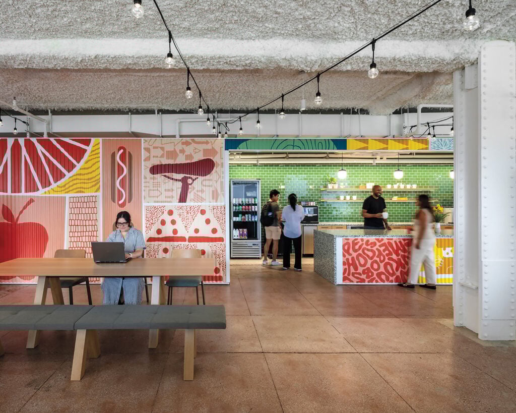
DoorDash’s New York Flagship Is Inspired By The City’s Energy
The DoorDash New York flagship, designed by HKS, was conceived as a tribute to the Big Apple’s energy, rhythm, and neighborhoods.