
10 Questions With Joël Brodovsky-Adams
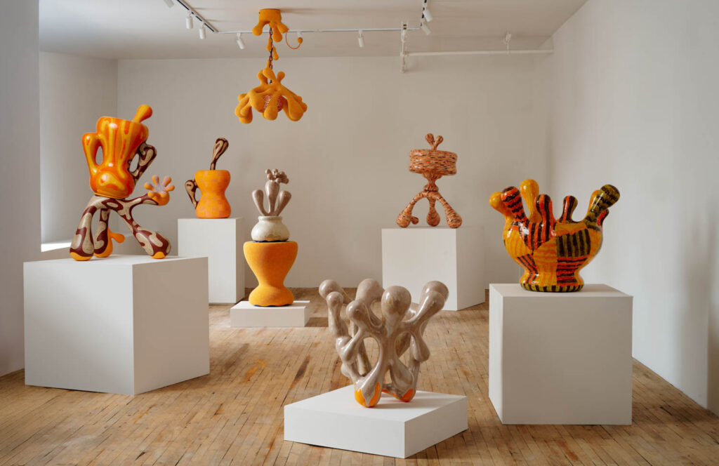
The galvanizing music of Swedish pop heroine Robyn often blasts from Joël Brodovsky-Adams’s Brooklyn studio. In fact, the Dancing On My Own singer’s euphoric beats and lyrics are quite traceable in the Canadian-born designers’s recent exhibition, “Like a Rumor,” at Superhouse gallery’s Tribeca space. The show’s vessels and lighting solutions each possess an explosive visual aura in ceramic, dressed in fiery hues of orange. From ambers to yellow-ish coral and pumpkin, the shades in Brodovsky-Adams’s objects and furniture pieces call to mind club lights veiled by smoke on the dance floor or the morning dusk after a long night-out.
Bodily and transformative, the designer’s forms pay homage to various aspects of the queer experience, from late scholar José Esteban Muñoz’s studies on malleability of the queer identity to transformative and community-building aspects of club culture.
In Conversation With Joël Brodovsky-Adams
Interior Design: Dance floor brings to mind freedom in self expression. How do you translate this aspect of the dance floor to your practice, particularly to the works on view at Superhouse?
Joël Brodovsky-Adams: Being on the dance floor, when it is good, is the ideal of flow state. It’s a moment of being really embodied, that lets you move and dance, and react to music, light, and other people without conscious thought. It’s free, improvised, unfiltered expression but what is even more thrilling is that it is something you can hone. You can learn to reach this state more readily, follow intuitions, build trust that your body will take you where you want to go.
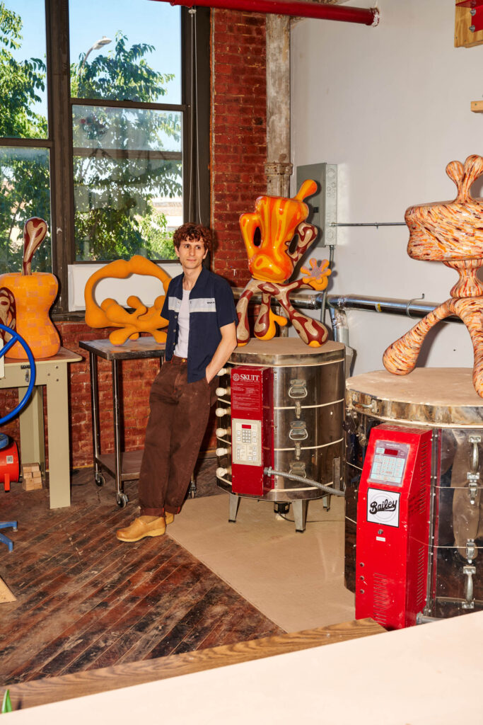
Maybe I’m laying it on a little thick but I hope it is clear that I’m not only describing the dance floor. I make some of my best work when I manage to land myself in this kind of flow state. The feeling in my studio can be remarkably close, especially when I have music blaring. The work (gossip) basket from the exhibition at Superhouse is great example of a piece that I built in that state. I had a sense of where it was going when I started but the final form was ultimately improvised.
ID: Rounded edges are a common thread. What type of parallel do you make between them and queer theory and expression?
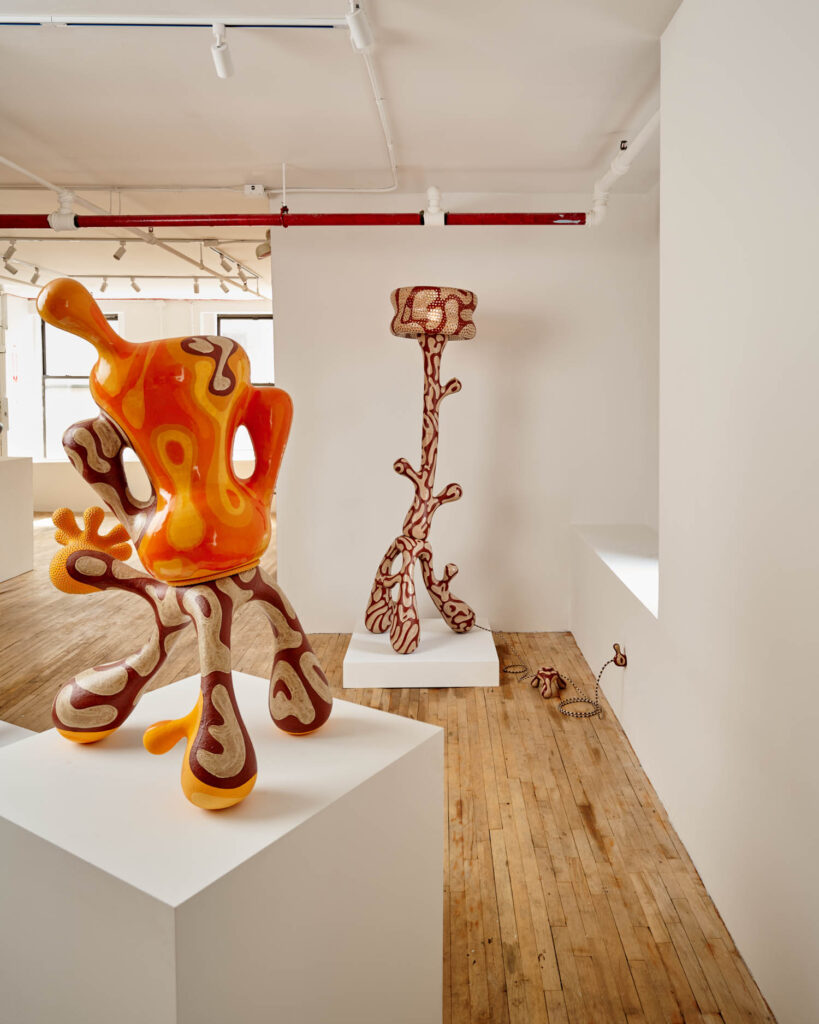
JB-A: In her book, Raving, McKenzie Wark describes the dance floor as “blending, edgeless” and this language directly informed the way I was making work. I remember reading that and thinking that I’d like to make edgeless work. It’s a pretty literal constraint I set for myself, but I think it really lent itself to my work because I use the potter’s wheel as my primary tool. I use it to make building blocks that I manipulate and assemble into larger composite forms. The wheel is an amazing tool for producing soft, rounded volumes.
ID: Queer theory always challenges the hierarchy between so-called high art and the everyday or the kitsch. How do you channel this approach in your practice?
JB-A: Artists working in craft mediums are constantly coming up against hierarchies relative to fine art and industrially manufactured products. Craft, ultimately, hasn’t been taken very seriously by popular culture. There’re all sorts of reasons for this, such as misogyny and the associations with women’s labor, economic factors that pit craft against inexpensive mass-produced products. Queerness, broadly speaking, asks us to reconsider or question social norms and value systems, so I guess this makes its way in to my practice on an existential level, which I have to believe that it is important, worthwhile, substantial to pursue and build a craft-based practice.
ID: Corporal accents are very vivid in your objects and they complicate aspects of gender and function related to the body. Could you talk about this aspect of your approach to form?
JB-A: I manage to produce a lot of these bodily qualities by abstracting the vessel forms. A bent bottle form becomes a reaching appendage and a vase becomes a torso. I work very iteratively, and repeat versions of the same form over and over, and the relationship to the body has become more and more prominent over time, but at first it wasn’t intentional. Now I feel a lot more conscious of that relationship and am actively pushing the work in that direction. Colors represent different ideas for every onlooker depending on personal journey, memories, and even how the eye sees certain colors differently.
ID: Could you talk about how you utilize colors in your work to tell a story that is subjective but also attractive for everyone?
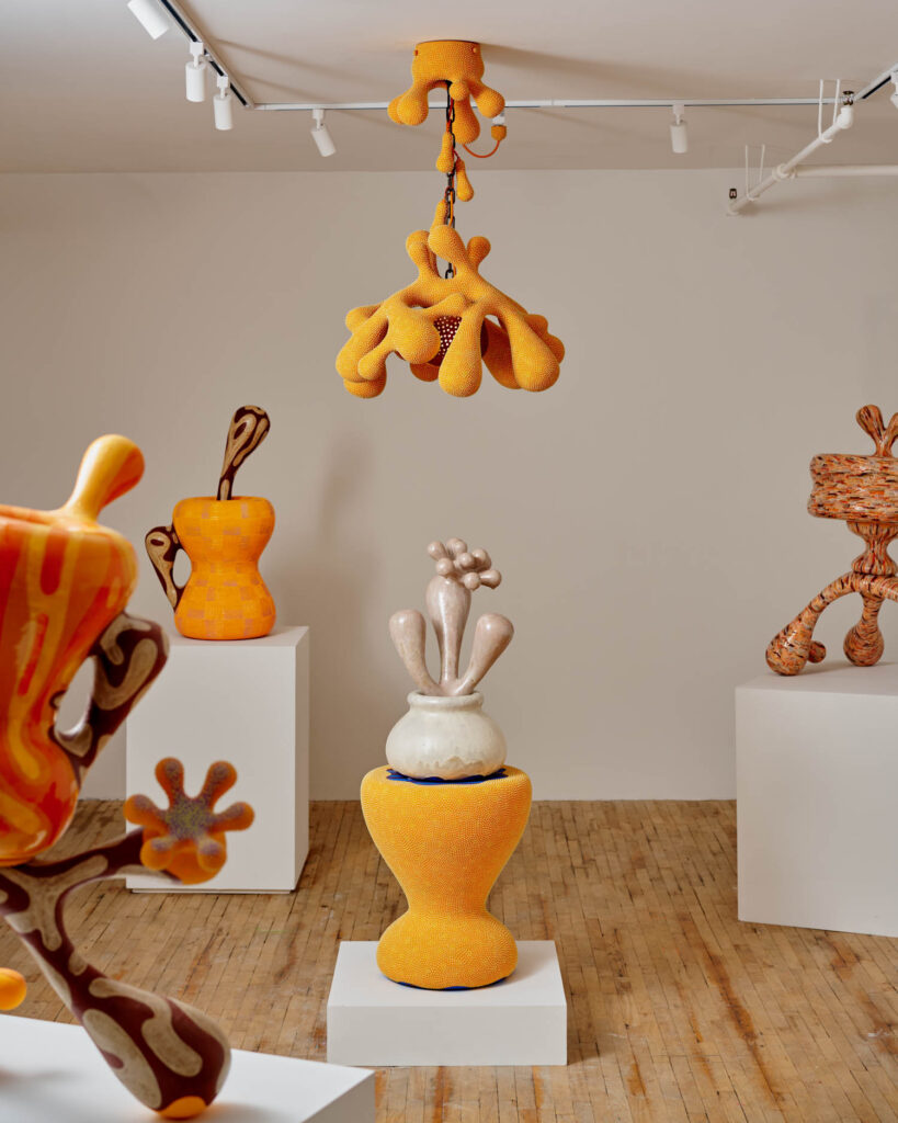
JB-A: Truthfully, I haven’t given all that much thought to the cultural and psychological implications of different colors. I chase after whatever pleases me and then run with it. I look at a lot of textile patterns and fashion as reference material. As I was preparing for this show I got a subscription to Vogue and pored over old runways to help me build the palette for the exhibition. I did a lot of glaze research to develop these surfaces, some ended up being pretty direct references to a particular piece of clothing and others sort of emerged more spontaneously from my experimenting in the studio. My aim for this body of work was to produce a feast of color and texture from a range of surfaces that felt cohesive. I don’t know that they are necessarily attractive to everyone, but they are definitely attractive to me.
ID: Orange is the dominant color in this show. Could you talk about this decision and what color signifies for you?
JB-A: The first glaze surface I made for this show was based off of a favorite orange and brown multi-tonal tank top of mine, nothing fancy, just something I bought at a thrift store in Halifax, Nova Scotia years ago. After landing on this predominantly orange surface, I decided to run with it and resolved that orange would be the anchor color of the exhibition. While I really do love orange, I think the choice was less about the color itself and more about picking a color to give the new body of work a tonal through line.
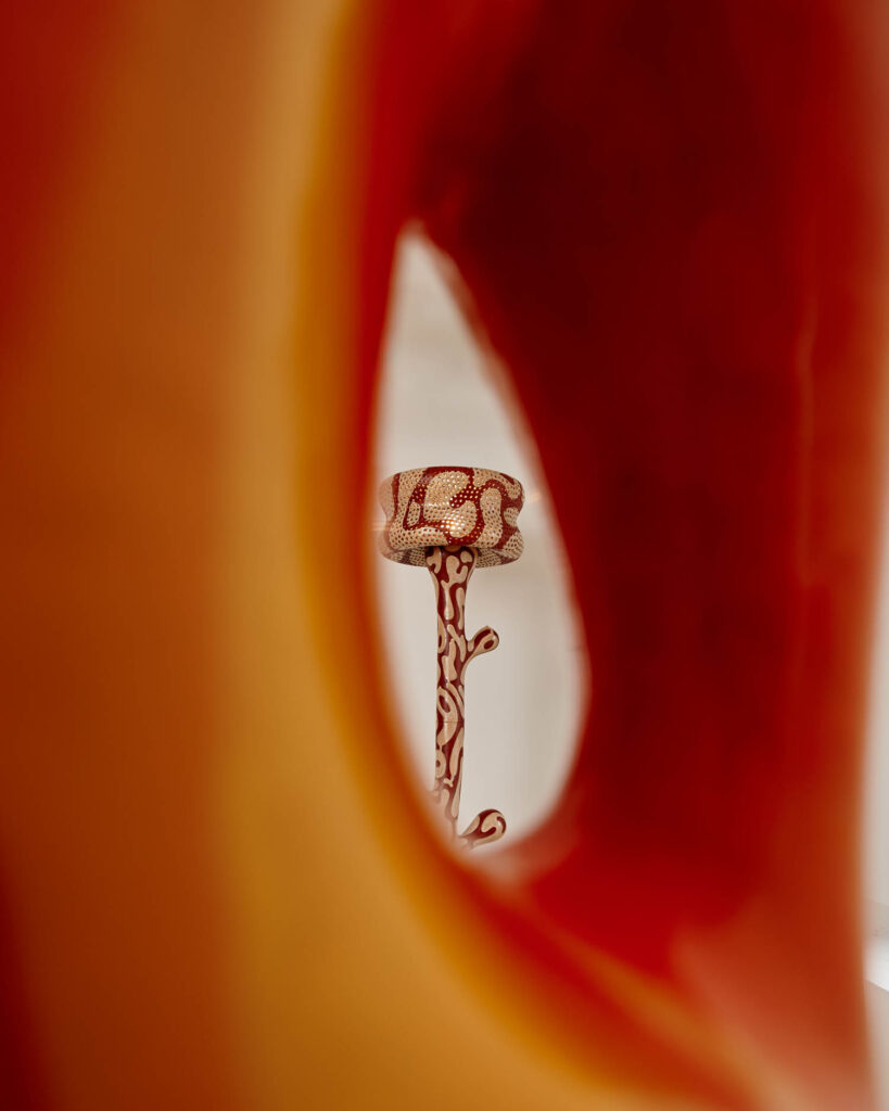
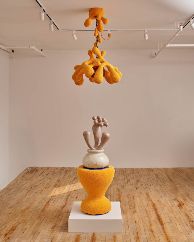
ID: A rumor is an interesting notion: it is malleable, unpredictable, oral, and very subjective. Could you talk about how these aspect translate to your objects in the show?
JB-A: Two things jump out to me as the function of a rumor relative to my work. A rumor is seductive: I make objects that I hope entice and delight people, I want people to gravitate towards them, to see what they have to reveal to you from up close. A rumor makes us skeptical: using the utilitarian object as a sculptural subject. My work asks viewers to question the limits of certain categories: jar, basket, vase, lamp. Are these objects being honest about what or who they are? Can they perform in the ways we expect them to?
ID: Some of the objects resemble certain familiar moments in life such as kissing or hugging. Could you talk about the queerness in hinting and signaling an idea or act without fully revealing it?
JB-A: This is a great opportunity to address the title of the show: “Like a Rumor” is a borrowed phrase from José Esteban Muñoz’s book, Cruising Utopia. One particular chapter really informed my thinking: Muñoz explains that queerness has a complex relationship to evidence. Evidence of queerness has been used to incriminate or discipline queer people. Maybe most importantly, evidence or proof of queer lives is often erased when we look at how our histories are kept. He explains that because of the complicated relationship to evidence in the traditional sense of the term, we need to look to something else. Munoz offers that to “prove” queerness we need to tether it to the concept of ephemera. He says to “think of ephemera as trace, the remains, the things that are left, hanging in the air like a rumor.”
He goes on to talk about gesture as this sort of ephemeral act. They’re these fleeting movements that are ultimately really deeply coded, responsible for communicating or declaring something about the self. Queer people in particular have had to rely on the communicative power of gesture. This helped me to understand that a whisper of or hinting at something, such as a kiss, a hand reaching, for example, can be really powerful, almost visceral. All of this informed the driving questions for this body of work: What does it mean to make these objects more gestural? How do I build this in to the work? I was building off of a visual vocabulary that I’d already been working on for years, but this idea of making them more gestural meant a lot of things in terms of how I was working. It meant more dramatic curves or building in components that read even more readily as body parts. I also pushed myself to work in a more improvisational way, to move away from symmetry, to make objects that felt really animated.
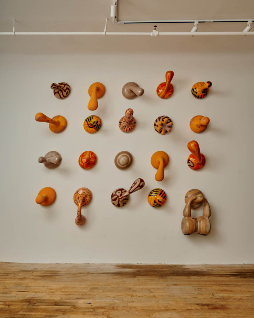
ID: There is an invitation to playfulness in your work. Could you talk about this aspect of your practice, especially as a way of challenging industry expectations of function?
JB-A: I’m not sure I really have an answer to how this challenges industry expectations. There is totally a sense of play and levity in my work, and I hope people feel that when they see it. It’s funny because while the finished objects are these really playful things, they take a huge amount of time and labour to produce, and I take that part very seriously. I’m very committed to honing this craft and understanding this material deeply. This makes me think of Dolly Parton saying “it costs a lot of money to look this cheap.” She’s sort of the North Star of rigorous playfulness.
ID: How has your relationship with the wheel has transformed over the years?
JB-A: I’ve been working at the wheel since 2013, and I spent the first six years producing small batches of table ware. It wasn’t until 2019 that I started exploring using the wheel to produce larger scale vessels and eventually as a tool to produce more sculptural objects. The wheel has always been the cornerstone of my practice. In the past, pieces would often be made start finish through that process. Now I think of it more as a starting point—is it the tool I use to produce building blocks that I then assemble off the wheel.
read more
DesignWire
13 Highlights Spotted At Design Week Lagos 2026
From dome-shaped installations to architecture-infused fashion designs, take a look at notable works spotted at Design Week Lagos 2026.
DesignWire
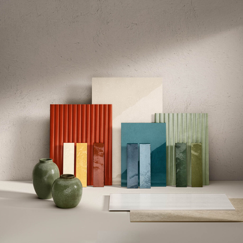
Cersaie 2026 Reveals The Next Evolution Of Tile Design
From sculptural 3D textures to oversized slabs, this year’s Cersaie showcased the latest innovations shaping the future of tile and bath design.