
June 18, 2026
Tekla Evelina Severin On The Power Of Color In Architecture And Design
Tekla Evelina Severin plays with color very seriously. Since she began posting small vignettes curated from her then-employer’s material library to Instagram in the platform’s early days, the Swedish multidisciplinary designer and self-proclaimed “colorist” has amassed almost a quarter million followers. Today, under the moniker Teklan, she collaborates with major brands at home and abroad on everything from installations and interior architecture to art direction and product design. Her collection for homeware giant IKEA, for example, involved working closely with the company’s product team on a portfolio of everyday electronics, including Bluetooth speakers and cables, that pair bold hues and simple geometries.
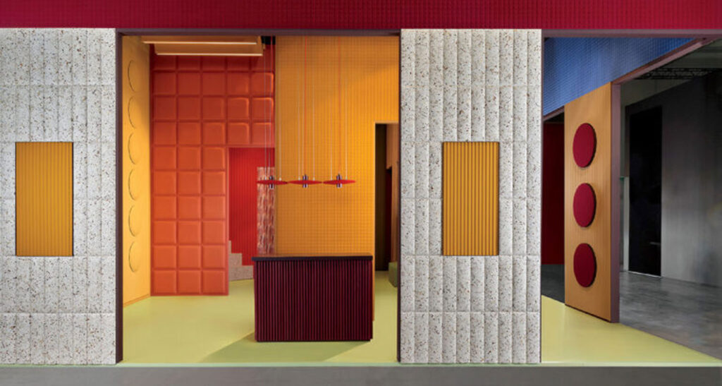
At this year’s Salone del Mobile in Milan, Severin created a booth for the Italian acoustic systems company Slalom. Having devised a fresh, mineral-toned palette similar to wall paint for the rectangular sound-absorbing panels, she treated them like architectural elements, overlapping, contrasting, and framing the different shades and gridded textures in an installation she called “Soft Cubism,” which blurred the two- and three-dimensional, reconstructing the visual experience. Severin continues this visual language for Slalom’s new Chicago showroom in the Mart, which opened during NeoCon. Working alongside Gensler, she has introduced multifunctional spatial dividers and an array of furniture—all in carefully selected colors, of course—to break up the space and create more rhythm, depth, and layering within the constraints of the existing structure.
Severin’s approach to color revolves around its neurological and psychological benefits, understanding how different tones can affect our moods and emotions, and how combinations can shift our experience of a space. She draws from historical references as well as the world around her, even scanning quotidian objects such as a bar of soap in her grandparents’ home to find the perfect shade of mint green for application elsewhere. In this interview, Severin discusses recent and upcoming projects, and also reveals her personal favorite color.
In Conversation With Tekla Evelina Severin
-
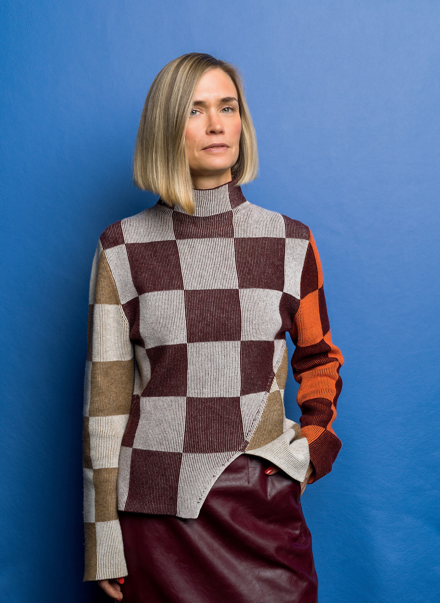
The founder of Swedish multidisciplinary practice Teklan Studio, backdropped by one of her new colors for the leather brand Elmo, wearing an asymmetrical sweater by Danish fashion designer Stine Goya—two Scandinavians who share a mastery of color and geometry. Photography by Björn Ceder. -
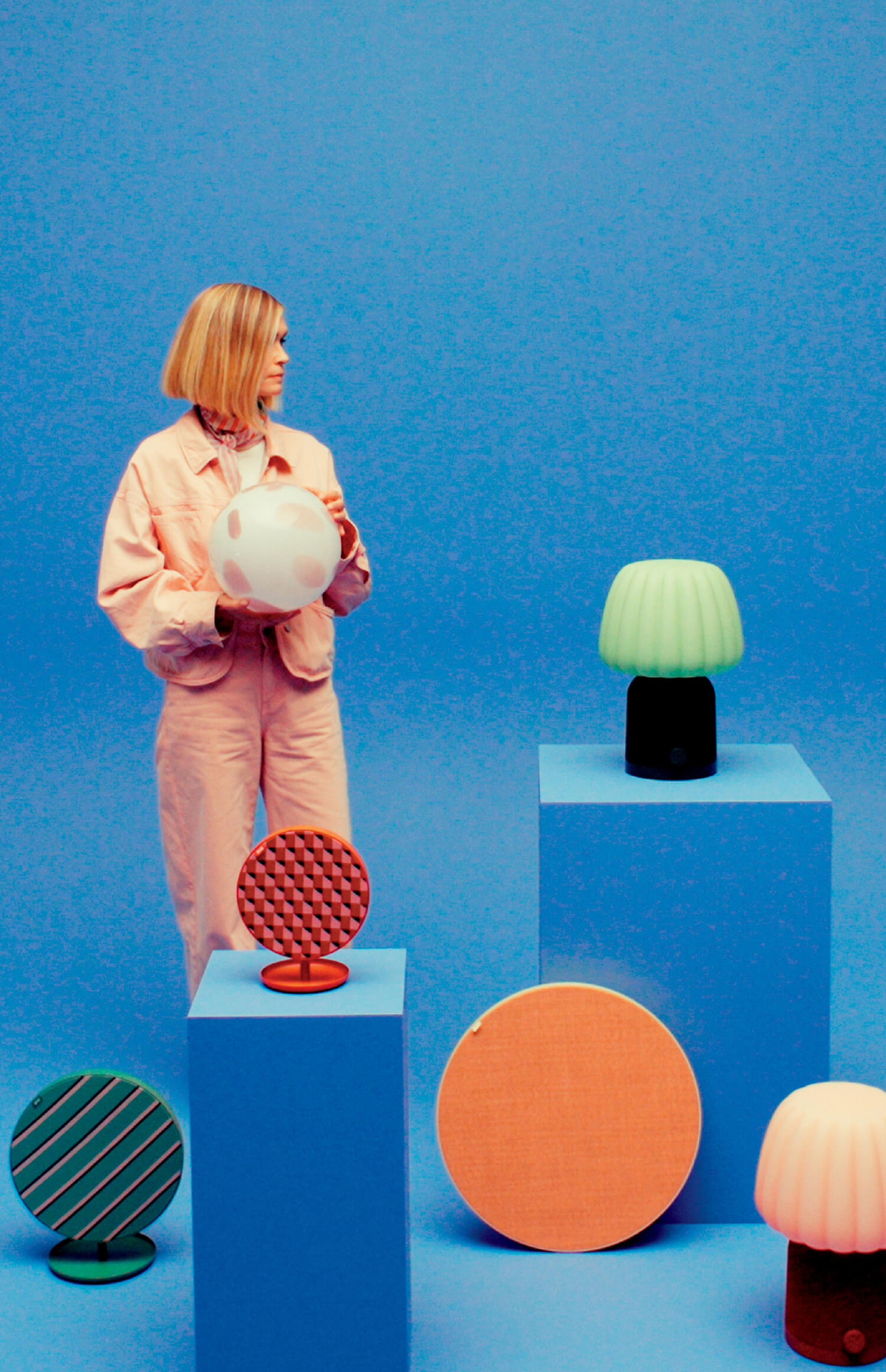
The designer holding her Fado table lamp, surrounded by Solskydd disk-shaped Bluetooth speakers and Kulglass speaker lamps, their shades inspired by soft-serve ice cream—all for IKEA, 2025. Photography Courtesy of Ikea. -
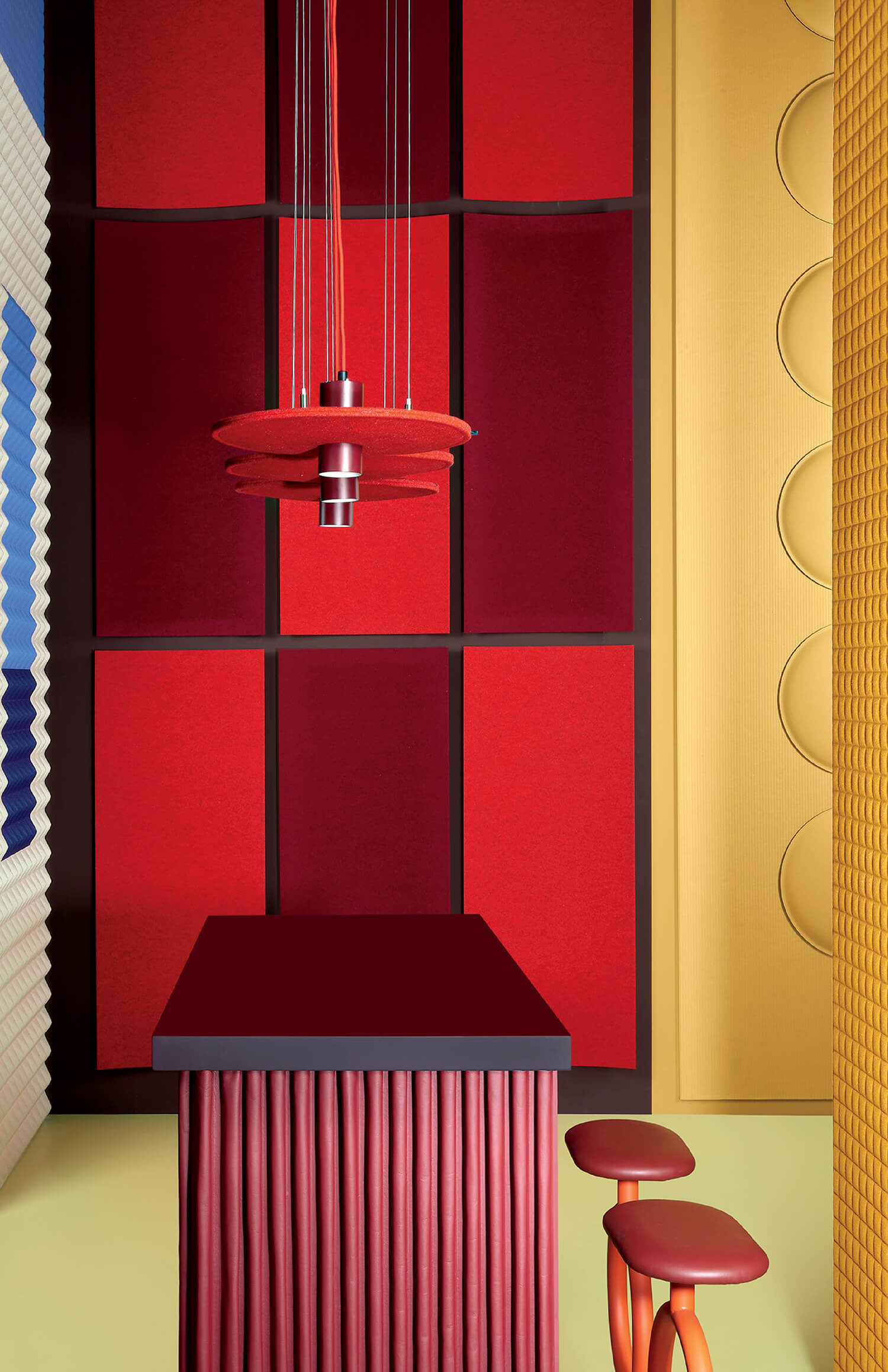
Playing with the grids and rectangularity of the Slalom sound-absorbing panels to produce the installation’s three-dimensional cubist vibe. Photography by Maria Teresa Furnari. -
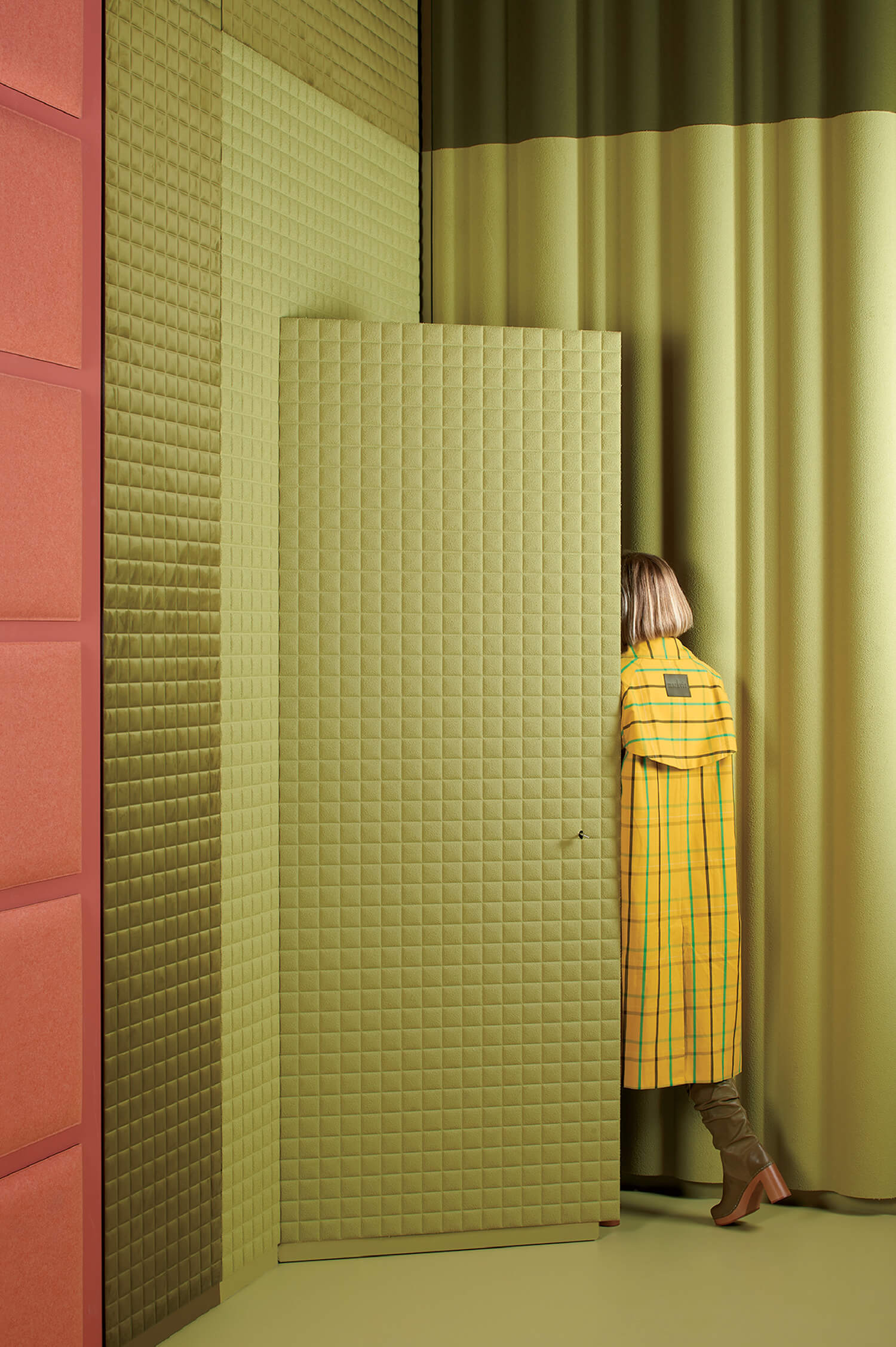
Severin in her “Soft Cubism” booth for the Italian acoustic systems company Slalom at Salone del Mobile 2026 in Milan. Photography by Maria Teresa Furnari.
Interior Design: To start, can you tell us about your background and practice?
Tekla Evelina Severin: At my core, I’m an interior architect, but I work in a multidisciplinary way across interiors, materials, design, and visual concepts. First and foremost, I call myself a colorist, because color is the most defining aspect of my work, regardless of the project. I launched my studio 11 years ago, initially as a creative outlet at a time when neutral, New York loft–style interiors dominated Scandinavia. My architecture office at the time had a material library from which I started making colorful still lifes for myself, posting them on early Instagram, and then gradually moved into freelance set design, photography, and eventually interiors again.
ID: How do you think color impacts spaces and people? Do you have a favorite?
TES: Color is the most powerful visual tool we have because it creates an immediate emotional effect, yet it’s incredibly complex and relative. It changes depending on light, surrounding tones, culture, and personal experience. I think modern interiors—especially offices and residential—have become too efficient and overly neutral, often at the expense of well-being. Studies show we feel most comfortable in nuanced environments with variation and richness. That is why I believe thoughtful use of color matters so much: It shapes how we feel and experience space on an instinctive level. People often ask for my favorite color, and I always return to peach. It has the softness of pink and the energy of orange, which I love. But ultimately, I believe every color can work, depending on the context. No one is inherently right or wrong.
-
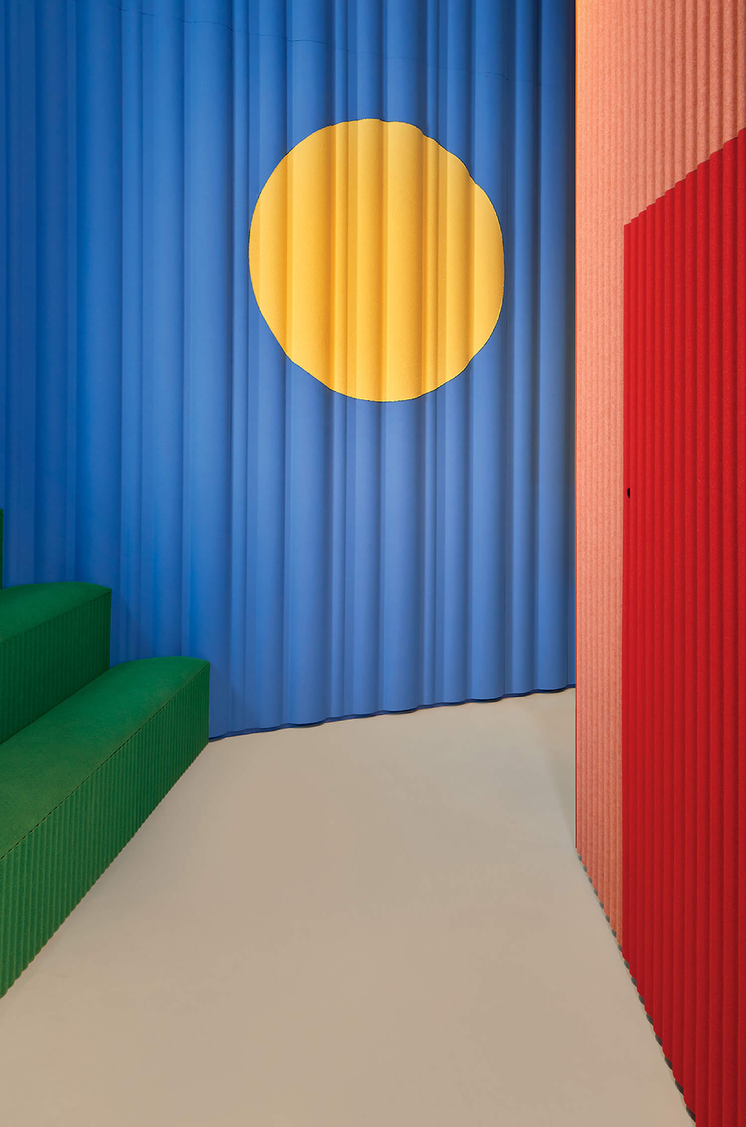
“A Box within a Box,” another installation for Slalom, at the 2025 Stockholm Furniture Fair. Photography by Maria Teresa Furnari. -
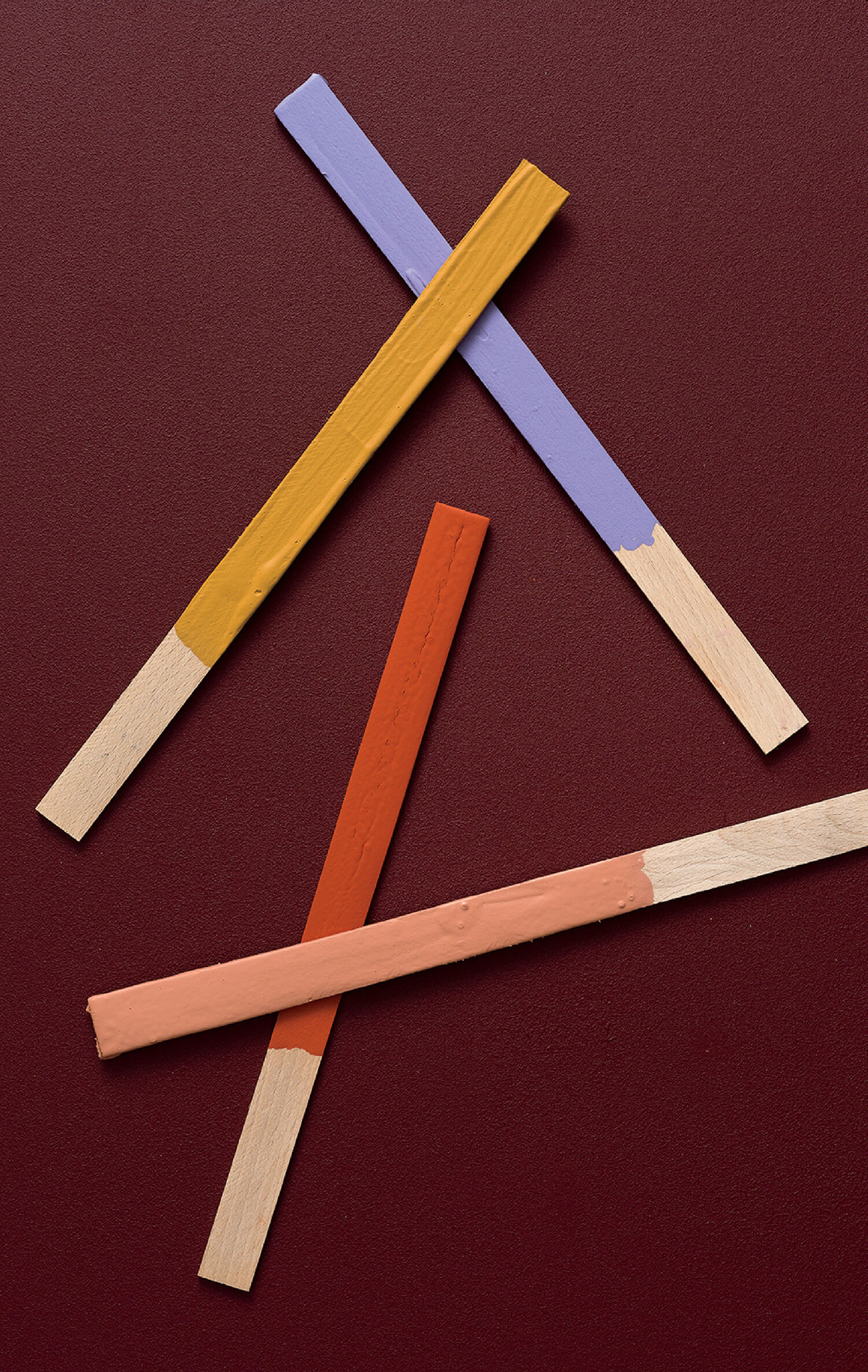
Developing the new palette for the Slalom panels. Photography by Björn Ceder. -
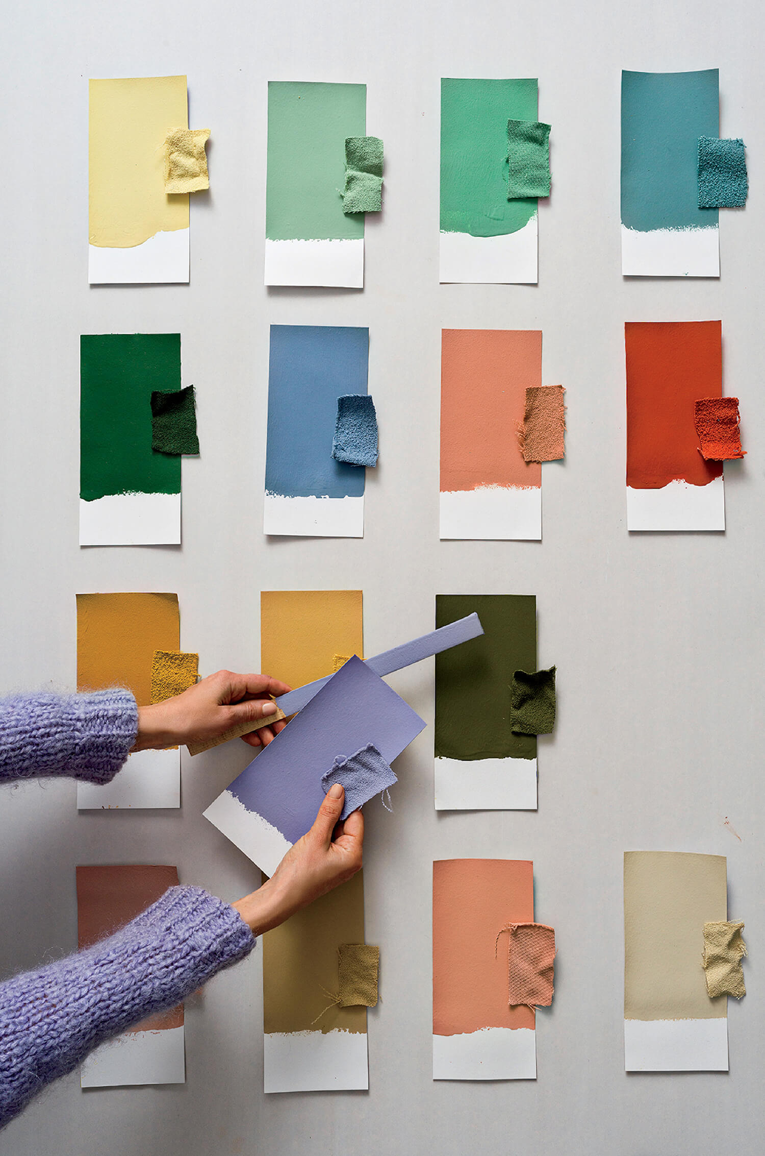
Developing the new palette for the Slalom panels. Photography by Björn Ceder. -
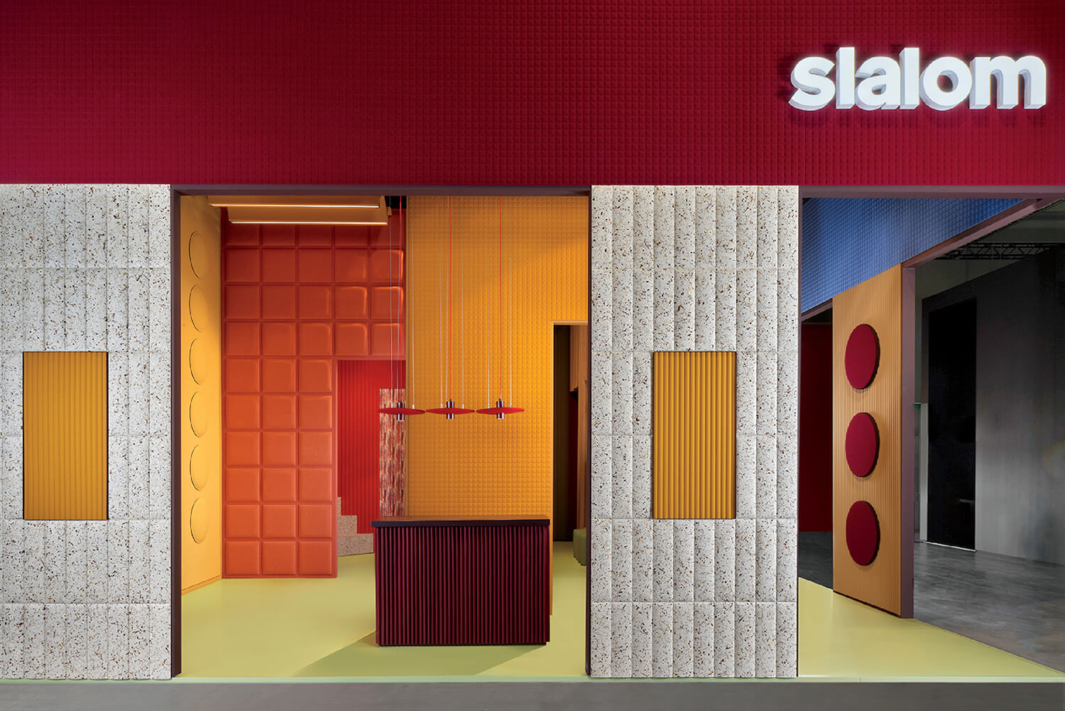
The mineral-toned colors, deliberately evoking a wall paint–like quality. Photography by Maria Teresa Furnari.
ID: How did your collection for Slalom develop?
TES: I wanted to explore tone-on-tone combinations in a way that felt harmonious but still nuanced. The collection includes muted buttery yellows, ochres, lavenders, olives, and sky blues, all designed to work softly together. We developed different versions for materials including Trevira, bouclé, and PET felt, each of which behaves differently with color. We also experimented with combining two colors in a single material. The goal was to create a palette that feels calm and cohesive, while still offering richness and depth.
ID: And how did you present it in Milan?
TES: The “Soft Cubism” installation grew from the square molded panels being launched alongside the collection. I began thinking about cubes, facades, and modular architectural systems. I wanted visitors’ perception of the booth to shift as they moved through it, with changing colors and layered frames creating optical illusions. Repeating structures in different colors introduced a playful tension between two- and three-dimensional space. I often work with this sense of visual ambiguity, and here it helped emphasize the architectural qualities of the materials and the softness of the collection itself.
ID: You’ve also designed Slalom’s new showroom in Chicago’s Mart. How does this space compare?
TES: It builds on similar ideas, but within more constraints. I joined the project quite late, and because it’s in an historic building, there were many restrictions and technical considerations. Gensler had already completed the main structure, so my role was to create greater depth and rhythm within a fairly straightforward layout. I introduced spatial dividers that also function as shelving, experimented with framing effects, and designed textured furniture pieces. It’s really about creating more dimension and visual movement within the limitations of the space.
-
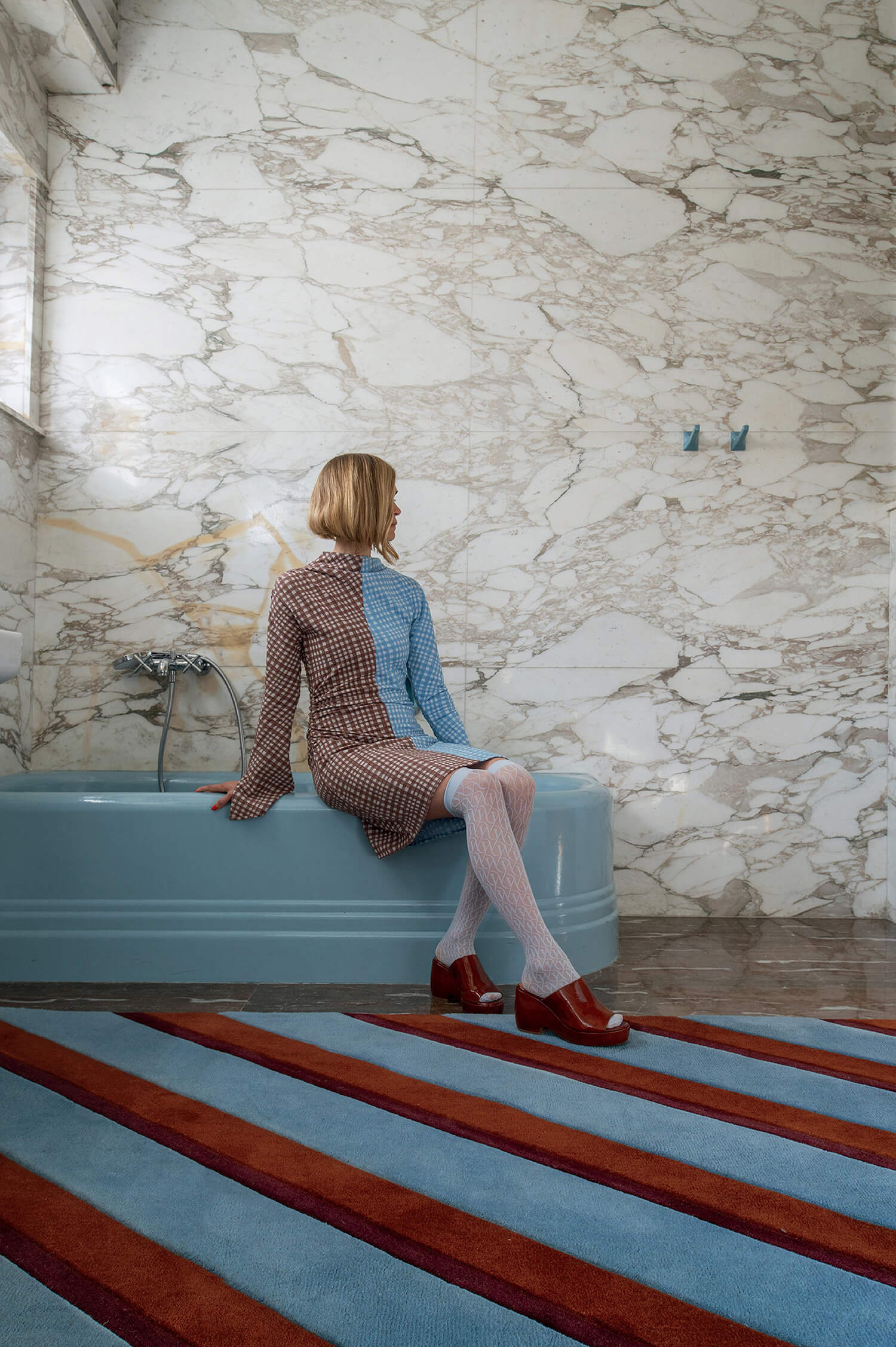
Shot in a bathroom at Vila Volman, a restored 1938 functionalist masterpiece in the Czech Republic, a Diagonal wool rug in Sky from Teklan’s second collection for the Stockholm studio Layered, 2025. Photography by Andy Liffner. -
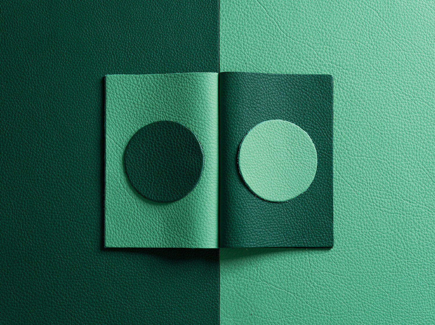
For leather brand Elmo, two new shades from the 2025 refresh of the Elmonordic collection’s 30-color palette. Photography by Björn Ceder. -
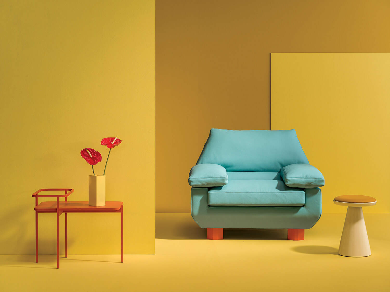
A set design for the launch of the leather collection incorporating Sancal furniture, including a DB armchair upholstered in a new color and other pieces from the Spanish furniture maker in complementary colors. Photography by Björn Ceder. -
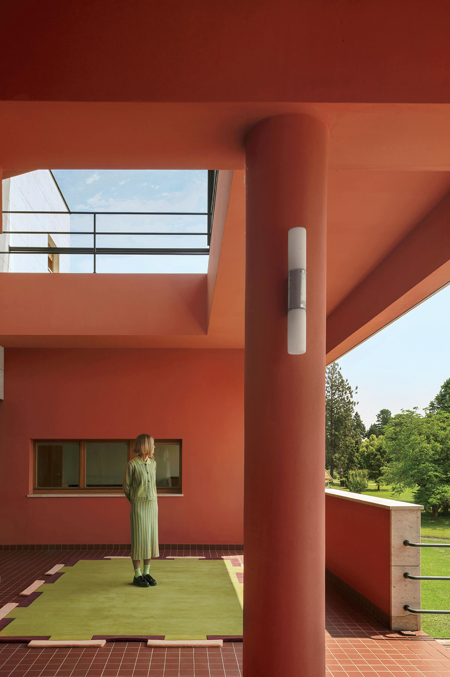
Also at Vila Volman, a Fregio rug in Olive Blush from the Layered collection. Photography by Andy Liffner.
ID: Tell us about your recent collaboration with IKEA.
TES: I worked on home electronics, including lighting and sound products, approaching them from an interior perspective. My goal was for those items to feel less like technology and more like objects with character, even when switched off. I often describe my approach as combining something flirty with something dirty—so, balancing soft pastels with earthier tones to avoid feeling overly sweet. Nostalgia also played a role in the collection; for one mint shade, for example, I referenced soap from my grandparents’ bathroom and actually scanned the color to recreate that feeling.
ID: And how about your work with Swedish furniture brand Johanson?
TES: Johanson approached me to rethink existing furniture pieces and reimagine them for the future. I became interested in what futurism means today. Rather than sleek Space Age visions, I think contemporary futurism is about tactility, craft, and texture, so I created a central shade called Neo Pistachio. I also worked a lot with contrast, pairing high-gloss metallic finishes with heavily textured walls. The painters hated me for it because the surfaces were so detailed, almost sandy in texture. But contrast is essential. Every good space should contain tension.
read more
DesignWire
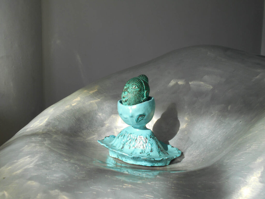
10 Questions With… Sculptor Aminata Mboup
Aminata Mboup discusses her practice, inspirations, fluidity between disciplines, as well as her unique approach to materials.
DesignWire
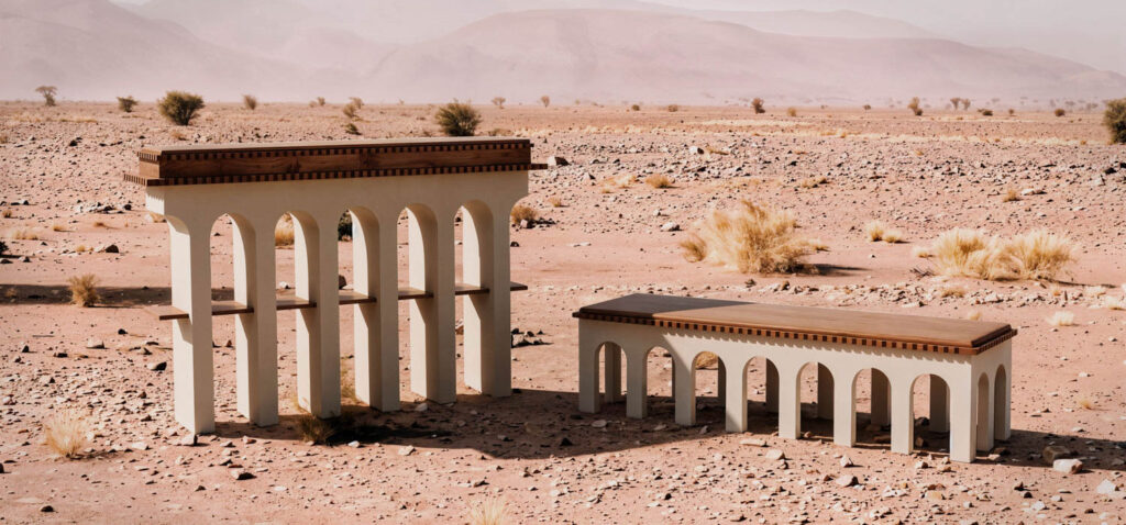
10 Highlights From Amman Design Week
Amman Design Week 2026 gathers a host of regional designers and architects under the theme ‘Accumulations.’
DesignWire
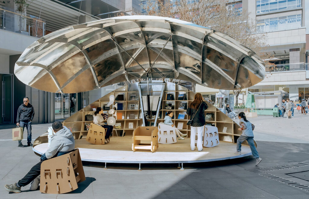
Beijing’s Fountain Plaza Welcomes A Futuristic Book Pavilion
Luo Architects’ Shell Book Pavilion in Beijing transforms collective reading into an experience with a biomorphic aluminum form that opens to reveal shelves of books.
- No tags selected