Art Deco Typography Inspires The Look of This Tile Collection
New Jersey–based visual artist Lisa Hunt is known for her graphic collages and screen prints, but for her first tile collection, Asha, she revisited typography, which she studied at Pratt Institute. “I’ve always been inspired by the art deco period and the fonts of that time,” Hunt says. Eight years ago, she started designing a pattern with the word “love,” and it’s now one of her five stoneware relief tiles for Ann Sacks. Arrows Right, Arrows Left, and Arrows reimagine a 2018 triptych print in 3D. Pomegranate, a simplified graphic of the cut fruit, also reflects earlier artworks. “My past work has heightened how fundamental yet effective a stroke, shape, or symbol can be when expressing yourself,” she says. All of the tiles are handmade in Portland, Oregon, and come in six glazes based on colors Hunt frequently uses in her work.


read more

Products
Clarence House Draws on Seminal Art and Architecture Movements in New Collection
Clarence House’s spring collection, 20th Century, brings together the art and architecture movements of the modern era into textiles.
Products
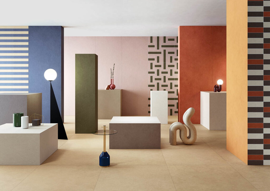
Must-See Tile and Stone Designs From Coverings 2023
Graphic takes dominated Coverings, the ceramic-tile and natural-stone conference. See the latest trends in tile design in these highlights from the show.

Products
Pigment Penetrates These Ultra-Thin Porcelain Tiles
Inspired by the chroma-centric work of several artists, architect Ferruccio Laviani created Pigmenti: ultra-thin porcelain tiles in a range of hues.
recent stories
Products
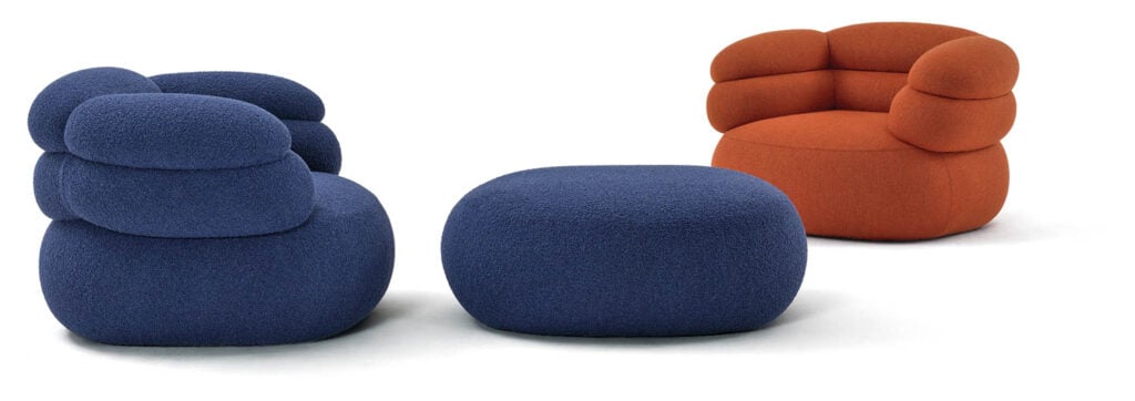
Johnston Marklee Expands Biboni Collection For Knoll
The expanded Biboni collection from Johnston Marklee builds on the success of its original seating line for Knoll with new sculptural pieces.
Products
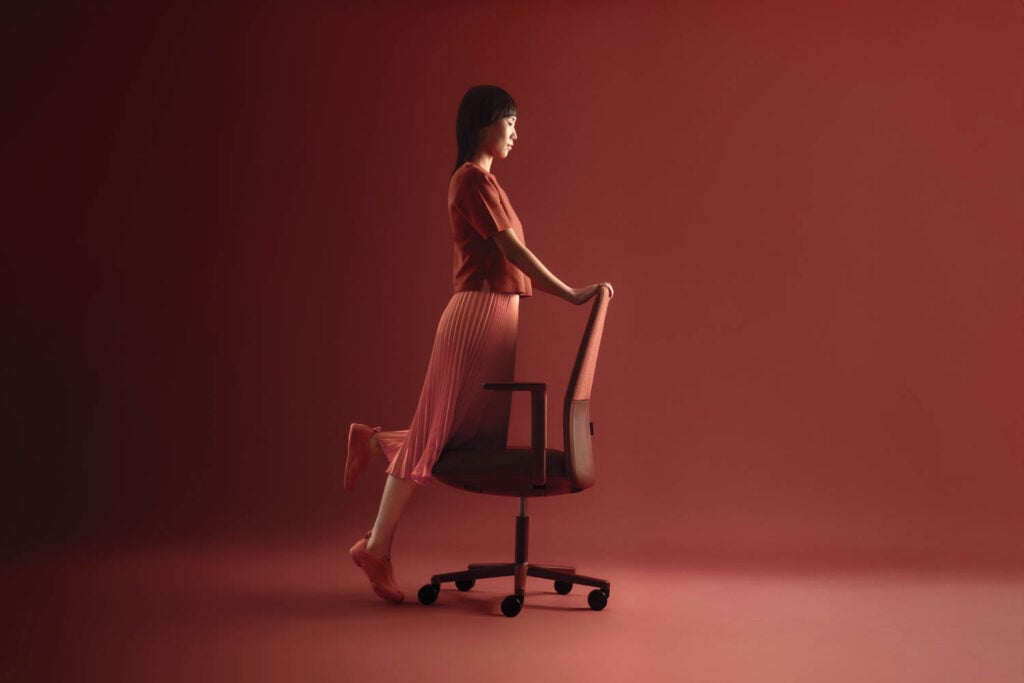
This Innovative Task Chair Responds To Body Posture
Velo, by London-based studio Layer, is engineered with a weight-activated mechanism that responds to posture and flexes accordingly .
Products
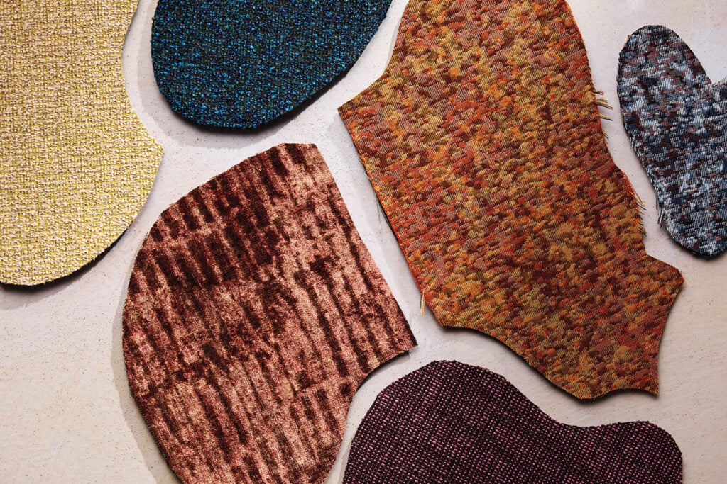
The Artist’s Way: Liam Lee Debuts Upholstery Collection With HBF Textiles
New York artist Liam Lee captures the evanescent quality of his original tapestries in his upholstery textile debut in collaboration with HBF Textiles.