Bold Hues Set the Stage for This Bakery by Day, Club by Night
Whether stopping by for a morning pastry or enjoying a drink after nightfall, this fun, multi-use spot has something for everyone. Pastry shop by day; club by night—that’s the clever combination found inside Pastry Club Woda. With interiors by Znamy Się, bold hues interplay with creative textures, creating a space that honors the building’s history while generating a modern concept.
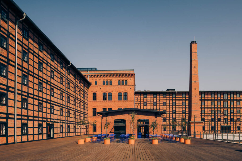
The shop is situated within the historic Rother’s Mill complex on Mill Island in Bydogszcz, Poland, a thriving community gathering spot. Designers landed on the curious combo of pastry/nightclub given the locale’s around-the-clock appeal, serving as both a concert venue in the evenings and a daytime destination for families.
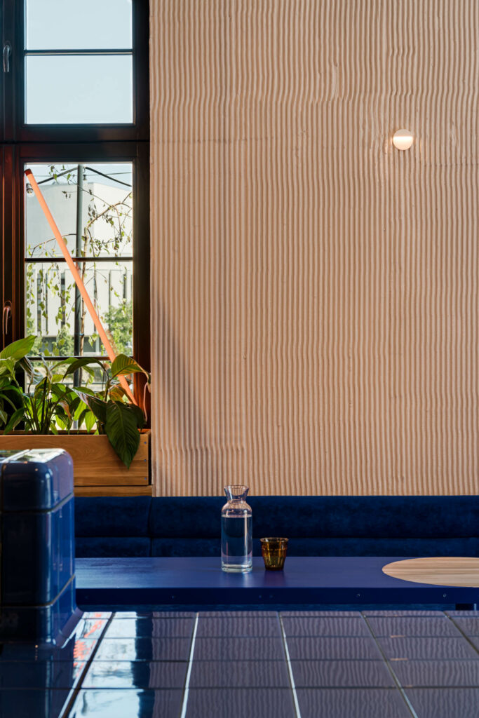
Inside a former boiler house within the complex, Pastry Club Woda was born. “We created the interior as an idea of the whole complex, where flour was produced, but the boiler house is at the heart of it,” says Aleksandra Majdzik, owner and architect, Znamy Się. Today, Pastry Club Woda is the only place in the complex still producing consumable goods but the interiors hint at its roots. Designers referenced the building’s flour-making past through distinct, vertical grooves within the plaster walls, which nod to the texture of raked grain after going through the millstone.
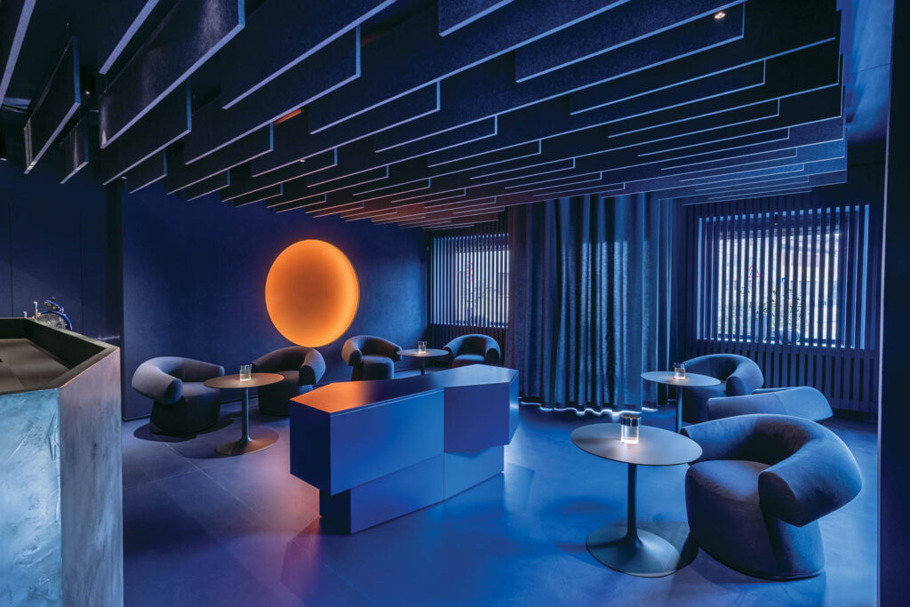
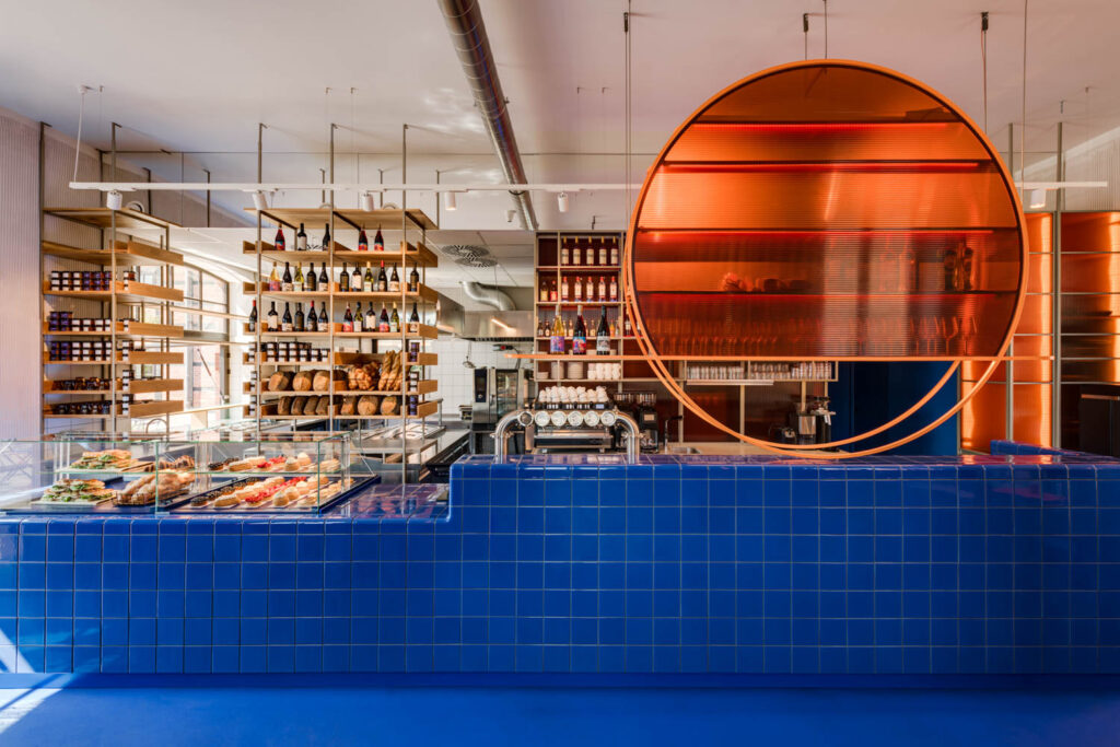
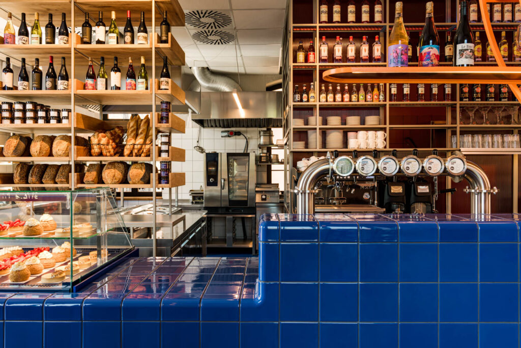
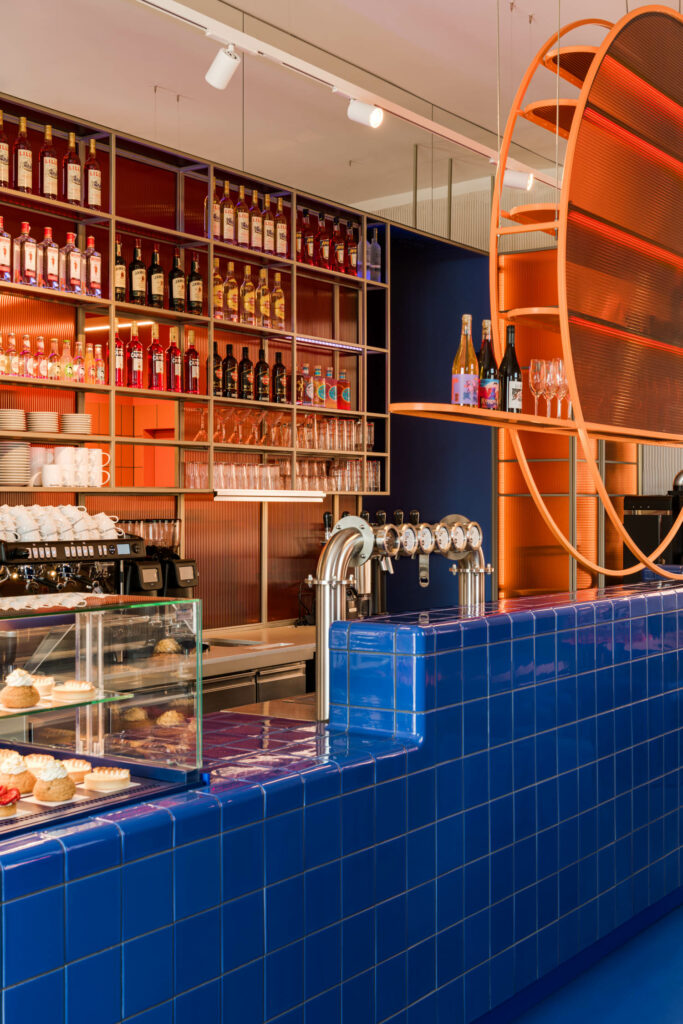
To showcase the daily work of Pastry Club Woda, the space features an open concept kitchen, enabling customers to see the complete production process, from bread being baked to goodies lining the shelves. Not to mention baking equipment and steel elements visible throughout. A striking combination of cobalt blue and sunny orange balances the steel accents. Cobalt was chosen for its likeness to water, which is referenced in the shop name (woda means water in Polish). Fitting, given the island locale and that water is a critical component of flour production. The color also gives a subtle nod to the designers’ connection to the Pastry Club’s owners. “This color was used as a very important detail in the owner’s first restaurant, which we also designed. It comes from old flour sacks, the ones with blue stripes.”
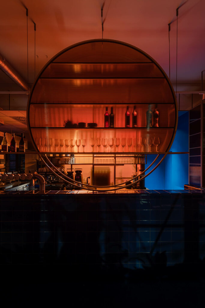
The other primary hue, orange, signals the transition from day to night. For Majdzik, the color exemplifies warmth and vibrancy, think a setting sun before a night on the town or an aperol spritz by the sea. The orange-tinted glass wheel atop the bakery’s counter includes horizontal details, an homage to sundown. Together, the bold colors signal the meeting of two energies—day and night, light and dark, morning bakery and late night party joint.
Inside Pastry Club Woda, a Hybrid Space Serving Sweet Treats

read more
Projects
6 New Eateries With Innovative Designs
Sustainable materials, algorithm-devised patterns, and sunsetlike lighting are some of the design-forward ingredients on the menu at these new eateries.
Projects
This Austin Nightclub Embraces Disco Era Design
Superstition, a new nightclub in Austin, harkens back to disco decadence with interiors swathed in 1970s design motifs thanks to Casa Metta.
Projects
15 Restaurant, Bar, and Cafe Interior Designs
We’ve rounded up 15 restaurant bar and cafe interior designs that welcome foodies and newbies alike. Explore the colorful designs in these eateries.
recent stories
Projects
Studios Architecture Rethinks Post-Pandemic Workplace Design for a New Era of Flexibility
FTI Consulting, Chicago
Projects
A Homestead Turned Vacation Compound In The Czech Republic
On an isolated plot in the Ore Mountains of the Czech Republic, a once-abandoned homestead is brought back to life as a glowing vacation compound.
Projects
A Futuristic Showroom Elevates A Popular Clothing Brand In China
For Progen Group, China’s premier manufacturer of business attire, Greater Dog Architects has fashioned a Ningbo gallery and showroom that’s precise, formal, and forward-thinking.
