Cersaie Celebrates its 40th Anniversary in Bologna, Italy
Cersaie, the International Exhibition of Ceramic Tiles and Bathroom Furnishings, recently closed its 40th edition with much to celebrate. Numbers first. Visitor attendance was up. Roughly 100,000 international guests, an almost nine percent increase, came to explore the latest artistic and technical offerings from 353 exhibitors in the ceramic tile sector. There was plenty to see. Ceramic and porcelain offer a blank slate for manufacturers and designers to present not only sustainable and durable alternatives to wood and stone as dead ringers, but graphics and creations of their own. We are often asked, after all this time haven’t you seen it all? To which we respond: Do we ever tire of viewing art, analogously presented on the blank slate of canvas?
Introductions initially catching our eye were those suggesting optimism and a sense of play. Channel that to a bright chromatic story and even a throwback to old-school video gaming as seen at Gruppo Bardelli S.p.A. Industrial Group and big color blocks at Glocal. Tying into design’s increasingly popular maker’s movement were hand-painted ceramics, especially those from Cersarda on Sardinia’s Costa Smeralda and Francesco de Maio from that other famed vacation draw, the Amalfi coast. At the opposite end of the spectrum were pastels, particularly striking as pinks and blue grays imparting otherworldly tones to onyx. Our friend and INTERIOR DESIGN Hall of Famer Piero Lissoni developed an entire dusky-toned palette, Boost, for Atlas Concorde also presenting Diamond, a bold black and white modular graphic by Zaha Hadid Architects. Cersaie’s roll call of other top-name designers included Paola Navone (another Hall of Fame alum), Nendo, and Ferruccio Laviani.
Whooping-sized slabs and technology creating seemingly soft, silky surfaces as counterpoint to their hard stone looks comprised Cersaie’s other big news. The latter likely suggested cocooning. Without question, though, standouts were Refin’s Cera, its molten wax-like face derived from digital imagery of melting candles and Flaviker’s Drape. Floor-to-ceiling panels of flowing, quasi 3-D curtains begged to be touched to determine the truth.
Of course, sustainability efforts also were on full display. Addressing abatement, emissions, circularity, and dematerialization, sustainability constituted an ever-present underlying theme. As one booth proudly proclaimed: lighter, leaner, greener. An apt mantra for the show.
For those who couldn’t make it, take our visual tour, and make plans for Cersaie 2024, September 23 to 27 in Bologna.
Highlights from Cersaie 2023, the International Exhibition of Ceramic Tile and Bathroom Furnishings
Flaviker
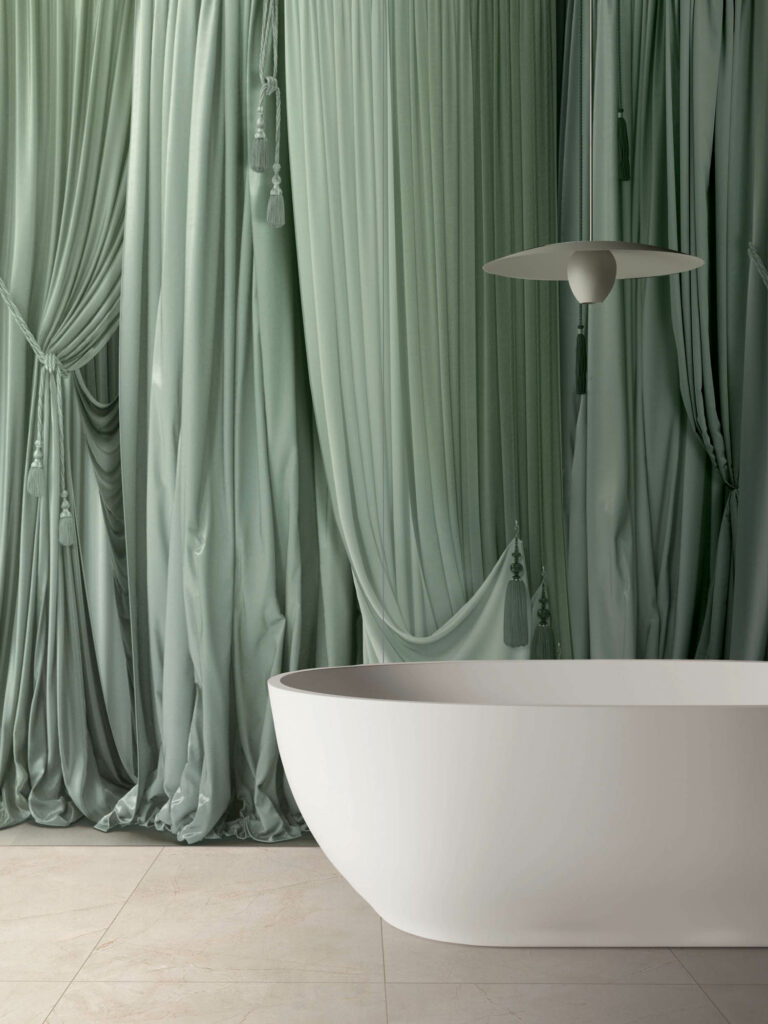
Part of the Art Walls collection, pale green panels (one color only) are 47-inch by 9-foot tall depictions of flowing fabric curtains.
Atlas Concorde Diamond

Zaha Hadid Architects created a modular graphic collection of diamond and rhomboid forms (like a Rorschach test) capable of spanning a wall’s height thanks to borders at top and bottom. According to Paolo Zilli, associate director of ZHA, “it’s a project blending a classic mosaic with a disruptive element.”
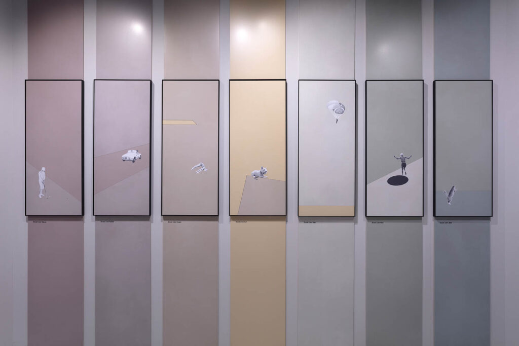
Boost Color

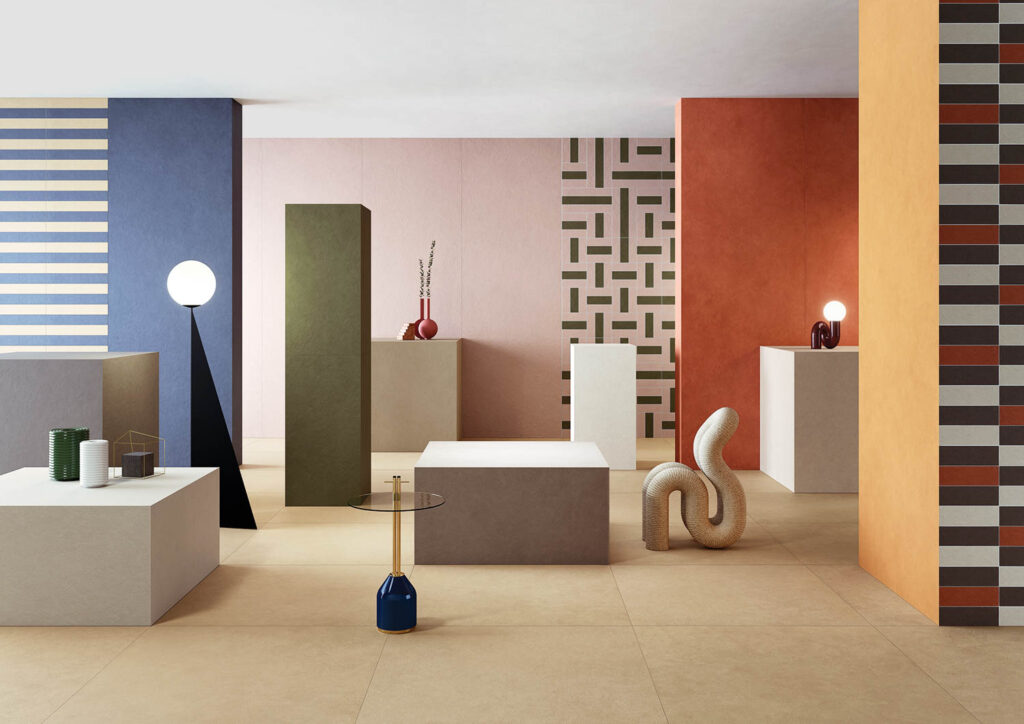
Piero Lissoni’s Boost Color Project encompasses 14 shades with a soft, velvety surface and one texture called Frog.
Fondovalle
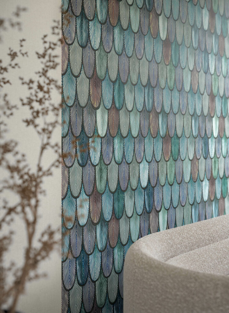
Iridescent peacock feathers on oversized porcelain slabs are a new take on the popular wallcovering theme.
Ceramiche Refin
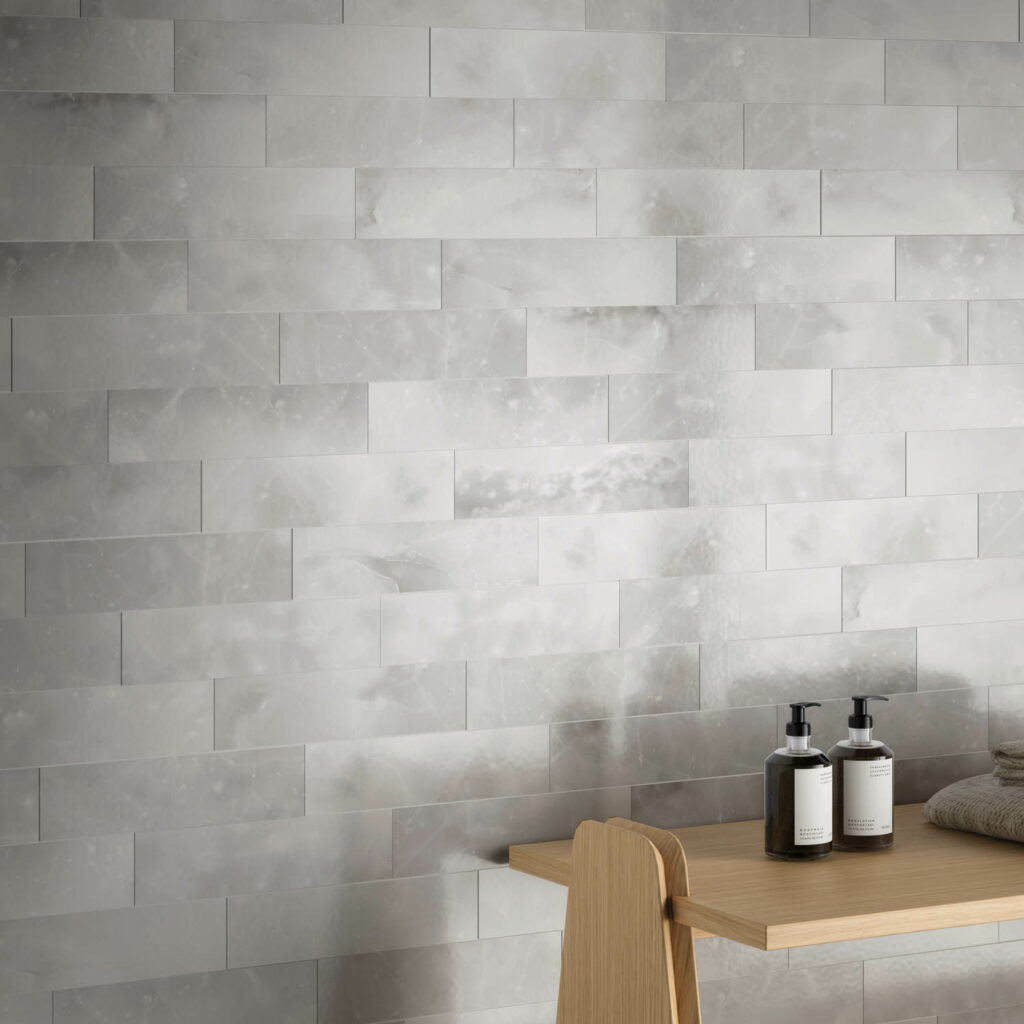
Look closely to see that Cera’s surface, albeit hard and durable, seems soft as molten thanks to digital technology. Cera, by the way, means wax in Italian.
Ceramica Fiornese
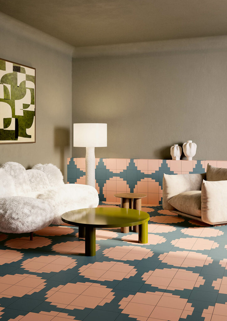
Designed by 23 Bassi, the graphic group in dusky colors, is inspired by three Italian cities, our beloved Florence, Siena, and L’Aquila. Pictured is Siena.
Gruppo Bardelli
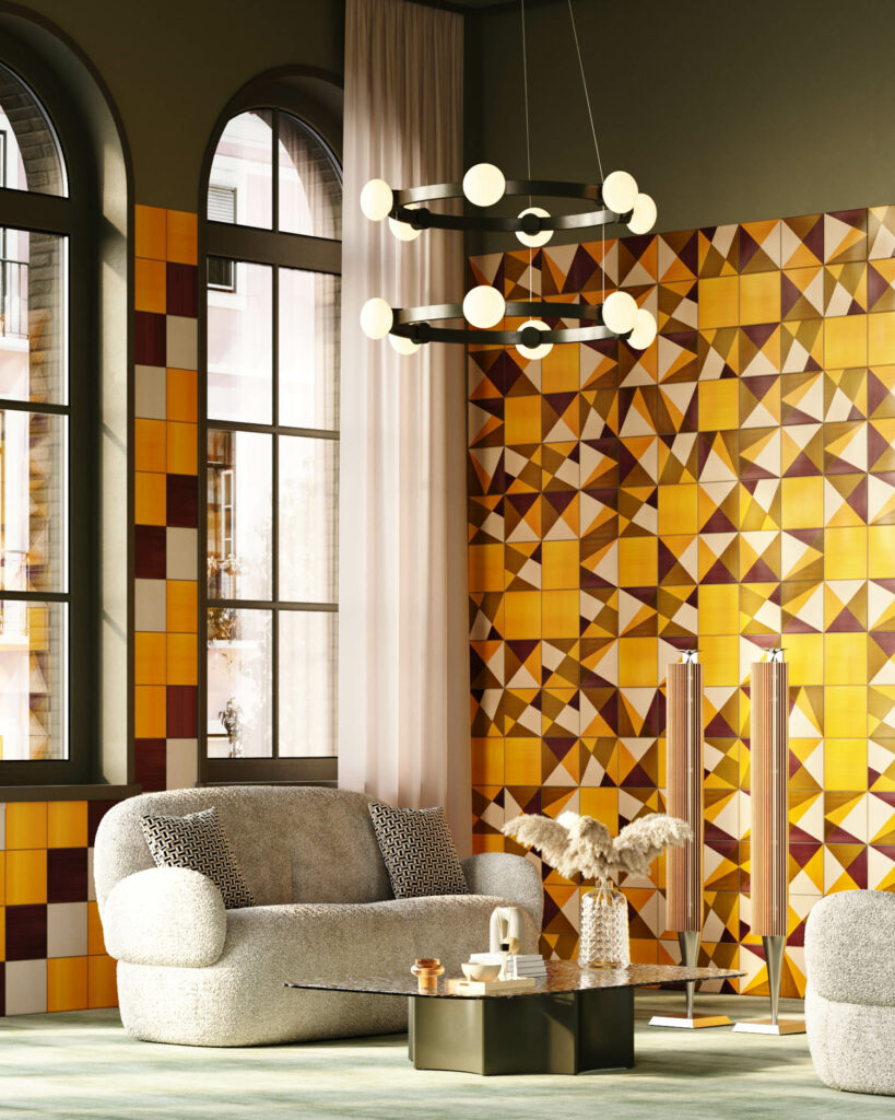
Caledio, created by the firm’s owner and designer Gianmaria Bardelli, is a handmade collection of porcelain stoneware, its forms and colors inspired by the classic kaleidoscope toy. A system of colors, shapes, and sizes, the group provides almost limitless possibilities for designers’ imagination.

Decoratori Bassanesi

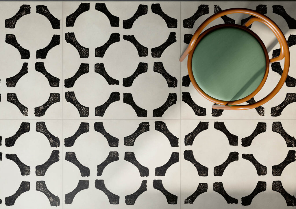
Oki Sato, the studio’s chief designer, turned to nature, specifically the wind and its effects on water, grass, and rice paddies to inspire his through-body, plaster-like ceramic tiles, their surfaces “grooved and chiseled” for the impression of depth in four combinable patterns.
Francesco De Maio

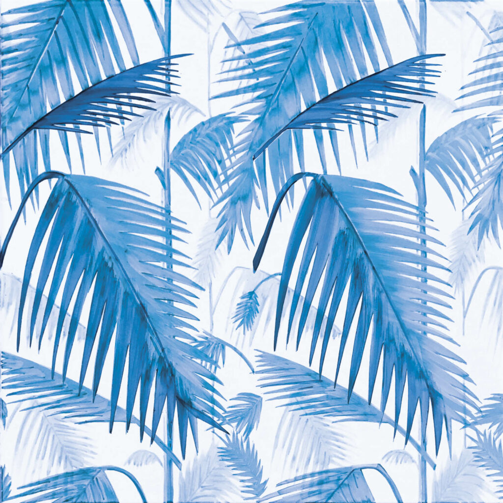
Inspired by ancient cathedrals plus inimitable Tiffany glass, studio (a+b) dominion quaquaro created their version of illuminated glasswork on ceramics with hand-made brushstrokes. Below, an urban-styled jungle in four patterns, fantastical florals on terra cotta or stoneware with an optional anti-slip finish were inspired by Path of the Gods, a hiking route along the Amalfi Coast from Agerola to Positano.
Cerasarda
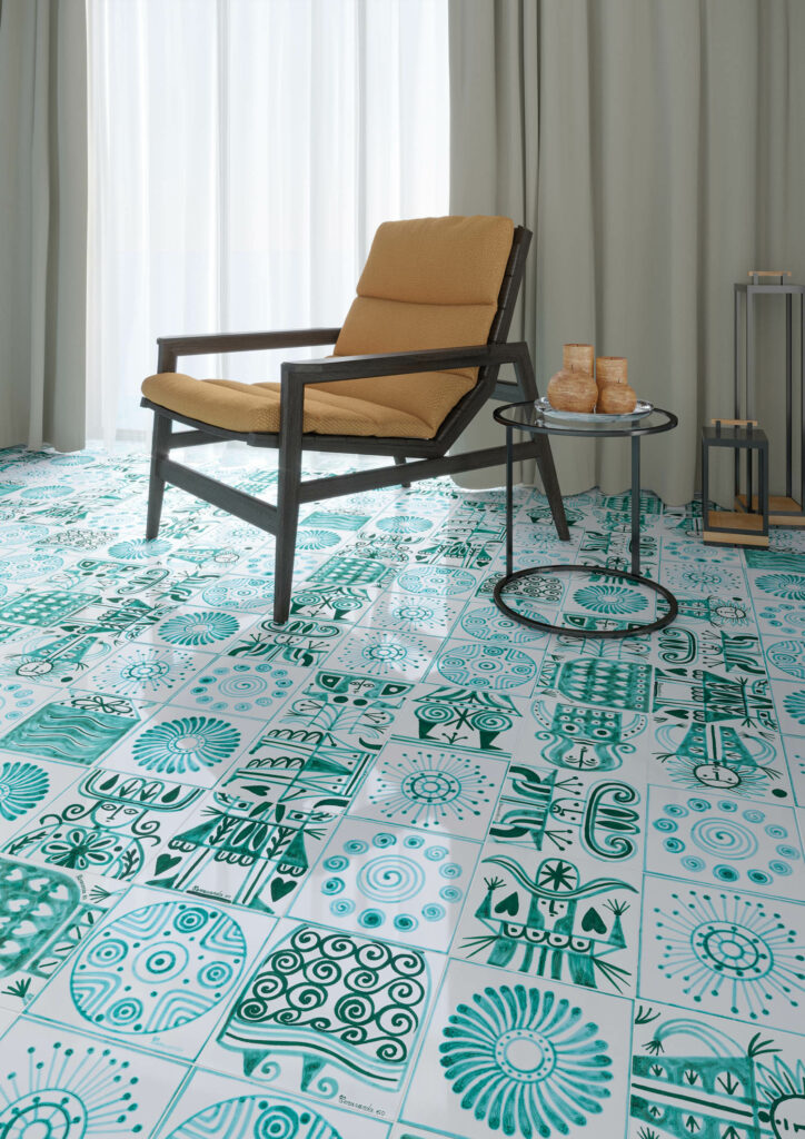
A mix of charming hand-painted ceramics comes in sunny green, yellow, rosy pink, and blue hues recalling the firm’s Mediterranean roots.
Lea
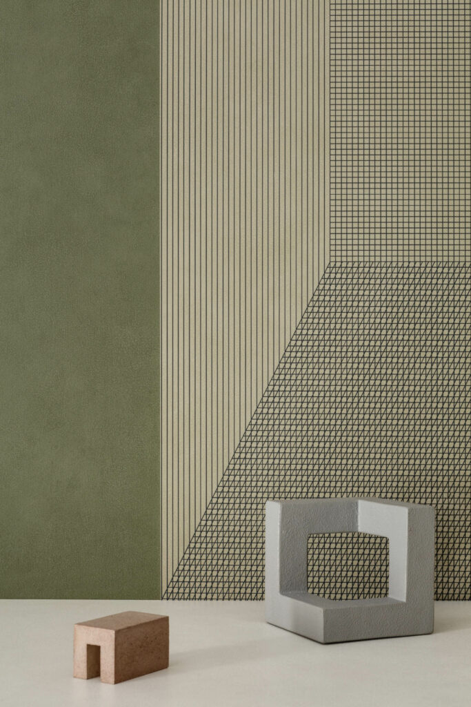
To his Pigmenti collection, a color story of 14 shades launched last year, Ferruccio Laviani added a linear graphic, i.e., Segni for a dimensional metal effect in five iterations on ultra-thin slabs claiming 100% carbon neutrality.
read more
DesignWire
Highlights from Cersaie 2022
Cersaie 2022, the world’s largest exposition of ceramic tile manufacturers, presented a variety of luxurious new collections last month.
DesignWire
Top Picks from Maison&Objet September 2023
At the September edition of Maison&Objet, an international showing of brands unveiled must-see lighting, furniture, and accessories designed to please.
Products
Must-See Tile and Stone Designs From Coverings 2023
Graphic takes dominated Coverings, the ceramic-tile and natural-stone conference. See the latest trends in tile design in these highlights from the show.
recent stories
DesignWire
10 Questions With… Eleanor Lakelin
Eleanor Lakelin uses felled tress from the British countryside, hollowing out their outer skins to reveal their material souls.
DesignWire
How Lucas Recchia Is Redefining Design With Brazil’s Natural Resources
Young Brazilian talent Lucas Recchia is drawing on his country’s rich natural resources in fresh and unexpected ways.
DesignWire
India Mahdavi Unveils Rainwear Collection For Aigle
Hall of Famer India Mahdavi unveils second collaboration with the legacy French fashion brand Aigle, homing in on lavender.
